Warp6 Mobile Theme – Retina Support, Drop-Down Menu and more
Warp6 comes with a dedicated theme for mobile devices! We know this was a long time awaited feature. Now you'll get it!
Mobile Theme
So what is a mobile theme? A mobile theme provides the general look and feel of a mobile device's user interface, so you'll get the best browsing experience on the go. Warp6 supports all mobile browsers which use the WebKit engine like the Apple iPhone, iPod Touch and Google Android devices!
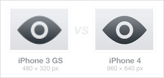
And yes we also support the iPhone 4 and its new retina display, with its awesome 960-by-640-pixel resolution on a 3.5 inch LCD. The Retina display has four times the number of pixels as previous iPhones, resulting in double the pixel density.
This means that the theme requires using optimized images for the high pixel density display. And guess what, we deliver the mobile theme with all images optimized for the retina display to show up in a crisp resolution.
Toolbar
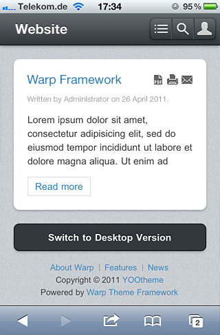
Let's take a look at the mobile theme itself. First you notice the toolbar with the logo position and followed by the button area to quickly access the navigation menu, search and login.
Logo
You can publish a custom module on the mobile-logo position to display your logo image or just leave it unassigned and the site name will automatically be displayed.
Layout
The mobile theme layout is clean and slick using all the goodies of HTML5 and CSS3. You won't find any unnecessary images or bloated markup. Thanks to CSS3 - all is done with web gradients, box-shadow and all the other cool toys that CSS3 brings into play. For example, we make use of the hardware accelerated CSS3 animations for all our nifty effects. No JavaScript effects anymore - this guarantees fast and smooth animations. So you'll get not only a nice interface but also a mobile optimized layout with a compact size.
Search
Use the search button and you'll get a search dialog which will utilize your systems search functionality to display all matching results for your query.
Login
And of course you can also log in through the mobile theme to provide access to content only for registered users.
Menu
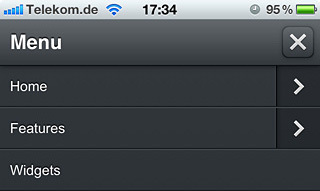
The menu button brings up the site navigation in a dropdown menu which can be nested in multiple sub levels. Further you are also able to set up a dedicated mobile menu, which can differ from your main site navigation.
Switcher
We believe in the freedom of choice ;-) That's why we added a button that lets you switch between the mobile and the desktop theme.
Administration
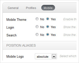
The administration options for the mobile theme are pretty self-explanatory. In general, you can switch the mobile theme support on and off, enable/disable the toolbars login and search buttons and assign module positions to the mobile position aliases. The position aliases help you to re-use modules from positions which are already set up, or you can use the dedicated positions which have a "mobile-" prefix. As you can see, it's not rocket science - everything was kept simple and easy.
Conclusion
That's it - the mobile theme support for the upcoming Warp6 framework. We put a lot of work in the mobile theme and are very proud to deliver one of the best experiences for mobile phones out there. Be excited as we are and ... hey to all mobiles, here we come!

