YOOicons launched - Handcrafted icon sets for web and print projects
At the end of our "YOOtheme templates - An inside look!" presentation, we did at JandBeyond, we showed the audience a little teaser of our secret project we were working on the last 9 months: Our new YOOicons! And today we are very proud to open the gates to the new website presenting our icons.
You may already use one of our templates to build good looking websites. But what about your content? Wouldn't it be great to have some real eye-catching icons to beautify the content of your website? Icons are an essential content element for web design. Today almost every major website uses icons to highlight important parts in their content. This is why we came up with the idea of creating handcrafted icon sets for web and print projects. Today we are proud to open our brand new YOOtheme icon club! With the icon club we will offer commercial icon sets. But we will also have some freebie icon sets in the future.
The Commercial Icon Sets
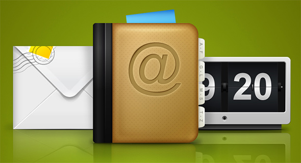
We start with 5 commercial icons sets: Symbols, Actions, Community, Contact and Homepage. They include useful icons for your company website, client projects and many standard icons you need for web applications. Altogether there are currently 125 high quality icons available. All icon sets are available in the PNG file format and in 8 different standard sizes, ranging from 16x16 to 512x512 pixels. Each icon is handcrafted and optimized for each specific size. The premium membership also includes vector PDF files of all icons that are compatible with Adobe Illustrator and can be rescaled to any size without a single loss to the details.
The Design Process
Let's take an inside look into the process of designing of the Basic Package.

We started off with a blank sheet of paper and produced our first ideas from scratch. While we used our imagination to come up with new and inspired designs, we went along the line of trial and error, to find out what would work and what didn't. In doing this, we got a better understanding of how our icons should look and feel: crispy, clear, lively and fitting a wide variety of needs.

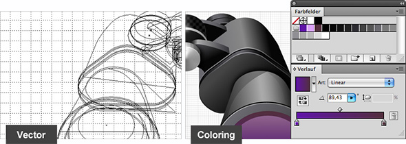
Now for the second step. We began to translate the selected scribbles into vectors. Lovingly taking care of every detail, we began with the largest size of 512 x 512 pixels. To keep a consistent look, we arranged a vivid and harmonic color palette and we were enthusiastic to see our icons taking form.

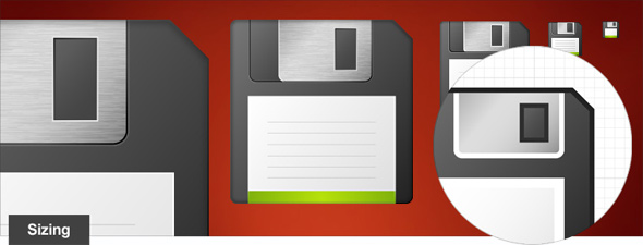
Next we prepared the smaller sizes, taking perfectly care of a beautiful result. Most important in this step was designing with the pixel grid. We needed a good feeling for which detail to highlight or ditch in every step of downsizing. Of course there were many modifications, and sometimes it was a hard fight until we were truly satisfied.

With the slices we'd already build in Adobe Illustrator it was easy to export the icons as PNG. To play safe we singly checked each one of them in Adobe Photoshop and cleaned up scruffy edges if necessary. The final step was to export the source file as vector PDF - Et Voilà, here they are!
Visit our icons website and enjoy browsing through all icons!
Note: We updated this blog post to fit our a new icon club model.