YOOtheme Pro 1.8 – A new style library and link picker
A couple of days ago we released what is one of the major updates to YOOtheme Pro since it was first introduced last year: The Style library! With its huge range of color variations it is a powerful feature for customizing your web projects. But of course that is not all you can expect this month. The YOOtheme Pro 1.8 release also holds another big improvement. We reworked the whole element settings user interface inside the Page Builder and enhanced many features.
Style Library
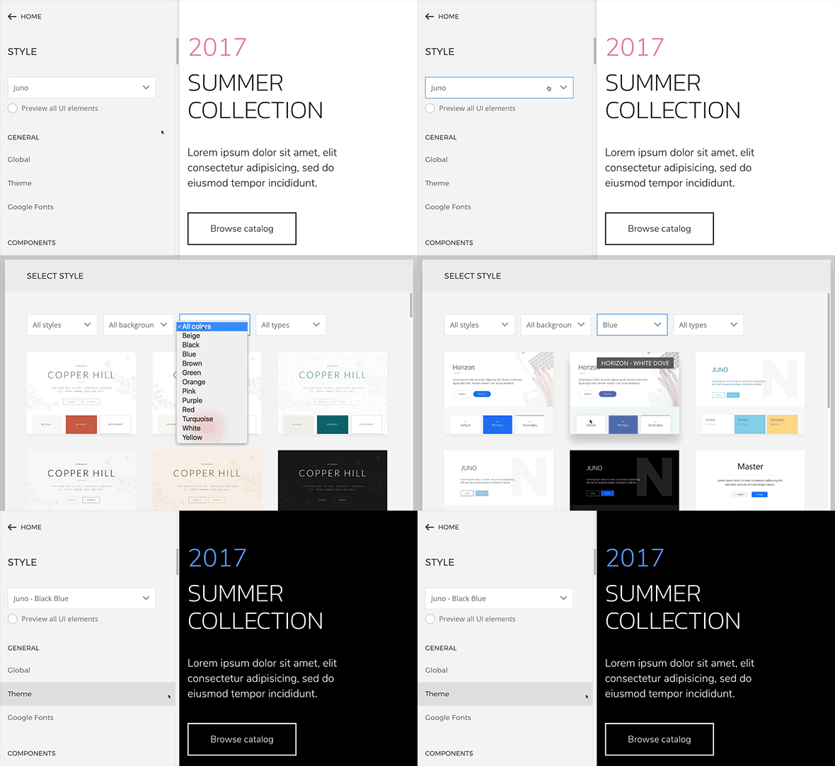
The new Style library of YOOtheme Pro allows you to quickly change the appearance of your entire website. It has access to all Pro styles that have been released so far. Just navigate to the Style section of the Pro administration and hit the Style select field. Thanks to the intuitive interface you can browse around and easily find exactly what you need. Filter the available styles by background, primary color, type and theme to find the best fit for your website. You can switch styles at any time, the content itself will be preserved and only the look changes. If necessary, you can customize colors, fonts, margins and all other style related properties of your website in the Style section afterwards. New color variations will be added with every theme release. Also take a look at our 45 New Styles blog post where you can get a quick overview of all new styles.
Reworked element options
This update brings the usability of YOOtheme Pro to the next level! We reworked the whole element settings UI inside the Page Builder. The new administration interface will give you a better overview when editing the settings of any element.
Tabs
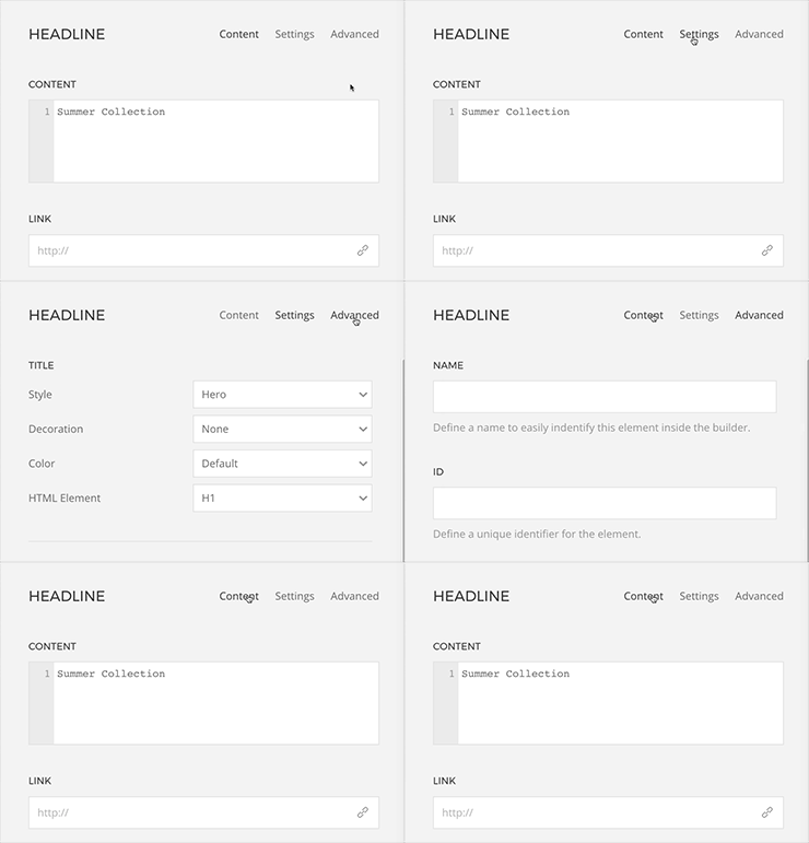
We updated all tabs and their related settings for Page Builder elements. From now on, every element has the same three tabs: Content, Settings and Advanced. The first tab provides all content related options like title, meta or text. Under the Settings tab most of the element’s settings are listed. The Advanced tab allows you to add a name, ID or class to the element and to enter your own CSS.
Group options
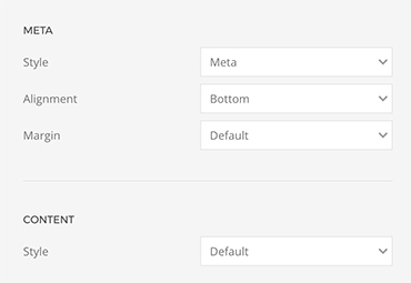
The Settings tabs benefits the most from the new UI layout. It is organized in group options labeled by headlines and subdivided into two columns with a label on the left and an option field on the right hand site. This helps to keep a good overview of the complex settings structure.
Disabled options
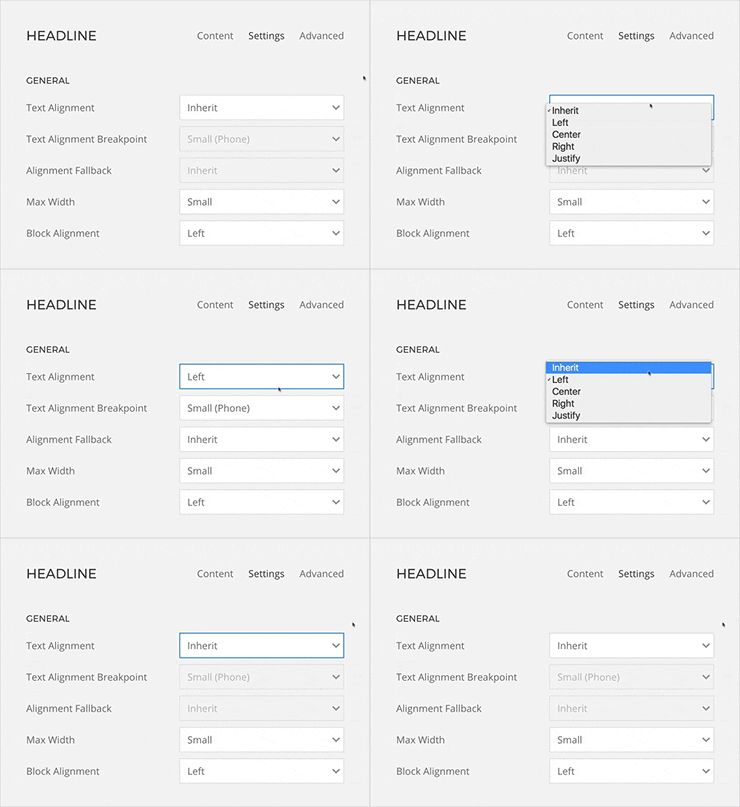
Settings will no longer disappear when they are not available. Instead, they are only disabled, so that you always see what’s possible for this element.
Link picker
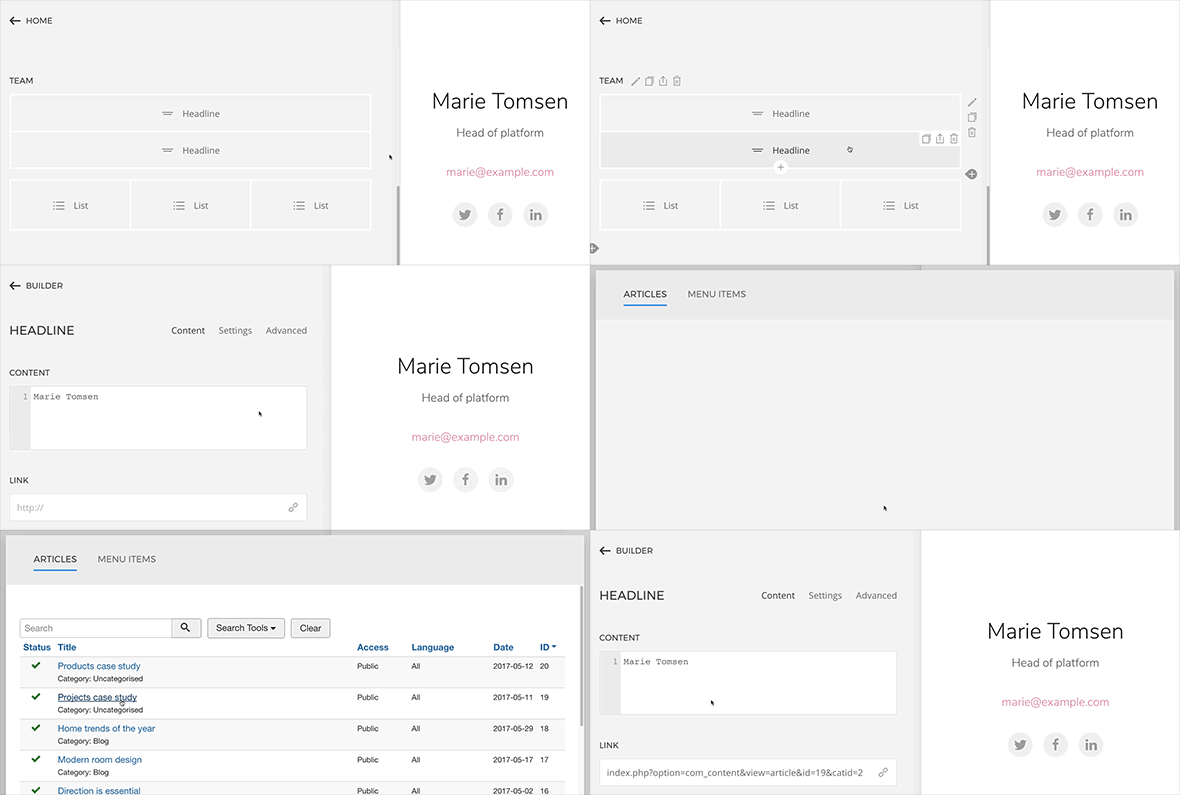
The link picker is a minor feature that will be a major timesaver for you. YOOtheme Pro now offers a native link picker, like you might be familiar with from WordPress and Joomla, to ensure a smoother workflow.
Wrapping up
These were the three main additions in YOOtheme Pro 1.8. A lot more has happened, for example the modal displaying the Layout and Style libraries will in future remember your last browsed folder upon opening. Furthermore, we included range pickers in the Map element. This makes it a lot easier to determine the right value for settings like lightness, saturation or gamma.
As always, we are happy to hear your ideas on this release. So, tell us what you think in the comments below.

