Warp gets responsive – Responsive CSS of Warp 6.2
It has been a little over a year since we released the Warp 6 theme framework. It was a major success for us, and we have improved it constantly. That's why we are really excited to announce the next major framework release Warp 6.2 which comes with a completely responsive design which adapts perfectly for all device resolutions. We will do two blog posts where we'll take a closer look at how we implemented the responsive design in Warp. This part will focus on the responsive layout and its CSS. But first the good news: It was really easy to make the Warp framework responsive. Thanks to our current CSS framework, which already provided a fluid grid system.
Media Queries and Breakpoints
We added a new responsive.css file to Warp, which contains all the CSS we need to make our themes responsive. For our layout breakpoints we use max-width and min-width instead of any device widths. This makes testing in the browser really easy because the layout breaks as you start dragging the edge of your browser window.
We have chosen our breakpoints around the currently most popular device dimensions. But if you want a more device-agnostic approach, you can easily support more layout dimensions and add more breakpoints. Here are our default breakpoints:
/* Only Phones and Tablets (Portrait) */
@media (max-width: 959px) {}

/* Only Tablets (Portrait) */
@media (min-width: 768px) and (max-width: 959px) {}

/* Only Phones */
@media (max-width: 767px) {}

/* Only Phones (Landscape) */
@media (min-width: 480px) and (max-width: 767px) {}

/* Only Phones (Portrait) */
@media (max-width: 479px) {}
We are very satisfied with the breakpoints we chose. The complete theme layout, including all the different modules layouts, adapts perfectly from large to small device widths.
Layouts
Basically we chose a fluid layout pattern for Warp, which relies on fluid grids and images to scale from large screens down to small screen sizes and stacks columns vertically. As you can see from our breakpoints we decided to support mainly 3 different layout dimensions by default. Here is an overview of what happens for each layout:
Desktop and Tablet Landscape
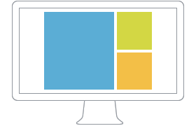
Since most tablet landscape views have at least a resolution similar to small desktops we decided for the layout to look the same.
Tablet Portrait
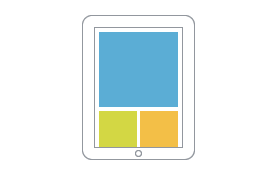
If there are two sidebars, both are side by side beneath the main content and each module inside the sidebars is taking 100% width. If there is only one sidebar, it also wraps under the main content, but each module inside takes 50% width. So, two modules are always nicely aligned side by side. This works really great for nearly all layouts.
Phone Landscape and Portrait
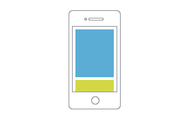
But there is a lot more happening in the theme header. A new select menu is injected as responsive navigation and the logo and search are newly aligned. But more on that in our second blog post.
CSS Helper Classes
We've already had a CSS class size-auto to achieve fluid images, videos and objects since the first Warp 6 release. We also added some useful classes to hide content on specific devices: hidden-desktop, hidden-tablet and hidden-phone.
Theme Settings
There are some general changes in the theme settings according to all the changes to the Warp framework.
Responsive Layout
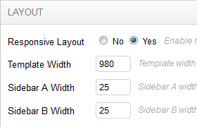
Sidebar Widths
To achieve a fully fluid layout we had to change our multi-column layout to percent units. This is why the sidebar widths are now changed from pixel to percent. The default setting is 25%.
Mobile theme and older themes
We removed the mobile settings from our new responsive themes. The mobile theme is now deprecated but still included in Warp. This means all older Warp 6 themes can be updated to Warp 6.2, but they'll still continue to use the mobile theme and not the new responsive features.
Stay tuned for our next blog post. It will take a closer look at the JavaScripts we use for the responsive design.
