UIkit 3.18 – Slider and Slideshow Parallax and Inverse Overlapping Content
Happy New Year, everyone! Let's start this year with a brand-new UIkit 3.18 release. We have two cool features for you. First, you can add a parallax effect to your slider or slideshow. And, you can automatically color a sticky transparent navbar depending on the background behind. This and more coming up!
Make sure to subscribe to our YouTube channel and join our Discord Chat Server for all news and discussions.
Slider and Slideshow Parallax
With UIkit you can create stunning sticky parallax effects. For example, you can slide through images which are positioned side by side while scrolling down the page. However, writing the needed markup requires quite some time and effort. And since the Slider component in UIkit already shows images side by side, we came up with the idea to animate the slider on scrolling, similar to the Parallax component. So instead of a step-by-step animation using navigation controls, you can use a stepless parallax animation based on the scroll position of the slider in the viewport. Just add parallax: true to the attribute. This is so much easier than writing all the markup manually.
And like for the Parallax component, there are also the parallax-start, parallax-end, parallax-target and parallax-easing options. The slider navigation is disabled, but it will show the active slide.
And that's not all. The same works for the Slideshow component! Just add parallax: true, and you can scroll through all your slideshow images.
Of course, you can make the slider or slideshow sticky and easily create even more stunning effects.
Inverse Overlapping Content
As you know, the Inverse component in UIkit can change the text color to make it look great on different backgrounds. The .uk-light and .uk-dark classes are set on container elements and color their containing content. However, there are cases where elements are not nested but have a position context and overlap each other. For example, a sticky navbar overlaps different sections while scrolling. To color content depending on intersecting elements, add the uk-inverse attribute. It will set the .uk-light or .uk-dark class depending on the section behind.
This works because the .uk-light and .uk-dark classes as well as all components which create backgrounds, meaning Section, Tile, Card, Overlay, Off-canvas, Navbar, Dropdown and Dropbar, set a custom property called --uk-inverse to either light or dark. The JavaScript looks for the --uk-inverse custom property in the closest intersecting element in the stacking context and sets the .uk-light or .uk-dark class correspondingly.
You can even select different parts of the navbar and color them separately.
If nested content should keep its text color, and only the overlapping content should inverse its color, use the .uk-inverse-light or .uk-inverse-dark classes instead of the .uk-light and .uk-dark classes. They set the --uk-inverse custom property to the corresponding color but without coloring the containing content.
And you can prevent the navbar from changing its color automatically when it stops being transparent.
For more information and many examples, check out the Inverse and Navbar component documentation.
Color Mode for Default and Muted Styles
UIkit 3.18 introduces new *-color-mode Less variables for the default and muted style modifiers in Section, Tile, Card and Overlay components. If needed in a custom UIkit style, they can now extend the Inverse component, just like the primary and secondary style modifiers.
@card-default-color-mode: dark;

@overlay-default-color-mode: dark;

@section-default-color-mode: dark;
@section-muted-color-mode: dark;

@tile-default-color-mode: dark;
@tile-muted-color-mode: dark;
Height Placeholder
There is a new Height component that sets a height for a placeholder element. For example, if you have an absolutely positioned transparent navbar, you may need a placeholder element with the same height as the navbar to push the elements down in the normal content flow. Simply add the uk-height-placeholder: SELECTOR attribute where the selector targets the element with the required height.
Nav Size Modifier
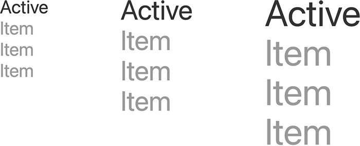
Additionally, we added new size modifiers for the primary nav in the Nav component. The .uk-nav-medium, .uk-nav-large and .uk-nav-xlarge modifiers provide bigger font-sizes which are especially useful in full-screen dialogs, like for the Modal or Dropbar components.

Icons
We have a small update for the UIkit icon library. There are five new social icons, for X, Mastodon, Telegram, Threads and Signal, as well as Link External and Arrow Up Right icons. And finally, there is also a YOOtheme icon.

The Twitter icon is now an alias for the X icon. So if you use the Twitter icon, the Icon component will automatically show the new X icon instead.
Migration to UIkit 3.18
There are breaking changes for components which extend the Inverse component. If you have created a custom UIkit style, please take a look at the migration guide.
What's Next
We are really proud that creating sticky parallax effects based on sliders and slideshows got so much easier in UIkit. And thanks to the improvements in the Inverse component, you can have an always transparent sticky navbar which looks great on any background. Now it is your turn to share your feedback, so let us know what you think about this release in the comments below.


