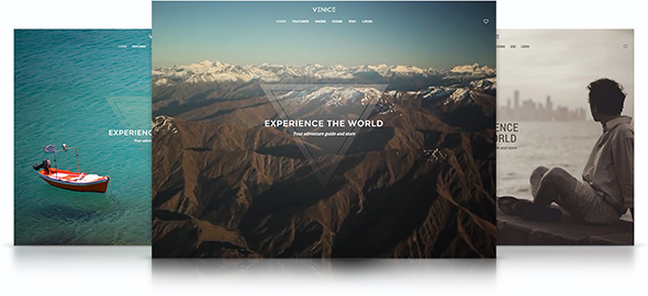
Venice Theme – February 2015 YOOtheme club theme
The beginning of February brings you a brand new theme release. Venice Theme opens big with a fullscreen slideshow to present images and videos. The special (and optional) two column blog layout works particularly well with image oriented websites, like traveling magazines or architecture portfolios.
Venice Theme comes with a fullscreen position that is ideal to present images, videos or a Widgetkit Slideshow including both. The slideshow will cover the entire viewport and fit all device widths.
The main navigation can be fixed to the top of the window. Additionally, you can enable an alternative navbar, placing the logo between the items of a centered menu. To match the Fullscreen Position, the navigation will adapt another style turning transparent and moving the logo above the navbar.
This theme features two different blog styles. The default stacked layout with the featured image above the title and a special alternating two column grid layout. It places image and article side by side and adapts seamlessly to different device sizes.
Venice utilizes Widgetkit 2 and also provides a Bonus Switcher Widget that uses thumbnails to navigate through different content panes. More features include a Socialbar widget position and different section backgrounds.
- Fullscreen position
- Special alternating two column blog layout
- Adaptive and optionally fixed navigation
- Hide page title and pagination in WordPress
- Socialbar widget position
- Default, alternative and image section backgrounds
- 6 pre-built style variations
- Easy customizer and LESS integration
- WooCommerce support
- Widgetkit 2 Switcher bonus widget


