UIkit 3 Beta – It's all reworked, shiny and new
Since our introduction of UIkit in 2013, it has become one of the most used front-end frameworks that power the modern web. With all the lessons we have learned during that release, we have continuously improved UIkit. After pretty much exactly one year of work and more than 1600 commits, we are taking the next big step today. We are releasing UIkit 3, the newest generation of our framework, which has been completely rethought and rebuilt.
While still being labeled as beta, UIkit 3 is really mature. The complete YOOtheme Pro product, including its theme and all of our websites from the past three months have been built with the new version of the framework. We have also taken the time to write an extensive documentation for every single component. The docs come with many examples that can be copy-pasted right into your own project.
UIkit 3 features all the things its predecessor is loved for: Modular components, conflict-free class names, customizable LESS sources, interactive JavaScript components, an easy to use theming system and responsiveness from the ground up.
What's new
There is so much more to discover in UIkit, but here are some of the highlights from the new and changed components:
-
The new Grid system, like the previous one, utilizes the powerful flexbox principle to create dynamic and flexible layouts. The Grid works in conjunction with the new Width component, which includes powerful width options. You can split content into evenly distributed columns, automatically apply the content's dimensions or expand the column width to fill up the remaining space. These modes can also be combined. When using the
uk-gridattribute, the necessary class is injected automatically and the grid system takes care of margin, wrapping etc. via JavaScript. -
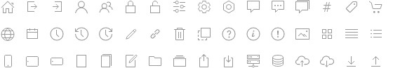
The Icon component now comes with its own SVG icon system. It dynamically injects SVG icons, which can easily be styled with CSS. All icons were custom-built and include many beautiful elements for pretty much every usecase. More and more icons will be added over time.
-
The Inverse component inverts most other UIkit components for any kind of background — dark or bright. No more need to write custom styles when displaying elements on different backgrounds. Just add the
.uk-lightclass for dark backgrounds in a light style or.uk-darkfor light backgrounds in a dark style.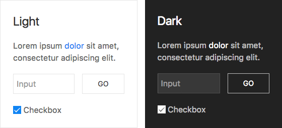
- The Card component is a new central way of presenting different kinds of content with optional header and footer sections. It replaces the old panel component.
- The Drop & Dropdown components with their enhanced flexibility now allow you to drop, well, anything. More options are available to define the drop behavior, for example boundary alignment to align a dropdown relative to any chosen element on the page.
- The Navbar component has been extended with new toggle modes (click and hover) and a transparent look, which can also be used with the Inverse component. This style looks splendid on any background. The new dropbar mode displays dropdowns inside a full-width background container.
- The Offcanvas component has been reworked completely and the new animation modes push, reveal and slide, all of which can be flipped, were added.
- The Form component has been rebuilt completely and unifies the old Form, Form advanced, Form select, Form file and Form password components.
- The Overlay, Position & Transition components originate in the old Overlay component and have been extracted to be easily combined with many other components.
- Margin & Padding are now their own components and contain the new size modifiers as well as additional classes to remove margin. For consistency, some class names have been changed or swapped, look out when migrating old code.
- The Toggle component now features more functionality, for example toggle classes depending on viewport size, even on itself.
- The new Background component includes beautiful background options and comes with multiple display and blend modes.
- The new Divider and Heading components include a simple dividing line or one that is decorated with an icon as well as different styles for headings.
- The new Spinner component features a beautiful loading spinner animation.
These are just some fantastic new additions of UIkit 3. Many components have gotten new modifiers, like Button, Column, Animation, Table and so on.
Things to keep in mind
UIkit 3 has some general changes, that we want to emphasize and that you should also be aware of when starting to work with the new version:
-
Consistency – While some class names appear to be the same as before, they might have a new or swapped order of words. This is the result of our effort to find consistent names for all components. One specific example are many sizing classes which have been unified to follow the same pattern as, for example, the
.uk-margin-large-topclass from the Margin component. -
JS attributes – Data attributes
data-uk-*have been renamed to simpleuk-*attributes. Many components now use the attribute. It injects the necessary classes, so that you don't have to set them manually. This includes frequently used components like Grid and Width. -
Viewport classes – Viewport specific class names now have size postfixes –
@s,@m,@l,@xl– instead of the old keywords-small,-mediumetc. -
Default style – Many default styles have been moved into a dedicated modifier class. For example
.uk-buttonand.uk-navhave no default styling anymore. Instead, you can add the.uk-button-defaultor.uk-nav-defaultmodifier. This is the result of our effort to limit the situations where you would need to reset the default styling when using components. - Modularity – Many of the new components are just extracted from old components, such as the large utility collection. This makes UIkit even more modular and tidy — both code and documentation. This includes components such as Heading, Table, Margin, Padding, Link and more.
Migrate your page from UIkit 2
With the new Migration tool you will have no trouble updating your site from UIkit2 to version 3. The tool helps you find all the critical changes, which affect your website and allows you to locate where things need to be changed. That way you can modify your website component by component to make it fully UIkit3 compatible. All you need to do is to replace the UIkit source with the new one and add the migration scripts the way you prefer. For more information, take a look at the Migration Documentation.
New documentation
A lot of our work for this release has gone into creating extensive documentation for every UIkit component right from the start. We have also made sure to include many examples that are prepared to be copied and pasted completely. You can also jump right into a Codepen to play around with the example in a live environment. Every component includes test pages, which we use internally to get an overview of all features of a component. You can jump to the test right from the documentation page of every component.
UIkit in numbers
In January 2016 we decided to start working on UIkit 3. Since then, our internal repository has seen more than 1600 commits from 10 contributors. This development now is moved into the regular UIkit repository, that has seen much attention since the original UIkit release in 2013.
- More than 8.000 stars
- Almost 3.500 commits
- 65 contributors
- 86 releases
A lot of effort during the development of UIkit 3 went into creating a clean and modular code base. As a positive result, the final CSS and JavaScript have become small, while containing all the functionality for any website, big or simple. When compiled to contain close to the same functionality as UIkit 2, the new release's CSS is 21% and the JavaScript 28% is smaller (gzipped). However, the complete release contains even more functionality.
What's missing
This is a beta release and as such it is to be considered a work in progress. A number of components still need to be reworked and will be added in the future. Our focus for this release has been to create a stable core and provide extensive documentation right from the start. Next on our list are the Slideshow, Slider, Slideset, Parallax, Nestable, Lightbox, Dynamic Grid, HTML editor, Date- and Timepicker components.
Hands on
We have designed UIkit 3 to be as modular as possible, so that you can include it in any kind of web based project, be it a typical website or a full web-app. We are happy to see what people have created with previous versions of UIkit, and we are incredibly excited to see what you will create with the new UIkit 3. Go and give it a try. Download it at getuikit.com.


