Navigation with Warp5 – The fancy Drop Down and Accordion Menus
In this post we're going to check out the endless navigational possibilities of the Warp framework's completely re-worked menu system.
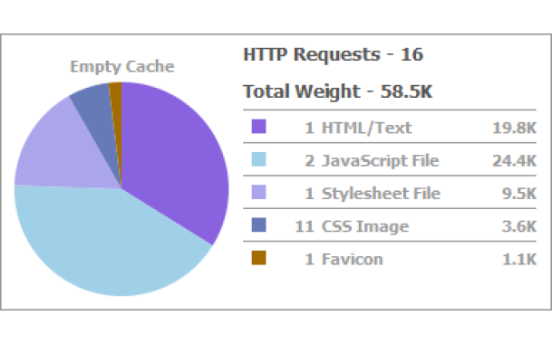
Please also check out our last posts on Warp in which we presented a brief overview on the framework's history, showed you how fast it loads and checked out what the module system has to offer.
How it works
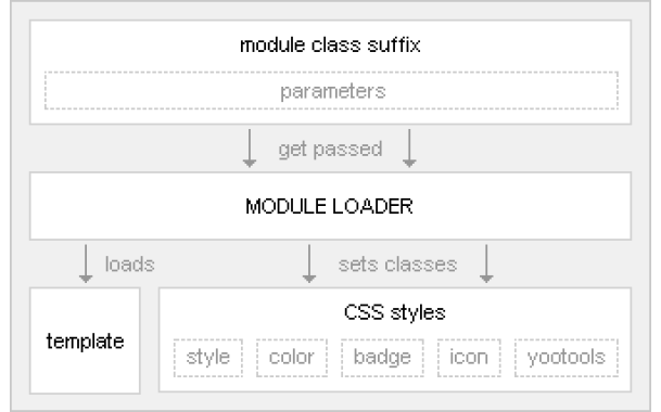
First, we use the Menu Class Suffix of a menu module to define what type of menu we want to render. The Warp framework comes with three different menu types, "dropdown", "accordion" and "default".
If we type in "dropdown", the menu gets rendered with the HTML structure necessary for the dropdown menu, if we type in "accordion", the accordion markup gets rendered. If we leave the Menu Class Suffix blank, the menu gets rendered with the standard list markup. Second, we deliver specific CSS for the different menu types. These CSS styles match exactly the rendered markup of a menu type to make it display the way we want it to look. We only use HTML and CSS to provide the menu system's functionality, JavaScript is not needed to render and style the menus or to make them work. The JavaScript effects are added unobtrusively to complete the user experience by keeping the accessibility.
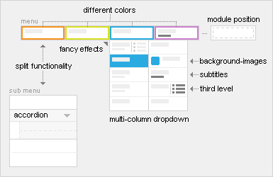
Menus are always displayed in a module in your frontend. This means that, for example, you can apply different module styles to the accordion menu and change the color of the surrounding module style. By the way: It is also possible to render any module in the "menu" position and to show it in the dropdown. The module's title will show up as a tab in the main menu.
Adding some magic...
The Warp framework provides a few JavaScripts to add effects to menus used in Warp-based templates. For example, it is possible to create tabbed menus, the famous Fancy Menu with the sliding bubble or the Slider Menu that uses the same effect as the YOOslider. Also, different effects can be set for both the dropdown menu and the accordion menu.
We are now going to take a closer look at two menu module types, the dropdown menu and the accordion menu.
The Dropdown Menu
The shiny new dropdown menu lets you set the dropdown column width in the template parameters in your Joomla backend. It also allows you to add subtitles and images to menu items. When you split the main menu into a dropdown and a sub menu you can now set different images to be displayed in each of the menus. Via the Page Class Suffix you can set the number of dropdown columns for each level 1 menu item.
The dropdown menu also comes with new JavaScript features: When you accidentally move the cursor out of the dropdown menu it keeps being displayed for some milliseconds, allowing you to move your cursor back onto the menu. Also, there is a new animation mode called "slide" which, unlike all other dropdown effects, does not extend and fade the dropdown but moves the whole menu downwards, out of the menu bar.
The Accordion Menu
The accordion menu can be loaded into any module style. In every template we provide default module styles that the accordion menu looks good in. To use the accordion effect, the level 1 menu items that shall trigger the effect have to be set up as separators. There are two effect modes: one closes all expanded accordion items when another accordion item is clicked, the other one can open more than one accordion item at the same time. A CSS class "active" is automatically applied when the accordion item is opened. That way, the opened accordion item will look exactly like an opened menu item without accordion effect.


