Demo Site revamped using HTMl5 and CSS3
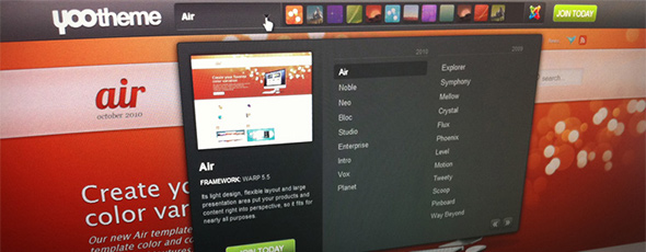
One site never changed much since we started YOOtheme 4 years ago. Any guesses? Yes, the Demo Site! The design and the old school select boxes for the different templates bugged us a long time. Today we are proud to present a completely revamped Demo Site using HTML5 and CSS3.
Not only that the new site is much more beautiful than the old one we also improved the usability. Now you can see little icons for the different color variation of the active template. Hovering them shows a little thumbnail how the color variation will look like. This way you get a quick overview about the available template styles. For the template selection we added a nice drop down area where you can browse through the different templates grouped by years. When hovering a template some information show up like a thumbnail image, a little description and the used framework version of the template. We also created a template archive where instead of a demo site only screenshot are shown in a nice slideshow. This makes it more easy for us to maintain all the demo installations. But of course the archived templates are still available for download. For now, we archived all templates from 2007.
Take a look at the new Demo Site and tell us what you think!


