YOOtheme Pro for WordPress and a new Horizon theme
It's been a couple of weeks since we released YOOtheme Pro and quite a few things happened in the meantime. We have been working hard and are excited to announce that as of today, YOOtheme Pro is available for WordPress! Joomla and WordPress users won't only be able to enjoy last month's website Fuse, but also our new release Horizon.
There's still more good news to share. You can now use Widgetkit 2 and YOOtheme Pro simultaneously. We know that this will make many of you guys very happy.
In addition, we published 12 minor releases in the last 4 weeks which come with a new style, a bunch of new features, options and settings as well as several improvements and bug fixes. This is an impressive number that we are proud of, and hopefully it shows, how passionate we are about YOOtheme Pro. We will keep pushing even more updates in the future. Read on to find out what all this means in detail.
YOOtheme Pro for WordPress
First, thank you to our WordPress users for your patience. This gave us the time to work out a solution that allows us to integrate YOOtheme Pro seamlessly into the WordPress interface, so that you won't even notice that you are working with anything but the CMS itself. Experienced WordPress users will instantly recognize the UI and newbies can easily find their way.
YOOtheme Pro is embedded into the interface and adds its functions to the native WordPress Customizer. You just go to Appearance > Themes and hit the Customize button below YOOtheme Pro and you will find our own settings in addition to the WordPress menu.
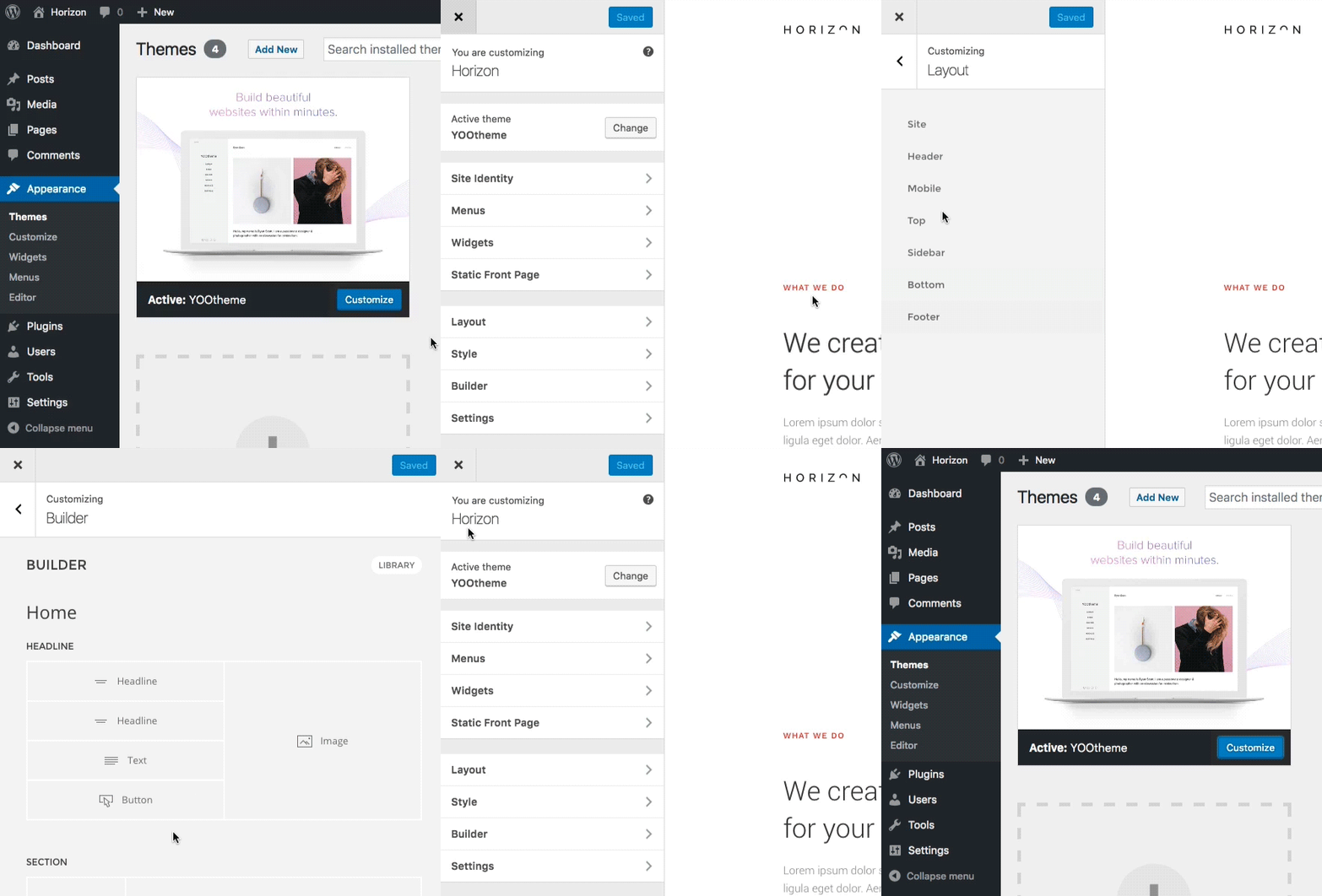
WordPress itself still takes care of the menu and widget handling in the Customizer. To assign a widget to multiple pages, you can use the Jetpack plugin, as is the recommended workflow of WordPress.
The October website Fuse as well as our new release Horizon are now available for WordPress, including all YOOtheme Pro features.
The new website, Horizon
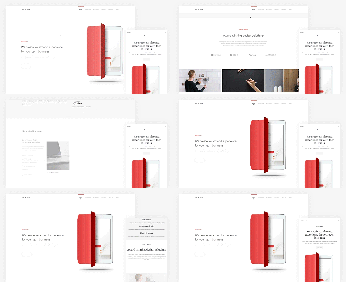
This month's website, Horizon, comes with an elegant and clean style. It works brilliantly with product pages or software company websites. The newly added box shadows provide more depth for the overall appearance. Choose from 8 different prebuilt layouts: Frontpage, Products, Specs, Overview, Services, Company, Pricing and News.
- New Material style
- 8 Layouts for different page types
- Product and business topic
New Material style
Today's release includes the new Material style. Thanks to the modularity of YOOtheme Pro it can be used not only with Horizon but also with Fuse and any future website. The new style is clean, elegant and lightweight, featuring colored details and UI elements. We introduced a number of new style options to give you more flexibility. All these options can also be applied to the Minimal style of Fuse theme.
Border
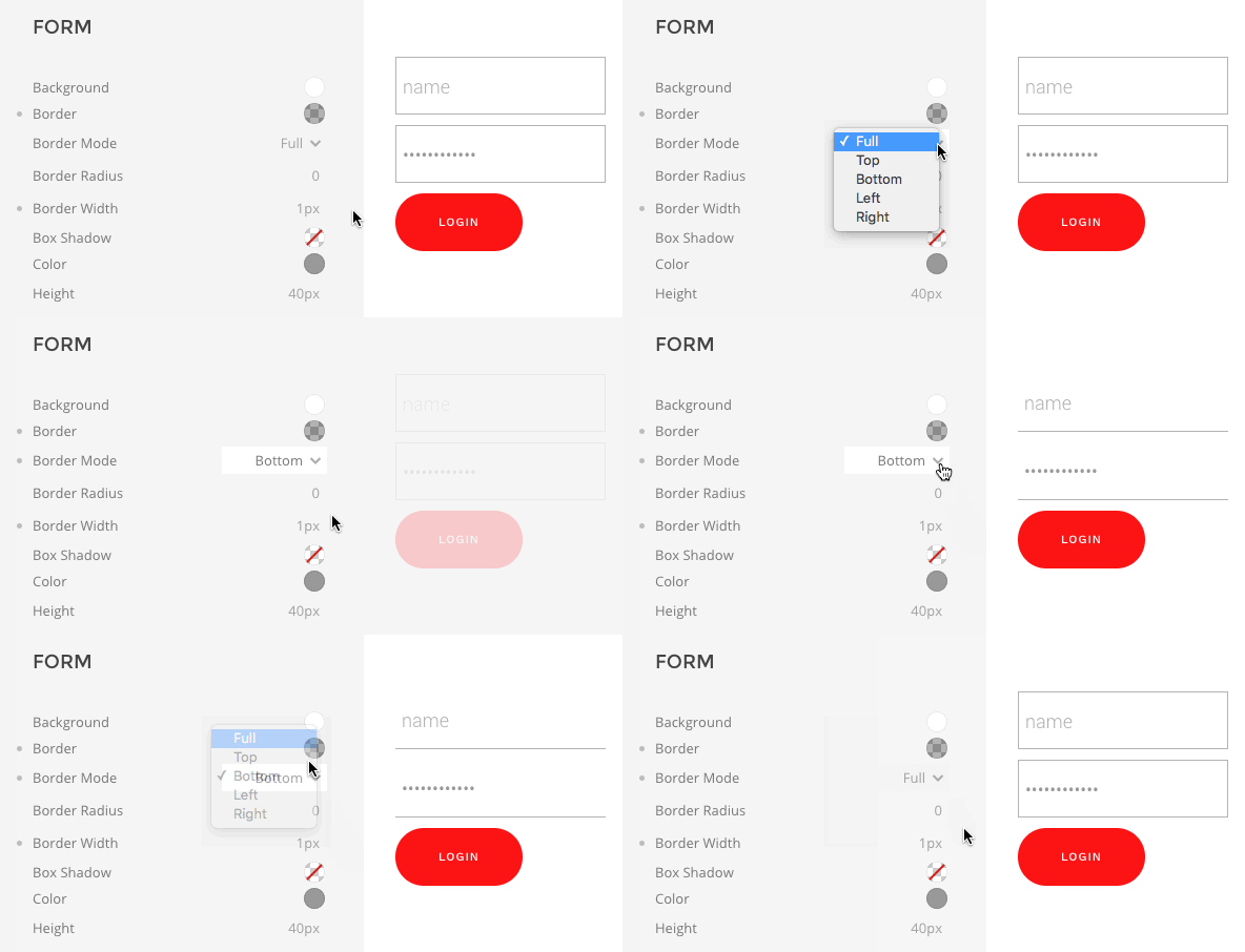
YOOtheme Pro now employs so-called modes for different components that allow you to change global aspects of your theme's styling in one click. In this case you can switch through different border modes, for example to style forms. Apply a top, bottom, left, right or full border by selecting one of the available options.
Box Shadow
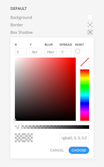
The style customizer includes a box-shadow picker. With this you can customize every aspect of an element's shadow. Enter values for offset, blur and spread, enable inset mode and pick the shadow's color and opacity.
Navbar item line
Another handy new addition allows you to add and style a decorative line that can be positioned at the top or bottom of navbar items. Enable Slide Mode, so that an animation will be applied to the follower when you hover different menu items.

Typography
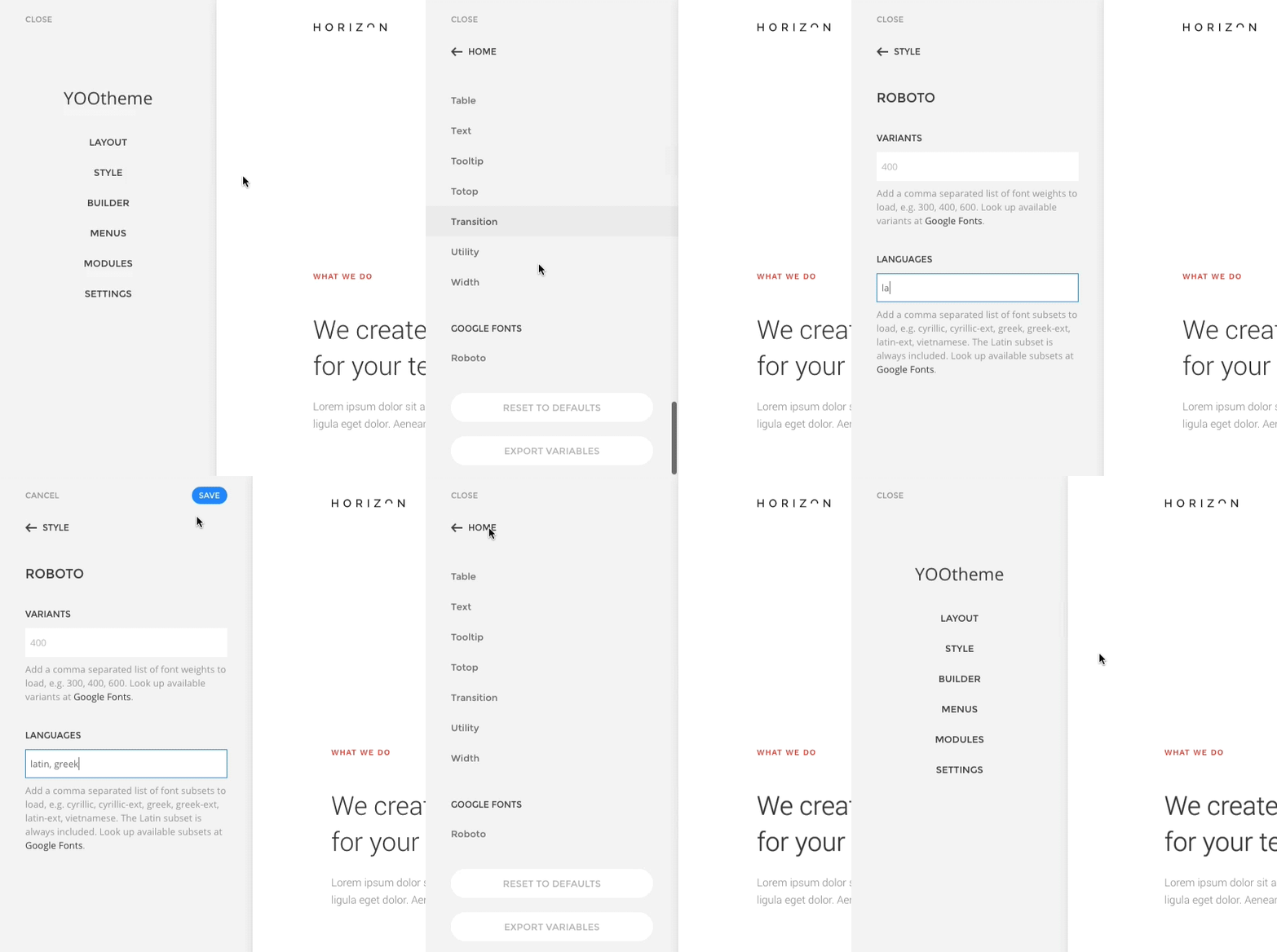
Some improvements have also been made in the default theme's typography settings. All Google fonts your style is using are automatically displayed at the bottom of the Style panel.
Improved Sorting
The new style customizer already was a big step forward. Nevertheless, we are continuing to improve its structure. Variables are grouped by modifier, then ordered semantically – for example modes like hover and active stay together – and alphabetically. This will help you to quickly find anything you want to modify in your style.
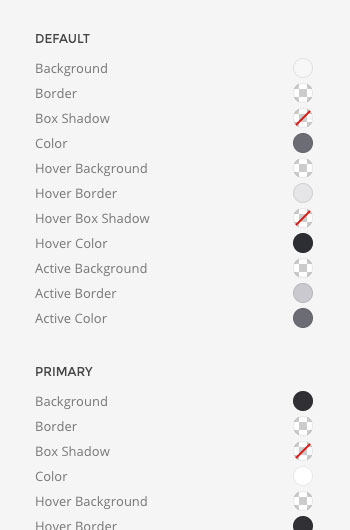
Take the button component for example. First, you can see general variables that apply to all buttons ordered alphabetically, followed by the groups Default, Primary, Secondary etc. At the bottom of each of these groups you will find hover and active states bundled together (if they exist).
Inverse Component
The Style customizer now features all variables of the Inverse component. This allows you to display components on all backgrounds. Take the Card component, for example. The Primary and Secondary modifiers allow you to select a color mode, so when using a dark background you can switch to light mode and the card's content will adapt accordingly. This is done through the Inverse component, the place where you modify the appearance of elements that you want to invert for contrasting backgrounds.
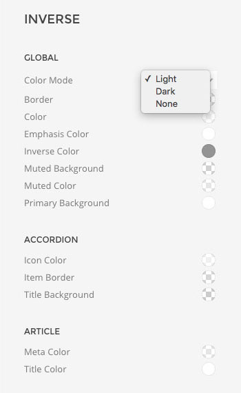
The global Color Mode select field lets you determine, whether light or dark mode is used, depending on the style. Light styles should apply light colors on dark backgrounds, as elements are usually dark by default, and vice versa.
Apart from all this, you will also notice that the performance of the Style customizer has improved dramatically, so that loading times have decreased by as much as 70%.
New Theme Features
Just like Fuse, the new website Horizon is built on our first default YOOtheme Pro theme. During the last few weeks we have released several updates with improvements and bug fixes.
Layout
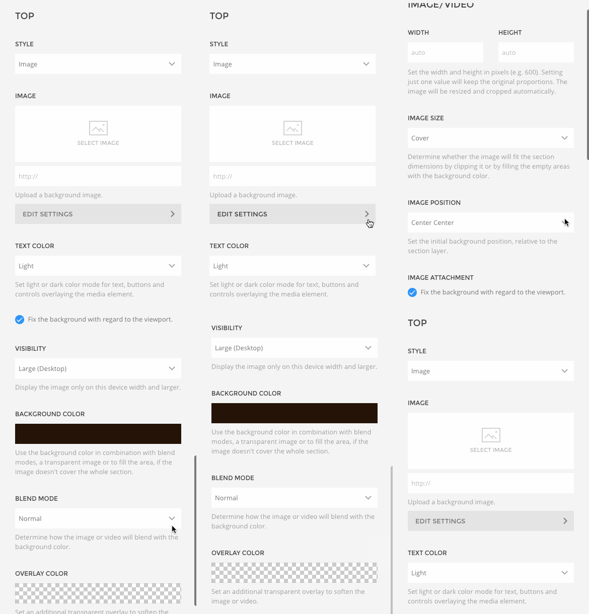
For better handling we've moved the image settings of each position into a separate panel. Instead of a bunch of options automatically appearing when you select an image as your position's background style, there's now an Edit Settings button that leads you to these options.
Module Options
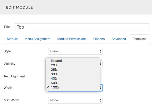
Modules in Joomla feature an additional Template tab. Here you can adjust a module's style, text alignment and width, which now can also be 100%. This enables you to stack multiple modules within one position.
Builder
The YOOtheme Pro Builder also features a couple of new options and settings.
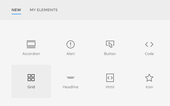
Grid element
The element library has grown by a new item to create a grid. That way you can easily align content in columns next to each other.
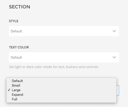
Section Width
The Width option of the Section panel has also been expanded. Now you can apply the Default, Small, Expand and Full, but also Large width, which is currently at 1600px.
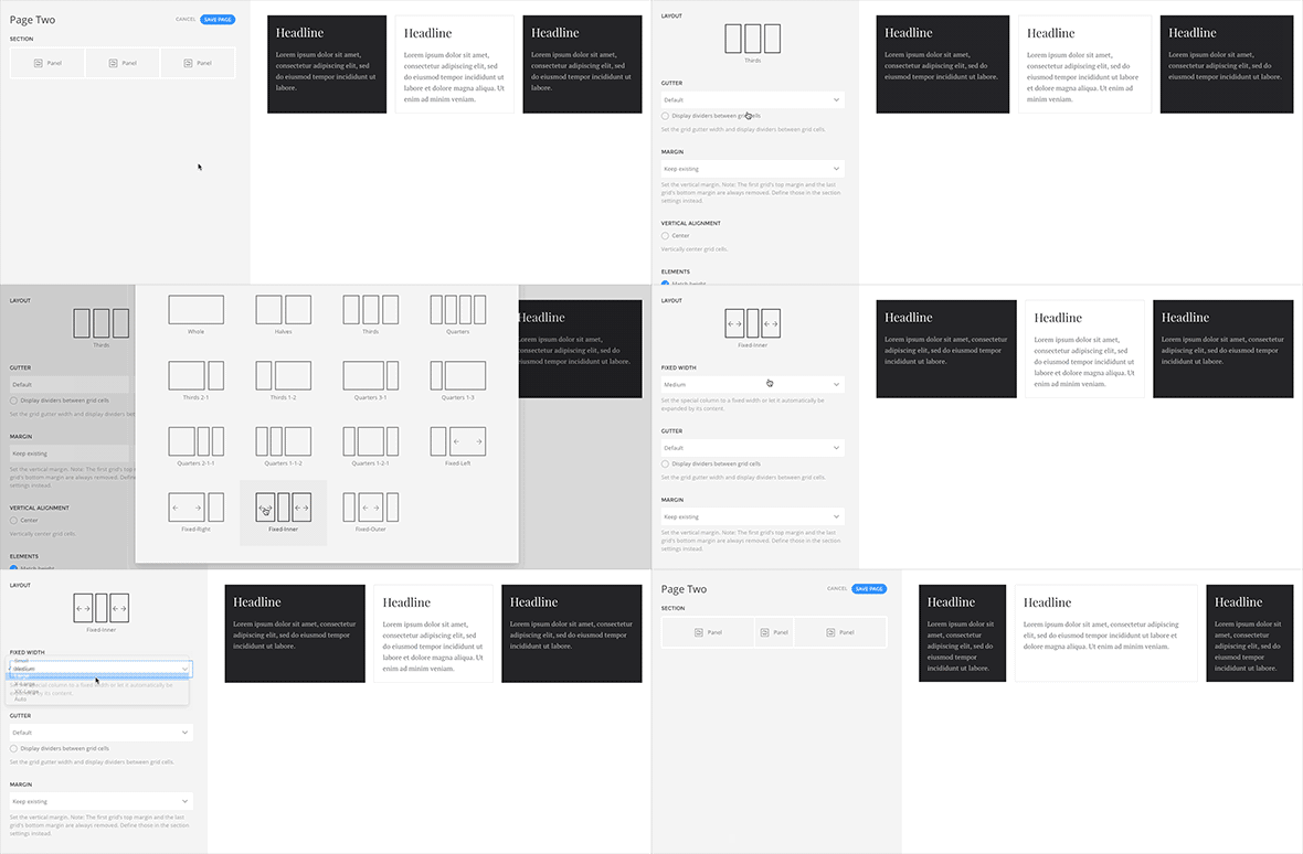
Grid Options
Builder settings for the grid inside a Row have been enhanced, too. Auto/Expand widths have been refactored to contain one grid item with a fixed width and the others expanding to fill the remaining space. This leaves you with the Fixed-Left, Fixed-Right, Fixed-Inner and Fixed-Outer layouts. The cell's width can be set directly in the Row panel.
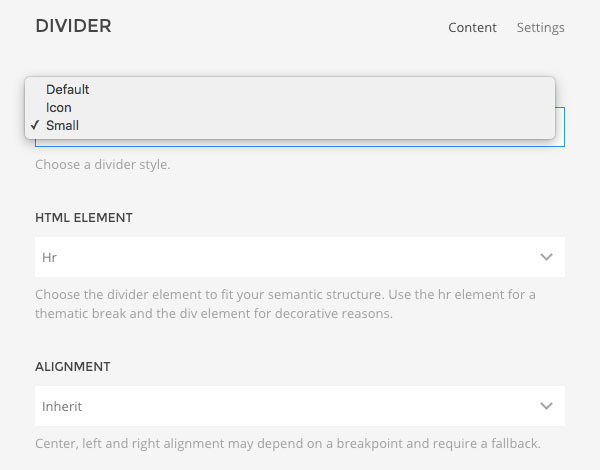
Divider Small
The Divider Element now comes with the additional Small style. It displays a shorter line that can be aligned to the left, right or center of the container.
New Icons
The icon element already comes with a comprehensive set of elegant line icons, which we will keep expanding in the future. With the Horizon website, four new icons find their way into the collection: plus-circle, minus-circle, play and play-circle.

Widgetkit 2
A much demanded feature was the compatibility of YOOtheme Pro and Widgetkit 2. Up until now this wasn't possible, because YOOtheme Pro and Widgetkit are utilizing different versions of our frontend framework UIkit. However, with this release, we have applied a noconflict mode that prevents issues previously arising from these different versions. So now you can use both in the same installation and add widgets, like a Slideshow, to your modules/widgets and articles. Note, that this is only a preliminary solution. In the future, all Widgetkit features will be fully integrated with the builder. Also be aware that, since different versions of UIkit are being loaded, your theme's style won't affect Widgetkit. It always applies the default UIkit 2 style to its widgets.
How to update
If you have installed Fuse before, you can simply update the theme from the Joomla backend, making use of the easy 1-click updates that YOOtheme Pro has introduced. Your website will look the same in the front end, but you have all improvements available in the website builder. Additionally, the update will add the new Material style to your theme. Go to the style customizer and select a style to display your website in a whole new look.
If you have not installed Fuse before, or want to start fresh, the recommended way to install is using a prepared demo package. It will include a number of demo pages for you to get started right away.
Wrapping Up
A lot of bugs were fixed and the creation of child themes has been optimized – for example, you can add your own custom.css file. In the future we will continue to improve YOOtheme Pro and the Default theme and add more and more features and styles to it. Thanks to the modular concept of YOOtheme Pro, all innovations will be applicable to past and future websites.
As usual, we are eager to hear your feedback. Be sure to let us know what you think and post any features you are missing in the support area.
