YOOtheme Pro 1.14 – Improved Blog Layout
Today's YOOtheme Pro 1.14 release focuses on the blog, which is an important part of your website. We have added a lot of settings like srcsets and lazy loading for blog images, improved multi-column blog layout with Masonry and Parallax effects and much more. Let's take a look in detail.
Multi-column Grid Layout
The main focus of this release was on the multi-column grid layout. We reworked the grid markup, which is now similar to our page builder Grid element. This enabled us to add some new features and solve existing issues.
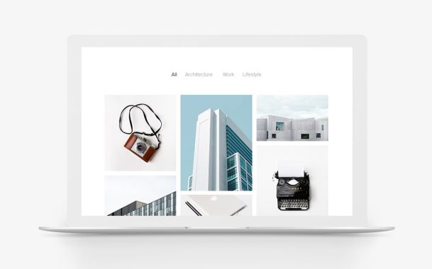
First, the multi-column blog is now a classic grid layout where posts wrap into the next line. This means posts are aligned side by side in each row. To achieve a gap-free layout, you can enable the Masonry effect. In addition, you can apply a parallax effect to the columns.
There is a breakpoint option so that the grid adapts perfectly to any device width. The article ordering is now kept intact on small devices too, which was an issue before. We also removed the "Down" ordering option in WordPress since this does not seem to be used in modern layouts.
Title Style
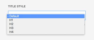
The title style can now be set separately for the blog overview and single posts. For example, if you have a four-column layout, you can set a small article title like an H3 and have a bigger title in single view.
Important In the past we have used a small article title for some of our theme releases because we wanted a small heading on the blog multi-column layout. This resulted in a small article title for single posts too. Now that this setting is available, we fixed the title size and made it larger again. Therefore, you may have to set the Title Style option for the blog overview if you are using the Vibe, Copper Hill, Jack Baker, Nioh or Yard demo package.
Margin Options
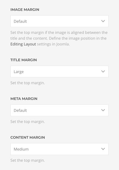
We added new margin options for the image, title, meta, content and Read More button. These can be set individually for the blog overview and the single posts.
Important We have added some fallbacks so the layout looks just like before, but in some cases this wasn't possible. For that reason you have to check the margins in your blog and posts layout after the update and adjust them if needed.
Blog and Post Widths
Along with separate margins and title sizes, you can now set different widths for the blog overview and single posts. In addition, the content can have a smaller width than the image for single posts. We even added another XSmall container option, which is perfect for this use case.
Content Length
There is a new content length setting which limits the number of characters for the teaser text of your article on the blog overview. This is useful if you want your article excerpts to have the same height.
Improved Images
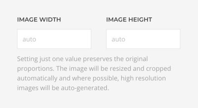
You can now separately set the width and the height of images on the blog overview and on single posts. This means they can have different proportions for the blog and post pages.
And of course, we unlocked the srcset and lazy loading features for all blog images. PageSpeed for the win!
Hide Comments Count and Read More Button
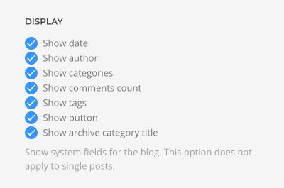
You can now hide the comment count and the Read More button on the blog overview in WordPress. Joomla already offers this feature by default.
More Blog Features
This is not all. Blog images which are smaller than the content will be automatically centered and not aligned to the left. Also, you can now center the heading, meta and Read More button on the blog page without changing the alignment on the post page. The Drop Cap can now only be shown on the post page since it is not usually used on the overview page. The blog layout settings now also apply to the featured blog in Joomla as well.
Text Filter in Joomla
Since Joomla 3.8.8 update, after a new Joomla installation, the text filters for Administrators and Super Users have changed to Default Blacklist. Unfortunately, this removes HTML comments within articles when saving. We use HTML comments to store the page builder settings. Make sure to set the text filter to No Filter after a fresh Joomla installation. We've also added a warning on the article edit page that appears if filtering is enabled.
Smart Search in Joomla
Previously, the search field shown in the YOOtheme Pro header layouts used the default Joomla search. There is now an option to choose the Smart Search, which you can find in Settings – System.
Updated Themes
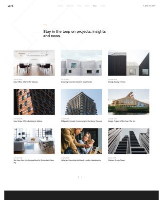
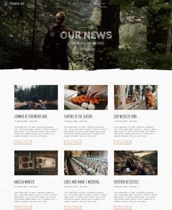
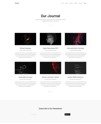
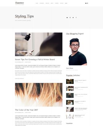
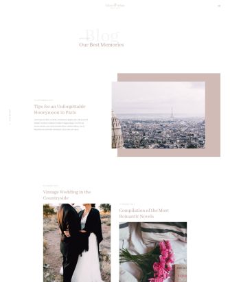
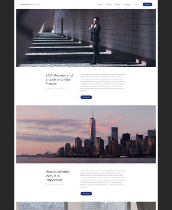
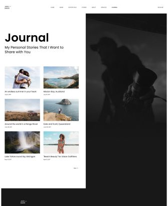
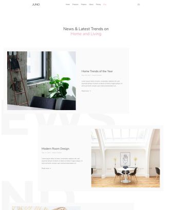
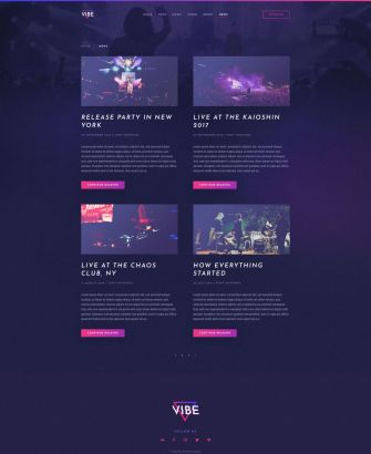
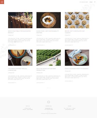
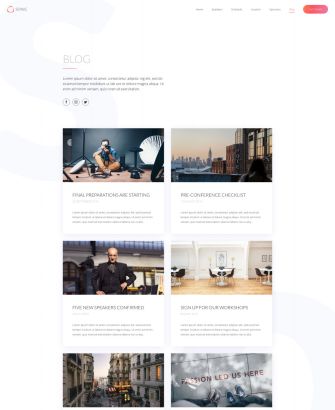
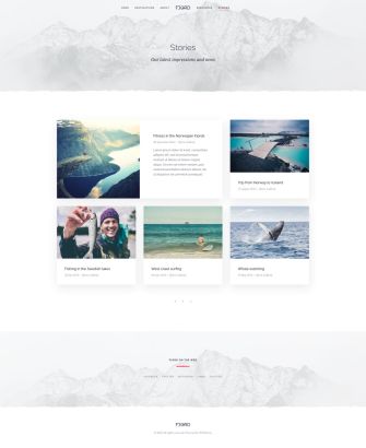
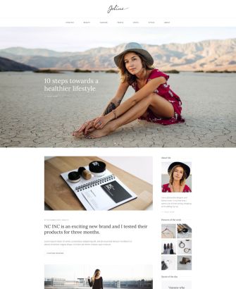
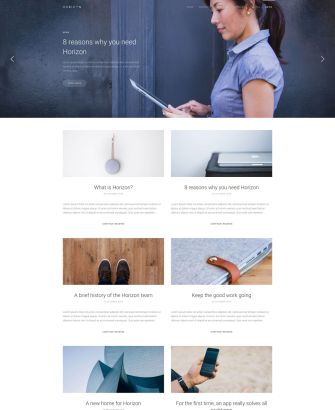
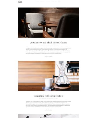
To showcase all the new features and possibilities, we put a lot of effort into reworking all the blog layouts from our YOOtheme Pro themes. See for yourself how your blog can look like.
What Next?
As you can see, with YOOtheme Pro 1.14 we focused on the blog settings and small improvements. But that's not all for this month. Our design team is working on the August theme release, which you can expect later this month.
Behind the scenes we are making good progress on refactoring the whole YOOtheme Pro JavaScript components to the latest Vue.js 2.5 version. We hope to have it ready for the next YOOtheme Pro release. It is the groundwork for many future improvements.
Now go ahead and try out all the blog features, and let us know what you think in the comments below.
