YOOtheme Pro 1.12 – Masonry, Filter and Lazy Loading Images
Today’s YOOtheme Pro release 1.12 will boost your website’s page speed. It adopts all the latest features introduced in UIkit RC 1, from the Masonry effect and filters for grids to lazy loading images and background image srcsets. Take a look for yourself.
Grid and Gallery Updates
YOOtheme Pro now has an option to enable the Masonry effect for the Grid and the Gallery element. The Masonry effect, as most of you know, allows you to have a gap-free multi-column layout even when grid cells have a different height. You can even combine it with the parallax effect to add a more dynamic feel to your website.
There is also a new option to filter items by tags. Choose a style, position and alignment for the filter navigation and customize it the way you want. The filter is of course responsive, so it looks great on every device.
Lazy Loading Images
Relaunching our website, we really focused on speed, and we wanted to bring this experience to you with YOOtheme Pro. So now, there is a new option in the Advanced settings panel to lazy load every image used in the YOOtheme Pro Page Builder. If lazy loading is enabled, the images are loaded as they enter the viewport. And don't worry about the content jumping as images load. Thanks to an empty placeholder image that is generated instantly, everything will be in place from the beginning.
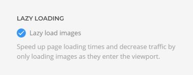
Lazy loading is enabled by default and works out of the box for all elements. This feature will substantially boost your Google PageSpeed score and decrease your server load.
Improved Image Srcsets
When you upload an image in YOOtheme Pro and set at least a width or a height value, multiple image sources with 80%, 100% and 200% of the target size are auto-generated. By using the srcset attribute the browser only loads the best fitting image depending on the device size and resolution. It is recommended to use images with the highest resolution possible so that the 200% version can be generated. However, if the size does not allow it, a version with the highest resolution possible will be created.
With YOOtheme Pro 1.12 we have improved the srcset feature even further. Instead of the 80% image, YOOtheme Pro now tries to generate srcset images for the most frequently used device resolutions: 768, 1024, 1366, 1600 and 1920 if the image size allows it. This increases the chances that the optimal image will be chosen for every device. These srcset images are now generated automatically, but it's still necessary to specify at least a width or height value for the 200% image on large high resolution displays.
Srcset for Background Images
Thanks to the latest UIkit release, srcsets are now working for background images which are often used in sections and columns! This is a huge improvement because images in full screen sections sometimes have very large file sizes, which can be terrible for mobile devices. Now that srcsets are generated, much smaller images will be loaded for mobiles. But mind that this feature depends on having the Lazy Loading images option enabled in the Advanced settings.
Next-Gen Image Formats
Another image improvement is the option to serve your images in WebP format. It has superior compression and quality characteristics compared to JPEG and PNG images. The file size savings compared to PNGs are really impressive. Your images will load much faster and consume less cellular data. At the moment only Chrome and Opera browsers support WebP images. For other browsers YOOtheme Pro still serves the original JPEG and PNG images.
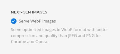
You have to enable this feature in the Advanced settings of YOOtheme Pro. It's disabled by default because you may use a 3rd party caching plugin or Nginx Reverse Proxy. Both would require further configuration to make this feature work nicely.
Video Element Updates
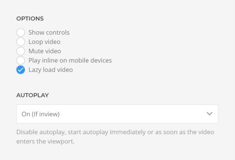
Other features in this release concern the Video element. First, you can now enable lazy loading for videos as well. Also, you have the option to play/pause the video as it enters or leaves the viewport. And now the poster image has the same size as the video element.
Smaller Font Sizes on Mobile Devices
To make sure you have the best experience on mobiles, we added smaller font-sizes for h1, h2, primary and hero headings as well as article titles on small devices. All current YOOtheme Pro styles are updated. Just open the Style Customizer, and the CSS will be re-compiled automatically in the background.
What Else
There is a nice addition for those of you who like Pinterest. The Gallery and Overlay elements now use image elements instead of CSS background images, meaning that the Pinterest Plugin can finally identify them as such. The image gallery shortcode from WordPress is now also rendered as a nice looking image gallery.
This is a huge release, but we are not done adding further speed improvements. We are already working on another major feature for you, so sit tight and let us know what you think in the comments below.
P.S. You are more than welcome to speculate on what’s to come next ;)
