YOOtheme Pro 3.0 – Mega Menu Builder, Sticky Parallax Effects and Images
Tada! YOOtheme Pro 3.0 has just been released. It took us over 9 months and 3 UIkit feature releases to get this baby ready, but it turned out to be by far the most feature-rich release we have ever had. First of all, YOOtheme Pro 3.0 comes with ... drum roll please... the Mega Menus. Now you can create sophisticated dropdown layouts with the YOOtheme Pro page builder. And then there is a new element called Sublayout which allows you to nest page builder rows into each other. Oh, and remember those stunning sticky parallax effects from UIkit? Well, now you can create them directly in YOOtheme Pro. And that is just the tip of the iceberg! So go grab a coffee or even better a coffee pot and let's get started.
Make sure to subscribe to our YouTube channel and join our Discord Chat Server for all news and discussions.
Mega Menu Builder
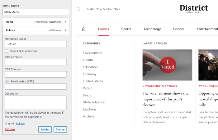
Today's the day! YOOtheme Pro 3.0 brings the long-awaited mega menus to YOOtheme Pro. Now you can use the power of the YOOtheme Pro page builder and design dropdowns for each menu item! There is a Builder button next to all first-level menu items that opens the page builder. It works just like the regular page builder, but instead of sections, the layout consists of just rows and columns. Here you can add builder elements, use the element and layout libraries and create sophisticated dropdown layouts. There is really nothing you can't do!
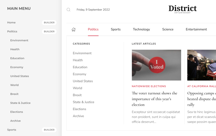
In WordPress, we integrated the new options directly into the WordPress menu customizer. Each menu item has a Builder button that opens the YOOtheme Pro page builder.
Menu Item Source and Nav Element
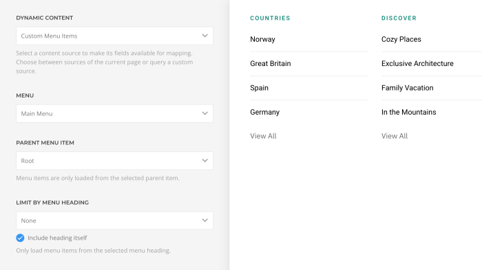
So how do we get menu items into your mega menu builder? We've added a new Custom Menu Items source that loads all menu items from the parent item. Just use the completely reworked Nav element. Now you can map the title, image, icon, subtitle and link of your menu item. You can even map its active state and the menu item type to create headings and dividers.
Dropdowns Anywhere
But not only navbars can have dropdown menus. Subnav and iconnavs now also render their child menu items in a dropdown. For example, you can publish a menu with dropdowns in the toolbar. This of course means you can design them with the YOOtheme Pro page builder as well.

Menu Item Settings
As you probably know, only first-level menu items in the navbar have some options in the header panel in YOOtheme Pro. Since you now can have dropdowns anywhere, every menu item should have these options. This is why we moved navbar item settings from the Layout → Header panel to the Menus panel. Choose a menu and click any menu item to open a panel with its further options. There is a button at the bottom that opens the modal with the Edit Menu Items view from Joomla. In WordPress, we added a Theme button, just like you know from the widgets, to make these new options available in the WordPress menu customizer. Now let's take a look at all the new possibilities.
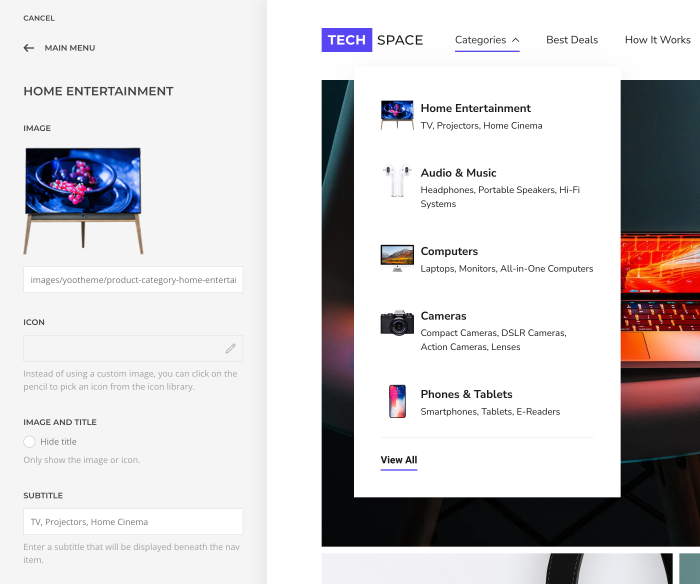
Every menu item can now have an image, icon and subtitle, no matter the menu type and item's level.
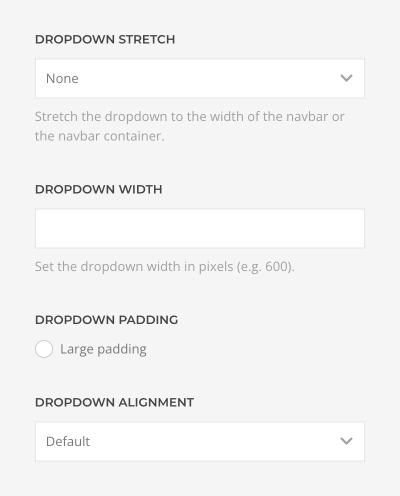
Additionally, we added plenty of options to customize dropdowns. You can set a custom width for the dropdown or stretch it to the navbar width or its container. For content-rich dropdowns, you can add a larger padding, and each menu item can now have a specific dropdown alignment.
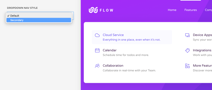
Finally, there is a new secondary style for the dropdown nav which is specifically designed for menus with subtitles.
Menu Position Settings
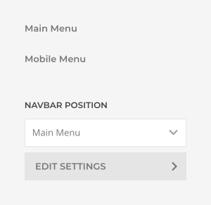
In addition to the menu item settings, we also added general settings for each menu position. Here you can change the menu type and its style, for example, display an iconnav in the toolbar. You can also set the size of the menu item images and icons and inject SVG images into the page markup. Finally, you can add an extra margin between the image and title and change the image alignment from center to top. This is especially useful if menu items have subtitles. Since these are the same options that can be set for the menu module, you only need modules in rare cases, for example, to assign menus to different pages or languages.
Now that we have the mega menu builder and optimized menu settings, let's take a look at header layouts.
Header Layouts
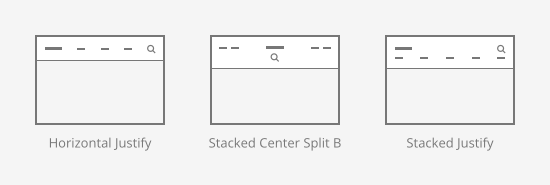
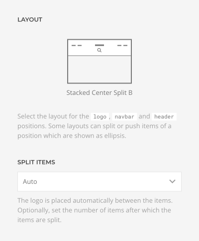
We added some new header layouts to YOOtheme Pro. There is an additional Stacked Center Split B layout where navbar items are split and positioned on the left and right ends of the navbar. And there are two layouts, Horizontal Justify and Stacked Justify, where all navbar items are equally distributed within the navbar.
Some header layouts split navbar items or modules automatically to show the logo in the middle. To have more control over this behavior, we added a new Split Items option where you can set the precise number after which the items are split.
There was another layout where the menu was on the left, and all following modules were pushed to the right. Again, you had no control on which side a module appeared. Now there is a Push Items option which works just like the split option. This allowed us to merge the Stacked Left A and Stacked Left B layouts into one layout.
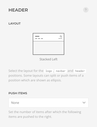
Finally, there is an option to show parent icons if menu items in the navbar have dropdowns.

Dialog Layouts
Did you notice all the offcanvas and modal header layouts are missing? These layouts were rarely used as header layouts because they only display a logo and a dialog toggle in the header and everything else in an offcanvas sidebar or a modal window. While this is perfect for small devices, it is almost never used for large screens. Here, modern websites, especially the ones with content-rich navigation, usually have both, a navbar menu and a dialog toggle to show the whole site navigation in a dialog. That's why we added a new dialog module position and separated the dialog layouts from header layouts. Now if you publish a menu or a module in this position, a dialog toggle will automatically appear in the navbar. That's really great as you can keep your favorite header layout and have an offcanvas or modal dialog with further content.
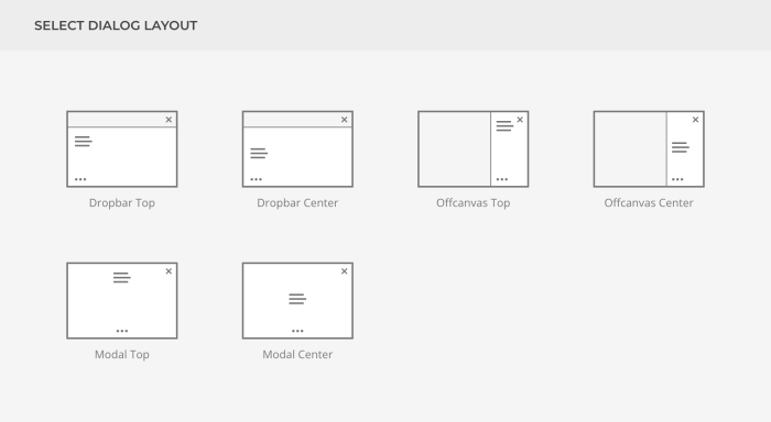
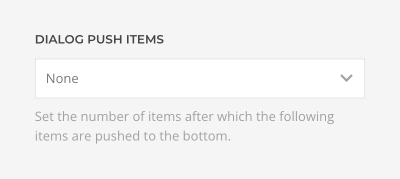
Additionally, all dialog layouts have the Push Items option which allows you to set a number of items after which the items are pushed to the bottom. This not only gives you more control over your dialog layout, but it also allowed us to cut the number of layouts in half.
Optionally, you can add a new logo in the Site panel that will be displayed in the dialog.
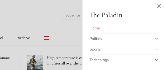
Dropbar Dialog Layouts
But that is not all. There are two new dialog layouts, Dropbar Top and Dropbar Center. Similar to a dropdown, a dropbar opens below the navbar but stretches to the full width and height of the viewport. You can either fade the dropbar or slide it from the top, left or right directions. This way you can make the dropbar look like a modal window or an offcanvas sidebar. But the main difference is that the navbar is visible all the time and can be used for further navigation.
And of course, we added a smooth animation for the dialog toggle which changes from a menu icon to a close icon.
We are really thrilled about the dropbar because it is becoming the new standard for mobile navigation these days.
Search, Socials and Dialog Toggle
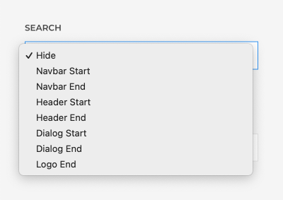
In YOOtheme Pro you can publish a search and social icons in the header and navbar without having to create a module or a widget. Now you can also publish them in the dialog and logo position and even specify whether to show them at the start or end of the position. The new dialog toggle is positioned in the same way.
Mobile Header
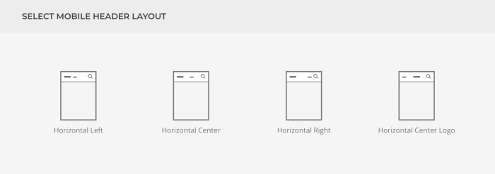
We have neglected the mobile header far too long. Finally, it got completely refactored. Now it works just like the default header and has all its features. For example, you can choose between different mobile header layouts and add any content to the mobile navbar. To do that, we added new module positions, navbar-mobile and header-mobile, and renamed the mobile position to dialog-mobile. So this means you can also choose between different dialog layouts, including the new dropbar layouts.
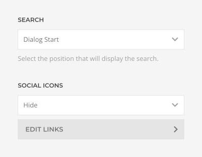
Additionally, you can publish the search with just a click and add social icons for the mobile header.
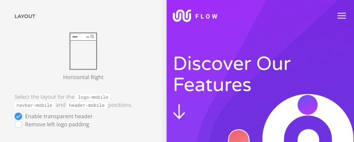
Just like the default header, the mobile header inherits the transparency from the section. If needed, you can disable this behavior.
Finally, it is even possible to disable the mobile header altogether. This may be useful if the default header already looks great on small devices.
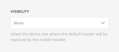
By the way, you can add a new mobile inverse logo in the Site panel. Now you have all the possibilities to create a modern mobile navigation.
Updated YOOtheme Pro Theme Packages
Wow, what an update for the menus, right? With all these new options you can now create modern navigation for any site. To show you some examples, we have completely reworked header and mobile header layouts for all our YOOtheme Pro theme packages! This means, we not only make use of the new options, but we also created dropdown layouts using the new mega menu builder. This was quite an effort for our designers, but it is definitely worth it. Take a look yourself.
45+ Dropdown Layouts
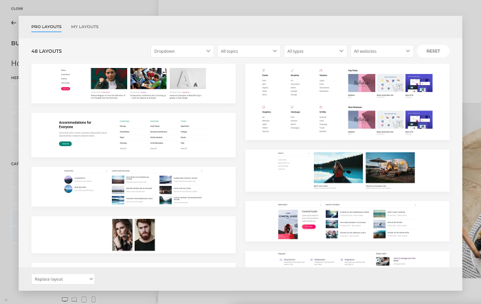
In addition to the theme packages, all dropdown layouts created with the YOOtheme Pro mega menu builder are now available in the layout library under Dropdown. As usual, load a layout for your menu item dropdown with just a click. Mind that dropdown layouts only consist of rows and columns. If, for some reason, you load it into a page layout, YOOtheme Pro will automatically wrap it into a section. On the contrary, if you load a section or page layout into the mega menu builder, the sections will be stripped, and only rows will be loaded.
That's all for the menus, now let's head over to other improvements.
Builder Anywhere
Remember the builder module that opens the page builder in the top and bottom module position? Well now it can be used anywhere on your site. This means you can design sidebars, toolbars, and even dialog layouts with the YOOtheme Pro page builder! Just like with the mega menu builder, the builder module published in these positions uses builder rows and columns instead of section. The rest is just like you're used to. No restrictions at all!

Sublayout Element
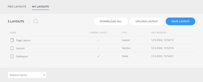
Now that we can use the page builder anywhere, why stop there? YOOtheme Pro 3.0 comes with the new Sublayout element which allows you to create sublayouts within the page builder. Sublayouts are regular page builder layouts but without sections. They consist of rows, columns and elements, so basically the same layouts as created with the mega menu builder. This means you can nest page builder rows into each other and create really advanced layouts.
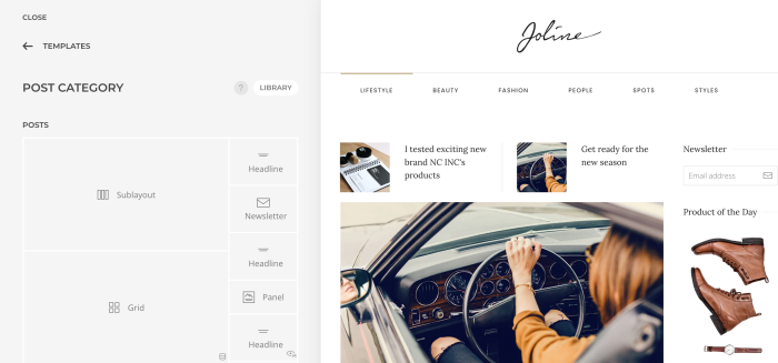
Of course, like dropdown layouts, you can save your sublayouts into the layout library and reuse them later. Again, if you load other layout types than Rows, all the sections will be stripped, and just rows will be loaded.
Sticky Parallax
The next major feature of YOOtheme Pro 3.0 is the sticky parallax effects. Thanks to the latest UIkit releases, you can now achieve stunning parallax effects directly in YOOtheme Pro. But before looking at these effects, let me first explain the main concept behind them. First of all, we need a section or a row which is multiple viewports high. This will define the duration of the parallax animation. Within this section or row, we need a sticky column which has a height of one viewport. And finally in this column you can add elements that have the parallax effect. Since the column is sticky, the elements will not scroll out of the viewport, but will be animated while scrolling.
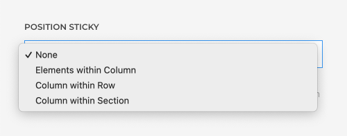
So far so good, now let's take a look at how this can be achieved in YOOtheme Pro. We have refactored builder columns and added two additional position sticky modes. Here you can choose whether to stick the column within its section or row.
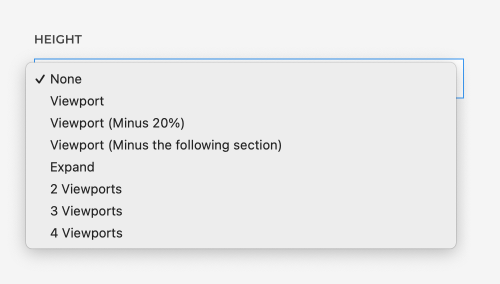
Additionally, we added more viewport height options for the builder sections.
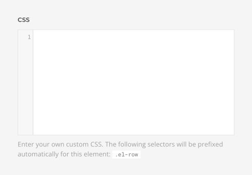
If you want to set a custom height for the row, use a new custom CSS field in the advanced tab.
Finally, to make the parallax animation start and stop depending on the height of the section or row, just choose it as a target in the parallax settings of the element.
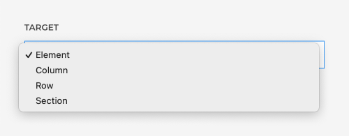
Now that we can make the parallax effects sticky, let's see how to control their animation more precisely.
Parallax Effects
We completely refactored the parallax settings. When animating a property, you can now add multiple stops to define start, intermediate and end values along the animation sequence. The animation will be equally distributed between the stops. You can even specify percentage to position the stops along the animation sequence. Additionally, you can now use %, vw and vh units for the Translate and Scale properties and define the origin of their transformation.
By default, the animation starts when the targeted element enters the viewport and ends when it leaves the viewport. For even more control, you can now set a Start and End offset. For all the details, check out the UIkit 3.12 blog post.
Now that we have all the tools in our hands, let's take a look at some examples of what you can create with YOOtheme Pro thanks to UIkit.
Sticky Section
We even added two fancy sticky effects for the builder sections. Here, you can either cover the section by the following section on scrolling or reveal a section by the previous section. Both are just a click away. Pretty impressive, right?
Builder Columns
Additionally, sticky columns now have a pinned status icon and are marked blue.
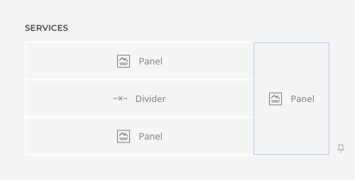
For a better orientation, columns are now numbered, so it is easier to see which column is being edited. By the way, the same is also available for multiple items elements like Grid and Gallery.
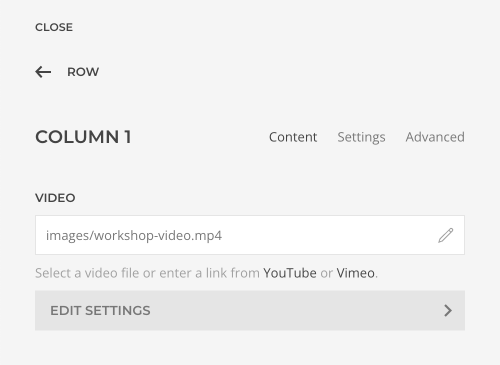
Finally, builder columns now have background videos just like builder sections. This includes the same features e.g. background images with blend modes and color overlay.
That's all for the sticky parallax effects. But they're one more major feature.
Lazy Loading Images
YOOtheme Pro 3.0 comes with a big update for the images. It implements all the new UIkit image features. Now YOOtheme Pro uses the native loading="lazy" attribute to load images as they enter the viewport. Additionally, YOOtheme Pro automatically adds width and height attributes for the images to prevent layout shifts. Lazy loading is enabled by default. To disable it for images which appear in the first viewport, we added an option to eagerly load images across all YOOtheme Pro elements.

Builder elements like slideshow and slider automatically eagerly load images from adjacent slides, so they are immediately displayed. And if you wonder what about background images, don't worry. Thanks to UIkit even background images are loaded lazy.
Next-generation Images
YOOtheme Pro now uses the <picture> element to serve alternative image formats like WebP. This also solves the longstanding issue with page caching which now perfectly works with alternative image formats. Since UIkit can emulate the picture and srcset features for background images, YOOtheme Pro even serves WebP images in different sizes for your background hero images. Just think about the impact this will have on your page loading times! That's incredible and is a unique feature of YOOtheme Pro.

But we have one more thing. Since we always want to bring you the newest web technologies within YOOtheme Pro, we added support for the new AVIF image format which has even better compression than WebP. YOOtheme Pro will serve images out of the box. But mind that this is a cutting edge feature, you need the GD extension in PHP 8.1 compiled with AVIF support.

That's the image update, now let's go through all the other features.
Sneaked into 2.7
Our next improvements sneaked into YOOtheme Pro 2.7 as we needed them for our theme packages. They were not covered in our release blog post, but they are definitely worth mentioning, so we want to give you a quick walk-through.
To create a pagination with images of the previous and next posts, we've added a new previous/next source to the dynamic content feature of YOOtheme Pro. It allows you to load the previous and next article, page, or custom post type directly into your layout.
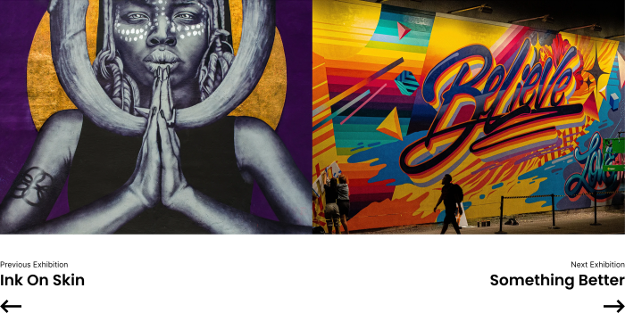
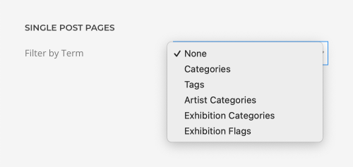
In WordPress, you can additionally select a taxonomy to only load posts from the same term, while in Joomla only articles from the same category are loaded by default.
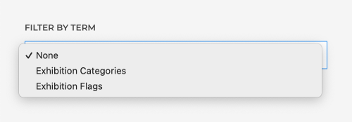
Just like with the previous and next sources, the actual Pagination element loads posts from the same taxonomy in WordPress and articles from the same category in Joomla. To have the same results, we added an option to the pagination element in WordPress to only navigate between posts from the same term.
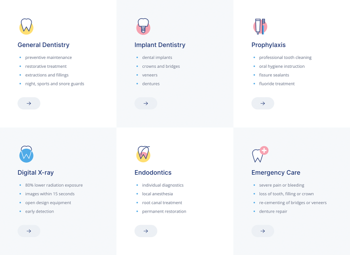
We added a new Tile Checked panel style option for the Grid element. It alternates between default and muted tile styles creating a chess pattern. What's cool about it is that it is fully responsive, so the pattern does not break when columns wrap into the next line. This is definitely an eye-catcher on any site.
There is a new option for the List element. Now in addition to the default vertical list, you can also have a horizontal list. Additionally, set a separator between list items, for example a comma or a dash between start and end dates.

Further Element Updates
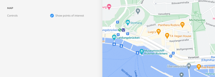
But that is not all for the builder elements. The Map element now can show points of interests on Google Maps, and the Google Maps MarkerClusterer library got updated. If you use OpenStreetMap and Leaflet, you will get a fresh look thanks to the updated Leaflet library.
The dropdowns of the Popover element now perfectly work on small devices, so the switcher fallback is removed.
Overlay and Gallery elements now have a border option for their images.

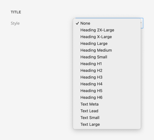
Finally, all elements have additional text small and large options to style the title, meta and content.
Style Improvements
YOOtheme Pro 3.0 incorporates all the style improvements from UIkit into the style customizer. Now you can style subtitles differently for the Nav, Dropdown and Navbar components.

In the Navbar component you can also set gaps between items for the default and primary navbar as well as different paddings for different breakpoints.

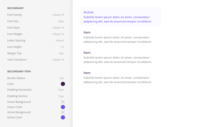
There is a new secondary nav style which is used for menus with subtitles.
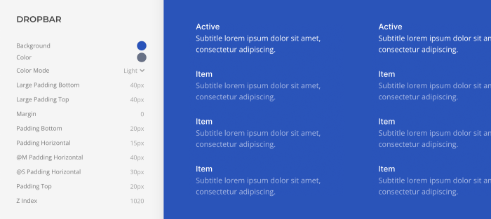
And of course, you can style the new Dropbar component.
But there are many other new options to set the background, border, box shadow and so much more across all components. Of course, our designers made sure that all these new style improvements look great in our 40 YOOtheme Pro styles. But that is not all, they tested all the possible combinations, navbars with dropdowns or dropbars, stretched to the navbar or the container, with and without the mega menu builder, in all the different header layouts and so on. This was quite an effort, but now everything looks just like it should.
120+ Videos + Documentation
We updated the YOOtheme Pro documentation with all the new features and everything that has changed. And, trust me, that was a lot! We also recorded new documentation videos and updated existing ones, which makes it a total of over 120 recorded videos! Get an overview of all the new videos on our videos page. Of course, they are all available in the contextual help system of YOOtheme Pro.
Further Improvements
YOOtheme Pro 3.0 comes with some further smaller improvements and fixes. For example, we added smooth scrolling to all links with URL fragments in any YOOtheme Pro menu, no 3rd party JavaScript needed.
Additionally, nav parent icons are now injected into the page markup and inherit the hover and active colors of their nav item.

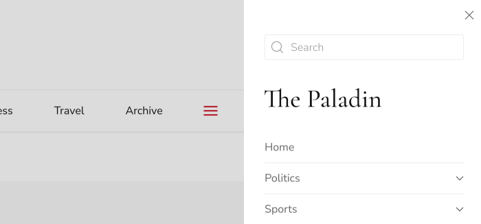
The search input now takes the full width when used in dialog layouts.
We also refactored the style customizer to show variables in case of errors and fixed an issue with multiple 3rd-party Less files. Additionally, we now allow mapping Url, Alt and Caption fields for the Toolset image field. Last but not least, we raised the required PHP version from 5.6 to 7.2. For the full list of features and fixes, check out the changelog.
Next Steps
YOOtheme Pro 3.0 is the biggest feature release we have ever had. It brings you the number-one feature from the YOOtheme Pro wishlist, the mega menu builder. With all the new header layouts you can build modern content-rich navigation. The sticky parallax effects will spice up your page layouts, and the image update brings the latest technologies to your site.
And now that this huge release got through the finish line, we can focus on our upcoming theme package releases. We have already prepared three theme packages, which will show you the full potential of YOOtheme Pro 3.0. The first theme package will be released shortly, and the others will follow one after another.
To get a quick impression of all the new YOOtheme Pro capabilities, check out our updated demo websites and see their mega menus in action. Now go ahead and take YOOtheme Pro 3.0 for a test drive. As always, we are looking forward to your feedback, so let us know what you think in the comments below.
