YOOtheme Pro 2.7 – Pro Element Presets
Today we are excited to introduce YOOtheme Pro 2.7! This time it is all about the elements! We are proud to introduce a brand new element preset library with over 280 Pro presets which we think will completely change the way you create layouts! All 36 elements got their own online showcase and a dedicated documentation. But that's not all. There are so many new features for the elements, and the focus style for keyboard navigation is heavily improved. So get comfortable and let's get started!
Make sure to subscribe to our YouTube channel and join our Discord Chat Server for all news and discussions.
Pro Presets for the Element Library
YOOtheme Pro 2.7 adds a new Pro Presets tab to the element library, just like the one you know from the layout library. It was a small task to add the tab to the library, but it was a huge workload to fill it with content. Our designers went through all our existing layouts and picked the most useful examples for the new library. Every image, every element feature was carefully considered to give you the best collection of ready-to-use element presets. We added 280+ (!!) elements to the new preset library that you can load into your layouts with just a click.
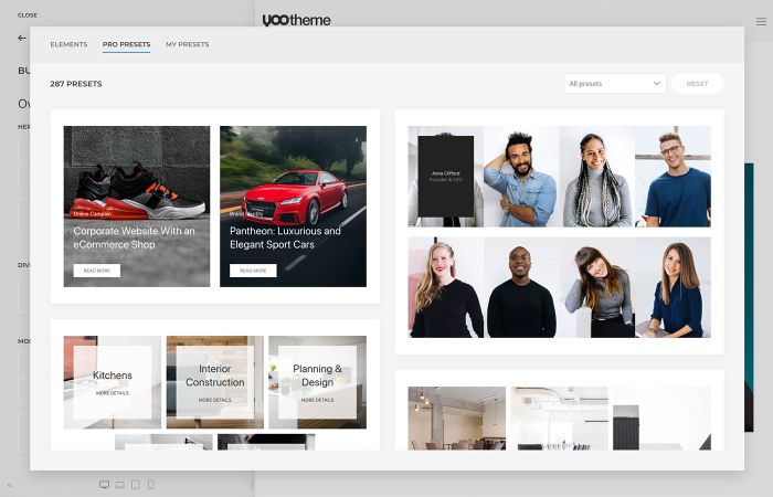
We have been working on this huge task for the last 4 months, which is why all the theme package releases are scheduled for late autumn. But we think it is worth it because it gives you a new visual way to add elements to your builder layout and will be a huge boost for your workflow. Instead of starting with a blank element, you can pick an element variation visually without having to set any of its options. Now even someone who uses the page builder for the first time can see how different an element can look like and won't have to guess what hides behind all its settings. We think this will forever change the way you create layouts. And as with all our libraries, we will continue to update it with fresh element presets, so the first 280+ presets are just the beginning.
Elements Showcase
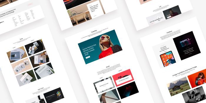
All elements now have a showcase where you can see all the variations from the preset library. Similar to the Widgetkit demo, you can see how the elements look in all YOOtheme Pro styles. This also helps us improve our styles and make sure they look great with all the element presets.
Elements Documentation and Videos
As we were working on the elements showcase, we took the opportunity and wrote a comprehensive documentation for the basic, multiple items and system elements. Here you will find all you need to know about the elements and their settings. We also recorded 73 new documentation videos for both WordPress and Joomla showing you the element settings in action. This was quite a lot of work (phew).
Position Sticky for Columns
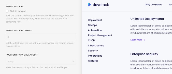
YOOtheme Pro 2.7 also comes with a position sticky option for columns. This means you can stick the column to the top of the viewport while scrolling down. The column will stop being sticky when it reaches the bottom of its containing row. You can see an example of this feature in DevStack on the Feature Index page.
Overlay, Gallery and Overlay Slider
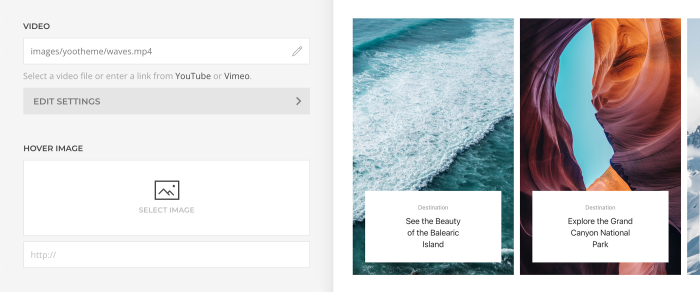
As you know, the Overlay, Gallery and Overlay Slider elements all show overlays, but they had a different feature set. For example, you could set a hover image in the Overlay and Gallery elements and a video in the Overlay Slider. The Overlay Slider even has options to color its image or video. We refactored the elements, so they now have the same content fields. This means the Overlay and Gallery elements now have a video field including the color options, and the Overlay Slider element has a hover image. While on it, we fixed some issues when combining box decorations and image transitions, and it is now possible to set a general min height for the Overlay Slider.
Panel, Grid and Panel Slider
Just like with the overlays, the Panel, Grid and Panel Slider elements all show panels. These panels only had three different card styles. This was very limiting not only because of the typical box shadows which require a gap but also because you often simply need a white or a muted background. The perfect solution for this are tiles. So now you can choose between four additional tile styles. Besides white and muted backgrounds, there are also primary and secondary backgrounds, and not to forget, tiles can be aligned side by side without any gaps.

Popover
There is a new marker color option for the Popover element, so depending on your image, you can either have a dark or a light marker.

Title, Meta and Content Style
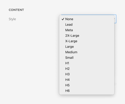
Title, meta and content fields had different style options. This was quite limiting, for example, if you wanted the title to look like a meta field or the content to look like a heading. Now all three fields have the same style settings across all elements. This gives you more flexibility to display your content.
That's all for the page builder elements, now let's head over to the style improvements.
Focus Style
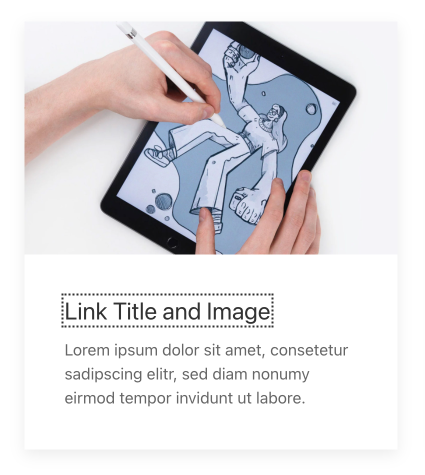
YOOtheme Pro 2.7 makes use of the updated focus style from UIkit 3.8. Up until now the same style was used when an HTML element was focused as when it was hovered. But often the hover effect is too subtle which makes it very hard to see which element is focused. Now there is a general focus style which applies a clearly visible dashed outlined border when using the keyboard navigation.
Thumbnav Style
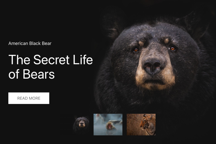
We updated the thumbnav in all YOOtheme Pro styles. Now the thumbnav has an inverse style, so it fades into dark on dark images and into white on light images. Additionally, instead of fading the whole image with a plain color, most styles now use a gradient from transparent to light or dark.
Style Improvements
As you may know, only some styles had a mask box decoration for images. Now if you choose the option in any element, it will show a nice default mask box decoration no matter what style you are using. The same applies for the text background option, which now shows a nice color gradient in all styles.


Blog and Post Image Alignment (Joomla)
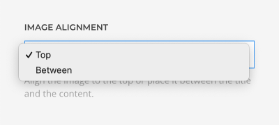
We added a new image alignment option to the default Joomla blog and post layout settings. Before, the image position could only be defined in the Joomla Article Manager Options. Now that in Joomla 4 this option no longer exists, YOOtheme Pro will ignore it in Joomla 3 as well. Instead, you can set the image alignment directly in YOOtheme Pro in the Layout → Blog or Layout → Post panels. This is only relevant for you if you aren't using the template builder for your blog layouts, so you may have to check these blog settings after the update.
Custom Less Files
This next improvement is for our extension developers. Now you can add a custom Less file to YOOtheme Pro using a Joomla or a WordPress plugin. This is great because you can add your own UI components to the YOOtheme Pro style customizer. It will have its own panel where you can change your Less variables. We have written a comprehensive documentation and updated the example module to get you started right away.
Further Improvements
YOOtheme Pro 2.7 comes with some further smaller improvements and fixes. For example, we brought the navigation options of the Switcher element into line with the other slideshow and slider elements. You can now set an item of the Nav and Subnav elements as active and choose a large margin for the navigation of the Slideshow, Panel Slider and Overlay Slider elements, and more. For the full list of features and fixes, check out the changelog.
Next Steps
With YOOtheme Pro 2.7 we have reached another milestone. The new Pro preset library and its 280+ ready-to-use elements will completely change the way you create layouts. And now that this huge release got through the finish line, we can finish our upcoming theme package releases. There are four of them champing at the bit. There is one last YOOtheme Pro release planned in which we will look into improving the menus before we shift our focus to UIkit 4.
Now go ahead and take YOOtheme Pro 2.7 for a test drive. As always, we are looking forward to your feedback, so let us know what you think in the comments below.
