UIkit 3.22 – Refined Lightbox for Product Galleries
Today, we are happy to introduce UIkit 3.22. It comes with a completely reworked Lightbox component, some nice refinements for the search, and other smaller improvements across various UI components. This and more coming up.
Make sure to subscribe to our YouTube channel and join our Discord Chat Server for all news and discussions.
Lightbox Component
With the UIkit Lightbox component, you can already create a great-looking lightbox gallery for your photo collections. Now we have completely refined it with new features, so it can be used as the perfect product lightbox for your next e-commerce shop.
Let's start with the zoom. By default, lightbox images and videos are responsive and always fit the viewport. Now, if the image or video is higher than the viewport, a zoom-in icon appears. Clicking it only constrains the image by its width, allowing the vertical scrolling. Click it again to zoom out.
Next, we added a new mode for how videos behave in the lightbox. By default, the videos show controls, and you need to click the play button to start them. For example, this is great if you want to show a movie trailer. However, with the new video-autoplay: inline option, videos will behave like animated images. This means they autoplay, loop, are muted, and don't have any controls, which is perfect for product galleries.
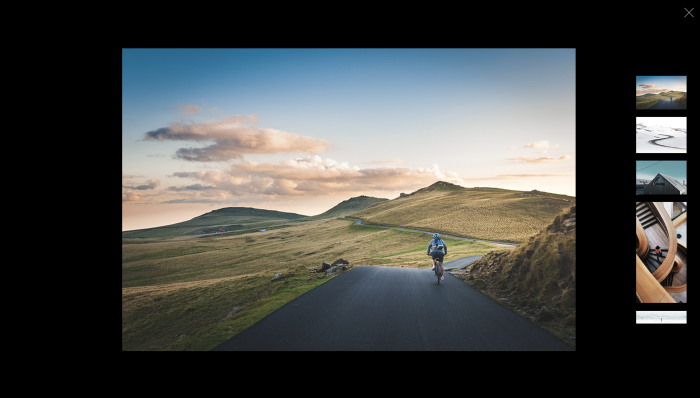
In addition to the default slidenav, you can now show vertical dot or thumbnail navigation to slide between items in the lightbox gallery. Just set nav: dotnav or nav: thumbnav, and with slidenav: false, you can even disable the slidenav altogether.
What's more, with counter: true, you can show a counter with the current and total number of items, so you always know where you are.
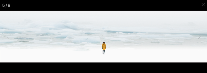
By the way, the lightbox navigations, the close button, and counter change their color automatically depending on the color of the lightbox items. Just set the corresponding .uk-inverse-light or .uk-inverse-dark classes on the lightbox items by using the data-attrs option.
<div uk-lightbox>
    <a href="image.jpg" data-attrs="class: uk-inverse-light"></a>
</div>
To change the lightbox layout, for example, to implement a different navigation type, you can completely override the Lightbox markup using a template element in the DOM, which you can reference with the template option.
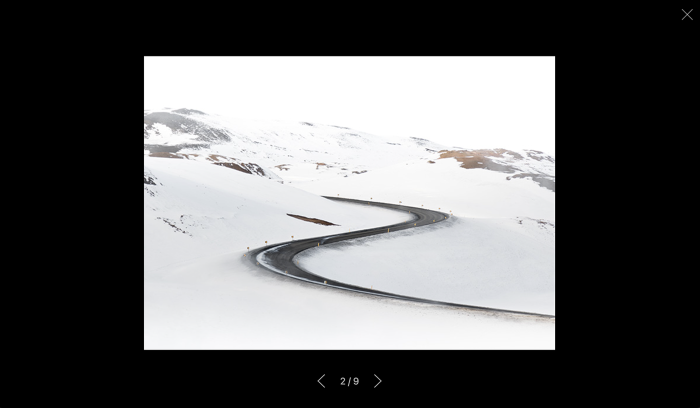
Finally, you can prevent the lightbox controls from disappearing by setting delay-controls: 0 and prevent the lightbox from closing when clicking the background by setting bg-close: false.
With all these features, you can now create the perfect product lightbox for your next e-commerce shop.
Search Component
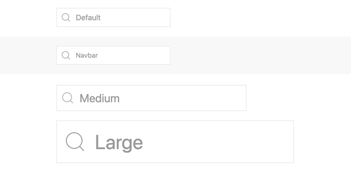
We also reworked the style modifiers in the Search component. Now, there is a dedicated search navbar modifier to style the search in a navbar, and there are two more modifiers – search medium and large – which look just like the default search but in different sizes. The search icon and its padding also adapt perfectly to the various sizes.
Icons
UIkit icon library got a small update as well. We added two new icons, Close Circle and Arrow Down Arrow Up as well as the Bluesky icon which sneaked into a previous UIkit release. We also updated all icons containing arrows to fit the overall UIkit outline style.


Further Improvements
Of course, UIkit 3.22 comes with a lot of other smaller improvements and fixes.
We added an inverse style for the form range to the Form component.

The gutter from the Grid component can now be used to override the gutters of Iconnav and Thumbnav components.
The Video component can now also play the video while it is being hovered, thanks to the new hover mode for the autoplay.
There are new uk-position-center-vertical and uk-position-center-horizontal classes in the Position component.
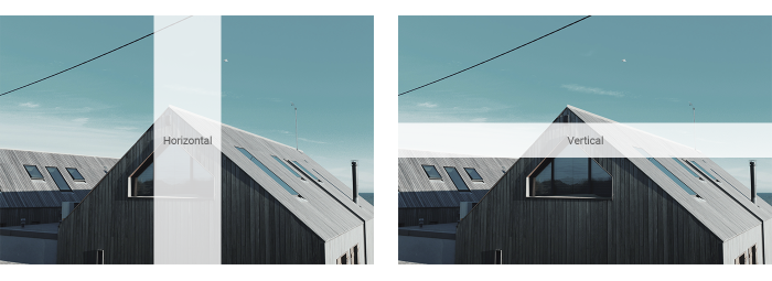
And we added new breakpoint classes for the flex directions like .uk-flex-row@s and .uk-flex-column@s, the flex dimensions like .uk-flex-initial@s, .uk-flex-none@s and .uk-flex-1@sand cross axis alignment, like .uk-flex-stretch@s, .uk-flex-top@s, .uk-flex-middle@s and .uk-flex-bottom@s.
There is a new .uk-hidden-empty class to hide HTML elements which don't contain any content in the Visibility component.
There is a new active option in the Slider component allowing you to make all visible items active, or just the first one. This is particularly useful if slider items are centered, as it ensures that the item in the middle will get the active state.
We added new xsmall margin classes to the Margin component.
The Scrollspy Nav component has a new target option, allowing you to define where the scrollspy should be applied to.
The Countdown component has a new reload option. When set to true, the page is automatically reloaded when the countdown expires.
The Sticky component has a new offset-end option. It applies an offset when oversized content sticks to the bottom of the viewport.
Finally, we heavily improved the performance of the query selector.
For the full list of features and fixes, check out the changelog.
Migration to UIkit 3.22
There are breaking changes for the heavily refactored Lightbox and Search components, so please take a look at the migration guide.
What's Next
UIkit 3.22 brings you the perfect product lightbox for your next e-commerce shop and includes many other great improvements. Now it is your turn to share your feedback, so let us know what you think about this release in the comments below.
