YOOtheme Pro 1.3 – Introducing the Layout Library
Today we are really excited to release YOOtheme Pro 1.3 which adds a missing feature we've been planning since its first release: the layout library! This is a game-changing feature when it comes to creating content pages you need for every website. YOOtheme Pro 1.3 also includes great new features, like a new style, the German front and back end translation, a supercharged grid and panel element as well as lots of new customizer options.
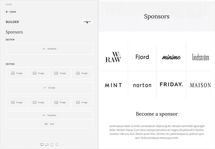
Layout library
Building websites with YOOtheme Pro is as easy as it gets. You can create and arrange elements via drag and drop in the page builder or install a demo package that contains the same setup that you can see in our theme gallery. This new release gives you even more range by including a layout library! You can now load an entire page from any of our websites, regardless if you are using a demo package or not. The library has access to layouts from all websites which have been released so far and new pages will be added with every website release. You can search and filter through various styles and topics to give you the best fit for your page. We optimized and improved all existing layouts from our Fuse, Horizon, Max and Joline releases before making them available in the library.
New style and options
A few weeks ago we released the UIkit 3 Beta and launched its new website with a comprehensive documentation. UIkit itself comes with a default style, which is now also available in the style customizer. It's a clean and lightweight style with a fresh blue as primary color.
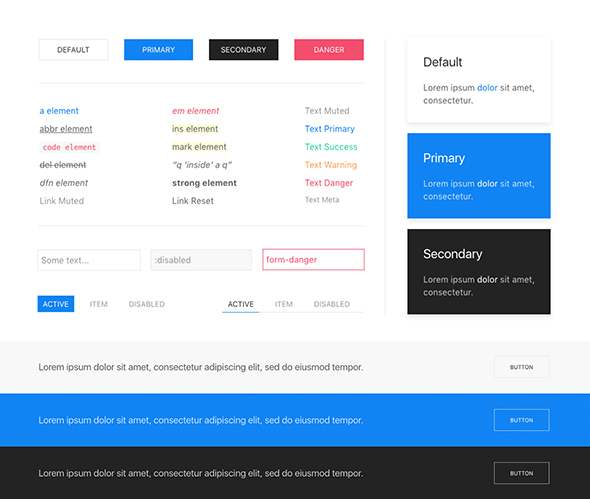
Also note that previous styles have been renamed to match the websites that they were released with. Other additions include a text style mode for buttons as well as typographic options for the blockquote footer and meta text.
German Translations
The YOOtheme Pro front end as well the entire website builder, including all descriptions, have been translated into German. We are planning on opening a space where all other translations can be added in and will inform you on that subject as soon as we have found a platform.
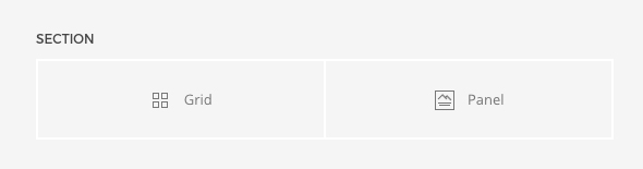
Panel, Grid and Section
The Panel and Grid elements inside the website builder have been reworked completely. We added a new settings tab to the Panel containing a bunch of new options – for example, you can add a meta text and define its alignment, style as well as spacing. Images can be displayed without padding inside the panel and aligned to the top, left, right or between title and content. In addition, the Grid now allows you to apply the same options as the panel's to its items.
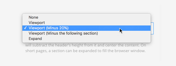
The Section options have also been enhanced. Apart from the usual viewport height and expand mode, you can now also have the section stretch to fill the viewport, but subtract 20% or the height of the following section.
More additions
A new option has been added to apply a default or divider style to modules or widgets which include lists. This comes in handy when displaying latest articles or comments inside a module or widget. Furthermore, we added a box-shadow option for image elements and a new, smaller padding for sections.
Last but not least
Thank you for all your feedback on UIkit 3 and its documentation in particular. We are still tinkering to get it as extensive as it can be. As always, we are happy to hear your ideas on this release. So, tell us what you think in the comments below.
Update: We just released our new February website: Fjord! Take a look.


