YOOtheme Pro 1.4 – New overlay, gallery and switcher elements
Two weeks after publishing our latest website Sonic we are very happy to announce the release of YOOtheme Pro 1.4. This version is a huge step forward. It comes with new elements that bring a lot of much demanded features from Widgetkit 2 into Pro: the Overlay, Gallery and Switcher elements. The Accordion element has been reworked and a bunch of handy new column options were added to Rows inside the builder. New site and admin localizations were added, making YOOtheme Pro available in more and more languages. Of course, many bugs were eliminated and minor improvements were made.
Overlay element
The Overlay element allows you to position content on images and apply a huge range of styles to it. You can select a background color or a second image that appears on hover. Animate title, meta, content and the image itself separately. You can apply different positions to the overlay or set it to cover mode and position the content inside the overlay instead. These are just a couple of the available settings. Just play around with them to get an overview.

Gallery element
The Gallery element displays images inside a grid with different layout options, like the number of columns on different viewport sizes. It also provides all settings from the Overlay element to display content inside the images. You can apply a different text color to each item and automatically inverse the color inside the overlay, if necessary, to improve legibility on all backgrounds.
Switcher element
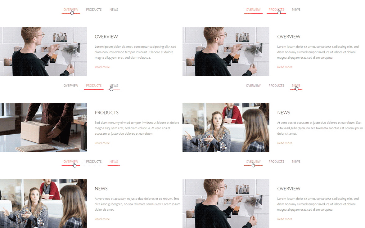
The Switcher element provides a number of different navigations to toggle through content items with an optional animation. Apply tabs, a subnav in different styles or a thumbnail navigation. The element features endless layout combinations. You can place the navigation to the left, right, bottom or top of the content and apply a width to it – the same goes for the image. To keep the page from jumping when switching through the items, you can match the content height.
Improved Accordion element
We totally spruced up the Accordion element. It now features all the usual fields, like title, content and image, and you can add a link as well as different title and image styles. In addition, the content layout can be modified through the Image Alignment option.

New column options for Rows
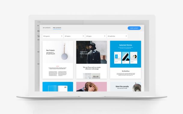
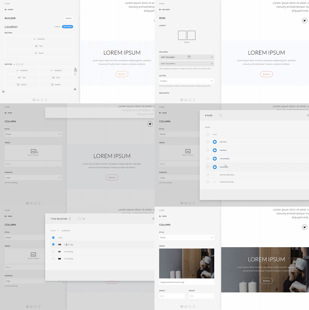
Layouts in YOOtheme Pro are built by placing rows in sections and arranging elements inside them. Each row can be divided into grid columns. From version 1.4 on, these columns feature individual settings, so you can create more sophisticated layouts. Apply a background color or image as well as text color to each column and modify or remove the grid gutter to generate tiled content boxes.
Tile Component
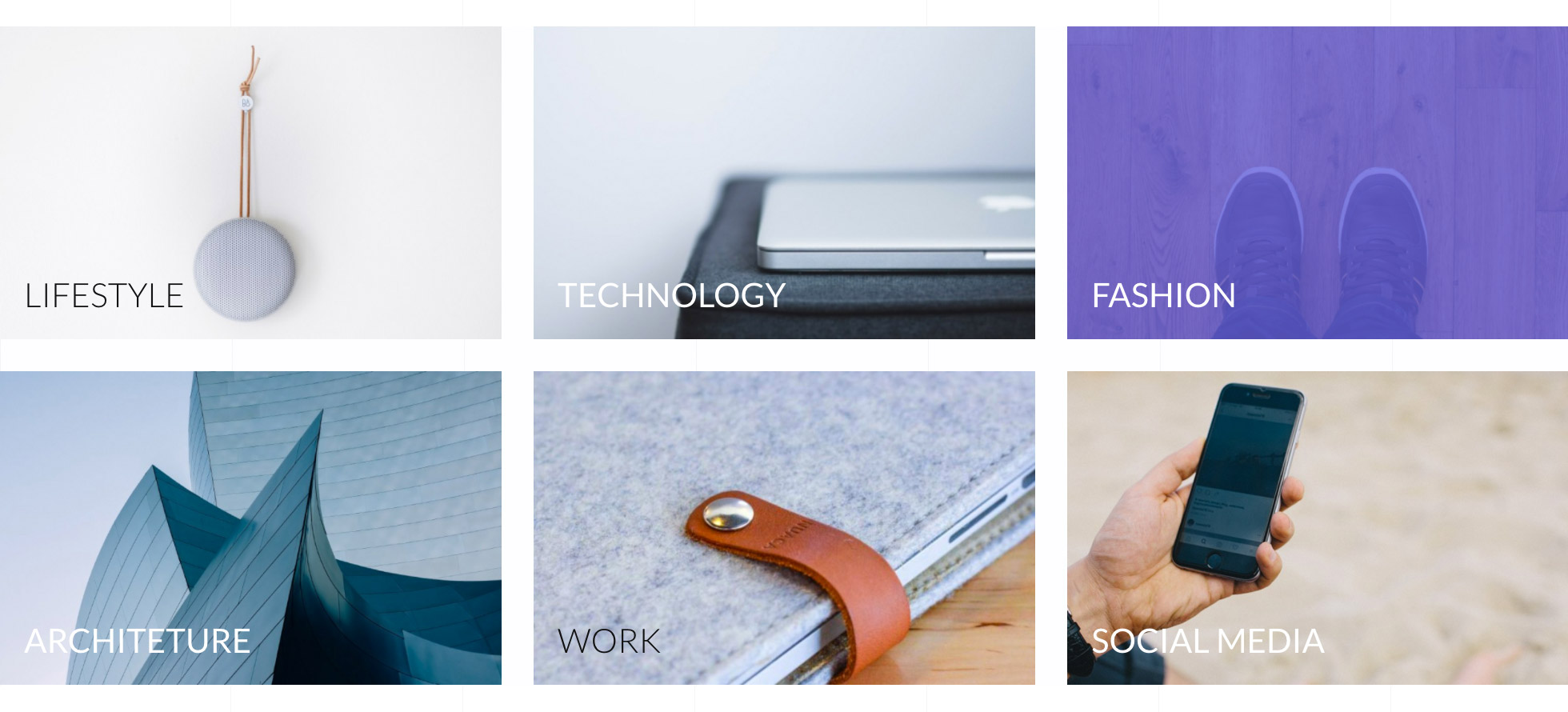
To give you more scope when creating layouts, we developed the new Tile component in UIkit. Like the Card component it allows you to create layout boxes and apply different background styles to them. But tiles can be placed seamlessly next to each other, because they never contain box-shadows or similar decorations outside the box itself. This is what enabled us to create the above mentioned column options for rows.

New features from Sonic website
Some new features from YOOtheme Pro 1.4 were already pre-released with our March website Sonic and made it possible for us to apply gradients to many UI elements and create those variable and open layouts.
Multiple section backgrounds
Previously, when applying a style to a section, you had to choose between using a background color or an image. Now these options can be combined, so that it is possible to select a background color and at the same time apply a background image. This lets you play with multiple background layers – fixed and scrolling – and greatly enhances the flexibility of sections in YOOtheme Pro.
New text background setting
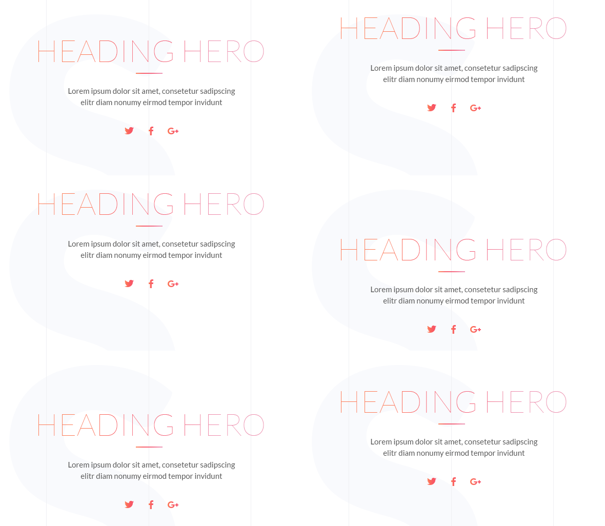
Titles inside the Headline, Panel and Module/Widget elements now feature a new background color option, so you can apply background images or gradients instead of the text color to those headings.
In addition to that, another title size – Heading Hero - is available. This is great to display extra large headings, for example in hero sections.
New social icon
We also added a new social icon: the receiver. When editing the social links inside the Header layout section of YOOtheme Pro, just enter tel:+1 (555) 555-5555 (with the phone number you actually want to provide) and the icon will be generated automatically.

Site & admin translations
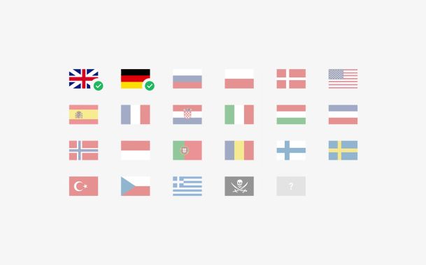
At this point we would love to thank everybody who helped translate YOOtheme Pro into so many new languages. By today we have been able to add 25 new site and 11 admin localizations. In addition, YOOtheme Pro now also supports RTL languages out of the box.
Thanks to the OneSky App, everyone who is interested can start translating the project after a simple sign up. There is still work to do, so please feel free to help us further on.

Improved update safety
If you are still reading, we got more news that we are sure will make a lot of you guys happy. CSS is automatically recompiled after updating YOOtheme Pro. So far, this wasn't happening. The theme would preserve your CSS file upon updating so as not to override your customizations. But this also meant that the CSS was likely to break when there were changes in UIkit. Now you only need to open the Website Builder after you've updated YOOtheme Pro and the CSS is compiled in the background. This will make updating a lot easier.
Wrapping up
These were some additions and features in YOOtheme Pro 1.4. A lot more has happened, for example we reworked the navbar and transparent header behavior, added options to the Description List element and squashed lots and lots of bugs. For more information, take a look at the Changelog.
Lastly, we would like to thank you for your feedback and ideas that we have been receiving and especially for everyone's support on the translations. Right now, there's a neck and neck race going on between the Dutch and Danish translations. Both are almost done, lets see who finishes first. ;)
So as usual, we are glad to hear your thoughts and ideas about this latest release. Please leave us your comment below.
