Multiple Items Elements
Enhance your layouts using these powerful elements.
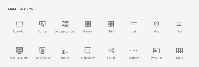
Multiple items elements can be found in the element library under Multiple Items. They display multiple content items where each item has a Title, Meta, Content, Image and Link content field. They offer powerful layout settings and often come with advanced effects. To learn more about general element settings, see the corresponding documentation.
Accordion Element
The Accordion element displays an accordion with a list of items. It has Title, Content, Image and Link fields. Take a look at the accordion element demo for a detailed showcase.
By default, the accordion starts with the first item opened and allows to only open one item at a time. Change the behavior to allow multiple items to be opened and to start with all items closed.

The accordion item image can be aligned in regard to the content. If aligned to the left or right, the image column width can be the same size as the image, a fixed width or percentage. Additionally, define the grid gaps and set the breakpoint from which the image stacks.
| Image Option | Description |
|---|---|
| Alignment | Align the image to the top, left, right or place it between the title and the content. |
| Grid Width | Define the width of the image within the grid. Choose between percent and fixed widths or expand columns to the width of their content. |
| Grid Column Gap | Set the size of the gap between the image and the content. |
| Grid Row Gap | Set the size of the gap if the grid items stack. |
| Grid Breakpoint | Set the breakpoint from which grid items will stack. |
| Vertical Alignment | Vertically center grid items. |

Options for the different content fields are very similar across all elements. They are described in the corresponding Text, Image and Button element documentation.
Button Element
The Button element displays one or multiple buttons within a grid. A button item has Content, Icon, Link and Dialog fields. Take a look at the button element demo for a detailed showcase.
Each button item has various style options. It can look like a regular button or a link.

If a button style is used, set the size for the button. Additionally, make the button take the full width.
| Option | Description |
|---|---|
| Size | Set the button size. |
| Full width button | Make the button take the full width. |

Since the Button element can have multiple items, set the size of the column and row gaps between them.
| Option | Description |
|---|---|
| Column Gap | Set the size of the column gap between multiple buttons. |
| Row Gap | Set the size of the row gap between multiple buttons. |

The button item can display an icon on the left or right of its content.

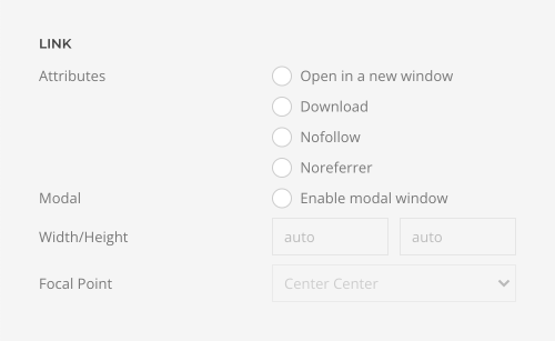
There is an option to open a button link in a modal. This could be an image, video, or YouTube or Vimeo link. Any other link will be opened in an iframe.
| Option | Description |
|---|---|
| Link Target | Open the link in a same or a new window or open it in a modal. |
| Modal Width/Height | Set the width and the height of the modal content, i.e. image, video or iframe. |
| Focal Point | Set a focal point to adjust the image focus when cropping. |
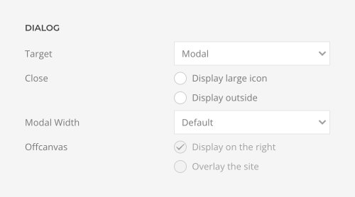
Instead of opening a link, the Button element can show content in a modal window or an offcancas sidebar.
| Option | Description |
|---|---|
| Target | Open the link in a modal window or an offvancas sidebar. |
| Close | Display a large close icon. Optionally, display the close icon outside. |
| Modal Width | Set the width of the modal content. |
| Offcanvas | Display the offcancas sidebar on the right and optionally overlay the site to prevent navigating and scrolling the page when the offcanvas sidebar is open. |
Description List Element
The Description List element displays a description list. It has Title, Meta, Content and Link fields. Take a look at the description list element demo for a detailed showcase.
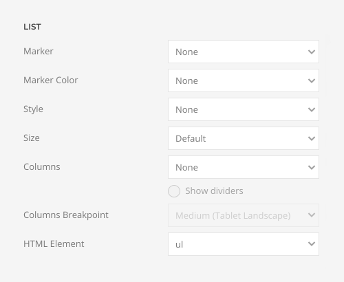
The Description List element has various list options. For example, select a marker and its color, a list style as well as a padding between list items.
| Option | Description |
|---|---|
| Marker | Select the marker of the list items. |
| Marker Color | Select the color of the list markers. Mind that it is not supported in Chrome and Edge yet. |
| Style | Set the list style. |
| Size | Define the padding between items. |
| Columns | Set the number of list columns. |
| Show dividers | Show a divider between list columns. |
| Column Breakpoint | Set the device width from which the list columns should apply. |
| HTML Element | Choose between an ordered and unordered list to fit your semantic structure. |
Define the layout of the title, meta and content. Choose between a grid layout to display the title, meta and content side by side or a stacked layout to stack them below each other.

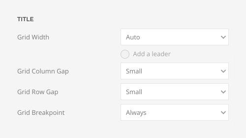
If a grid layout is selected, choose whether the title column width is the same size as the title, a fixed width or if it expands to fill the available space. Define the grid gaps and set the breakpoint from which the title stacks. Optionally, display a leader between the title and the content.
| Title Option | Description |
|---|---|
| Grid Width | Define the width of the title within the grid. Choose between fixed widths or expand columns to the width of their content. |
| Leader | Add a leader between the title and the content. |
| Grid Column Gap | Set the size of the gap between the title and the content. |
| Grid Row Gap | Set the size of the gap if the grid items stack. |
| Grid Breakpoint | Set the breakpoint from which grid items will stack. |
Align the meta text above or below title or content.

Options for the different content fields are very similar across all elements. They are described in the corresponding Headline, Text and Button element documentation.
Gallery Element
The Gallery element displays multiple Overlay elements within a grid. It has Image, Video, Title, Meta, Content, Link, Hover Image, Hover Video and Tags fields. Take a look at the gallery element demo for a detailed showcase.
The Gallery element has options to set the number of columns for each breakpoint. The Inherit option refers to the number of columns on the next smaller screen size. Auto expands the columns to the width of their items filling the rows accordingly.

Set the size of the column and row gaps between gallery items. Optionally, show a divider between them.
| Option | Description |
|---|---|
| Column Gap | Define the size of the gap between grid columns. |
| Row Gap | Define the size of the gap between grid rows. |
| Show dividers | Show dividers between gallery items. |

If the last row does not have enough columns, there is an option to center columns horizontally. If gallery items have different heights, they can be centered vertically.

Create a gap-free masonry layout if grid items have different heights. Pack items into columns with the most room or show them in their natural order.

Enable a parallax effect to move single grid columns at different speeds while scrolling. Define the vertical parallax offset in pixels. If grid columns have different heights, which is often the case for masonry grids, enable the parallax justify option to move columns while scrolling until they reach the bottom at the same time.

The parallax animation starts when the element enters the viewport and ends when it leaves the viewport. Optionally, set a start and end offset, e.g. 100px, 50vh or 50vh + 50%. Percent relates to the element's height.

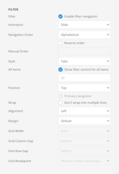
To filter the gallery items by tags, enable the filter navigation. Define the animation that will be applied to the content items when filtering between them, set the style for the filter navigation and position it in regard to content.
| Option | Description |
|---|---|
| Filter | Enable filter navigation. |
| Animation | Select an animation that will be applied to the content items when filtering between them. |
| Navigation Order | Order the filter navigation alphabetically or by defining the order manually. Optionally, display the navigation in a reverse order. |
| Manual Order | Enter a comma-separated list of tags to manually order the filter navigation. |
| Style | Select the filter navigation style. The pill and divider styles are only available for horizontal Subnavs. |
| All Items | Show filter control for all items. |
| Position | Position the filter navigation at the top, left or right. A larger style can be applied to left and right navigation. |
| Wrap | Set whether filter items are forced into one line or can wrap into multiple lines. |
| Alignment | Align the filter controls. |
| Margin | Set the vertical margin. |
| Grid Width | Define the width of the filter navigation. Choose between percent and fixed widths or expand columns to the width of their content. |
| Grid Column Gap | Set the size of the gap between between the filter navigation and the content. |
| Grid Row Gap | Set the size of the gap if the grid items stack. |
| Grid Breakpoint | Set the breakpoint from which grid items will stack. |
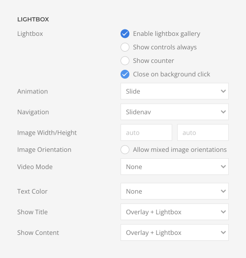
There is an option to open the gallery item links in a lightbox gallery. This could be an image, video, or YouTube or Vimeo link. Any other link will be opened in an iframe. Additionally, the title and content can be shown in the lightbox caption.
| Option | Description |
|---|---|
| Lightbox | Enable lightbox gallery. Optionally, show controls always instead of hiding them after a short delay, show a counter for the slides, and close the lightbox when clicking the background. |
| Animation | Select the transition between two slides. |
| Navigation | Choose between a slide, dot or a thumbnail navigation. |
| Image Width and Height | Setting just one value preserves the original proportions. The image will be resized and cropped automatically, and where possible, high resolution images will be auto-generated. |
| Image Orientation | Allow mixed image orientation. Width and height will be flipped accordingly, if the image is in portrait or landscape format. |
| Video Mode | Enable autoplay or use the video like an animated image (autoplay, loop, no controls and muted). |
| Text Color | Set light or dark color mode for text, buttons and controls. |
| Show Title | Display the title inside the overlay, as the lightbox caption or both. |
| Show Content | Display the content inside the overlay, as the lightbox caption or both. |
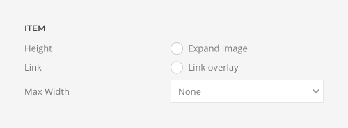
Gallery items have additional options to define their height and width.
| Option | Description |
|---|---|
| Height | Expand the height of the image to fill the available space in the item. |
| Link | Link the whole overlay if a link exists. |
| Max Width | Set the maximum width for the item. |
By default, all images are resized and cropped using the same width and height value no matter if they are in portrait or landscape mode. To mix both portrait and landscape images, enable mixed image orientation. Width and height will be flipped accordingly.

There are three options of how to recolor all gallery images or videos in a different tone.
| Option | Description |
|---|---|
| Background Color | Use the background color in combination with blend modes or a transparent image to fill the area if the image doesn't cover the whole page. |
| Blend Mode | Determine how the image will blend with the background color. |
| Overlay Color | Set an additional transparent overlay to soften the image by setting a color or a gradient. |

Each gallery item also has its own overlay, lightbox, image and hover image options.
Since the Gallery element displays multiple overlays, their settings are explained in the Overlay element documentation. Options for the different content fields are very similar across all elements. They are described in the corresponding Image, Headline, Text and Button elements. Options to recolor images and videos are described in the files and images documentation.
Grid Element
The Grid element displays multiple Panel elements within a grid. A grid item has Title, Meta, Content, Image, Video, Icon, Link, Hover Image, Hover Video, and Tags fields, and for iframe videos, an additional Video Title field. Take a look at the grid element demo for a detailed showcase.
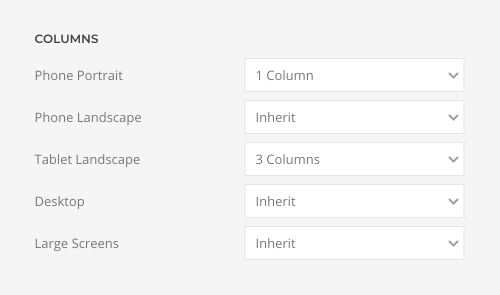
The Grid element has options to set the number of columns for each breakpoint. Inherit refers to the number of columns on the next smaller screen size. Auto expands the columns to the width of their items filling the rows accordingly.
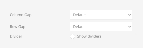
Set the size of the column and row gaps between grid items. Optionally, show a divider between grid columns.
| Option | Description |
|---|---|
| Column Gap | Define the size of the gap between grid columns. |
| Row Gap | Define the size of the gap between grid rows. |
| Show dividers | Show dividers between grid items. |
To align the images without any gaps when using a blank panel, use a panel padding instead of the grid column and row gaps.

If the last row does not have enough columns, there is an option to center them horizontally. If grid items have different heights, they can be centered vertically.

Create a gap-free masonry layout if grid items have different heights. Pack items into columns with the most room or show them in their natural order.

Enable a parallax effect to move single grid columns at different speeds while scrolling. Define the vertical parallax offset in pixels. If grid columns have different heights, which is often the case for masonry grids, enable the parallax justify option to move columns while scrolling until they reach the bottom at the same time.

The parallax animation starts when the element enters the viewport and ends when it leaves the viewport. Optionally, set a start and end offset, e.g. 100px, 50vh or 50vh + 50%. Percent relates to the element's height.

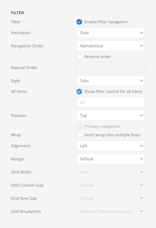
To filter the grid items by tags, enable the filter navigation. Define the animation that will be applied to the content items when filtering between them, set the style for the filter navigation and position it in regard to content.
| Option | Description |
|---|---|
| Filter | Enable filter navigation. |
| Animation | Select an animation that will be applied to the content items when filtering between them. |
| Navigation Order | Order the filter navigation alphabetically or by defining the order manually. Optionally, display the navigation in a reverse order. |
| Manual Order | Enter a comma-separated list of tags to manually order the filter navigation. |
| Style | Select the filter navigation style. The pill and divider styles are only available for horizontal Subnavs. |
| All Items | Show filter control for all items. |
| Position | Position the filter navigation at the top, left or right. A larger style can be applied to left and right navigation. |
| Wrap | Set whether filter items are forced into one line or can wrap into multiple lines. |
| Alignment | Align the filter controls. |
| Margin | Set the vertical margin. |
| Grid Width | Define the width of the filter navigation. Choose between percent and fixed widths or expand columns to the width of their content. |
| Column Gap | Set the size of the gap between between the filter navigation and the content. |
| Row Gap | Set the size of the gap if the grid items stack. |
| Grid Breakpoint | Set the breakpoint from which grid items will stack. |
There is an option to open the grid item links in a lightbox gallery. This could be an image, video, or YouTube or Vimeo link. Any other link will be opened in an iframe. Additionally, the title and content can be shown in the lightbox caption.
| Option | Description |
|---|---|
| Lightbox | Enable lightbox gallery. Optionally, show controls always instead of hiding them after a short delay, show a counter for the slides, and close the lightbox when clicking the background. |
| Animation | Select the transition between two slides. |
| Navigation | Choose between a slide, dot or a thumbnail navigation. |
| Image Width and Height | Setting just one value preserves the original proportions. The image will be resized and cropped automatically, and where possible, high resolution images will be auto-generated. |
| Image Orientation | Allow mixed image orientation. Width and height will be flipped accordingly, if the image is in portrait or landscape format. |
| Video Mode | Enable autoplay or use the video like an animated image (autoplay, loop, no controls and muted). |
| Text Color | Set light or dark color mode for text, buttons and controls. |
| Show Title | Display the title inside the overlay, as the lightbox caption or both. |
| Show Content | Display the content inside the overlay, as the lightbox caption or both. |

Additionally, set an optional content width which doesn't affect the image if there is just one column.

Each grid item also has its own panel, lightbox, image, hover image and link options.
Since the Grid element displays multiple panels, their settings are explained in the Panel element documentation. Options for the different content fields are very similar across all elements. They are described in the corresponding Headline, Text, Image, Icon and Button element documentation.
List Element
The List element displays a list. It has Content, Image, Icon and Link fields. Take a look at the list element demo for a detailed showcase.
Choose between a vertical or a horizontal list. Horizontal lists have an option to set a separator between its items while vertical lists have options for the list marker, style and size.

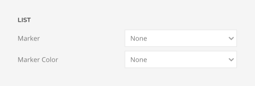
Choose between various markers and their color for vertical list items.
Choose the icon color and optionally select a default icon from the UIkit icon library to use it as a list marker for all items. Each item can also have a different icon. Alternatively, use the Image field to upload a custom image.
| Option | Description |
|---|---|
| Icon/SVG Color | Set the icon color. |
| Default Icon | Click on the pencil to pick an icon from the SVG gallery. |

The vertical list has various style options. Choose between the default, divider or a striped list as well as define a padding between list items.

The list items can be divided into multiple columns. Optionally, show a divider between them.
| Option | Description |
|---|---|
| Columns | Set the number of list columns. |
| Show Dividers | Show dividers between list columns. |
| Column Breakpoint | Set the device width from which the list columns should apply. |
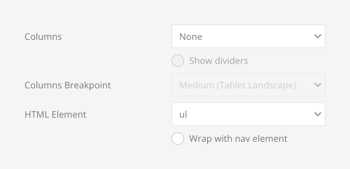
| HTML Element | Choose between an ordered and unordered list to fit your semantic structure. Optionally, wrap the list with the HTML nav element. |
The list image can be aligned to the left or right of the content. If image and content have different heights, the image can be centered vertically.

Options for the different content fields are very similar across all elements. They are described in the corresponding Text, Image, Icon and Button element documentation.
Map Element
The Map element displays a map with markers and popups. It has Location, Title, Meta, Content, Image, Link, Marker Icon and Cluster Icons fields. Take a look at the map element demo for a detailed showcase.
The Map element requires loading either the OpenStreetMap or Google Maps script. Simply add one of the prebuilt scripts in the YOOtheme Pro settings to enable the map rendering. The map scripts and the map itself are loaded lazy, which means, no external requests are sent to OpenStreetMap or Google Maps before the map enters the viewport.
The Map element is available as a roadmap and a satellite map.

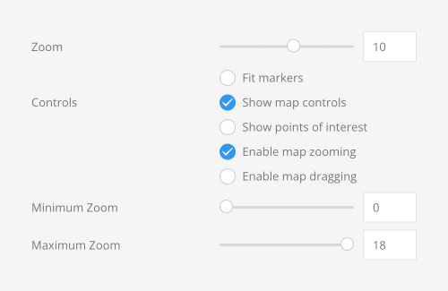
Set the zoom level, display map controls and enable map zooming and dragging. Additionally, define the maximum and a minimum zoom level of the map.
| Option | Description |
|---|---|
| Zoom | Set the initial resolution at which to display the map. 0 is zoomed out, and 18 is at the highest resolution zoomed in. Alternatively, set the viewport to contain the given markers. |
| Controls | Display the map controls and define whether the map can be zoomed or dragged using the mouse wheel or touch. |
| Points of Interest | Display points of interest for Google Maps. |
| Minimum Zoom Level | Set the minimum zoom level of the map. |
| Maximum Zoom Level | Set the maximum zoom level of the map. |
The Map element has several options to define its size. Set a fixed height in pixels or adapt it to the viewport.
| Option | Description |
|---|---|
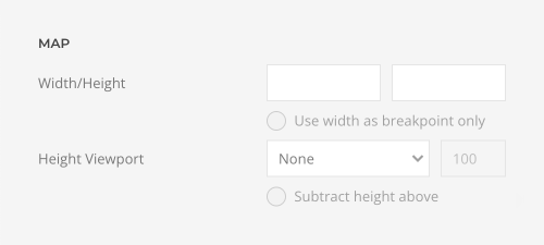
| Viewport Height | Adapt the map height to the height of the viewport. Optionally, subtract the height above the map. Make sure no height is set in the section settings when using one of the viewport options. |
| Height | Set the map height in pixels. |
| Width | Set the map width in pixels. If no width is set, the map takes the full width. If both width and height are set, the map is responsive like an image. Additionally, the width can be used as a breakpoint. The map takes the full width, but below the breakpoint it will start to shrink preserving the aspect ratio. |
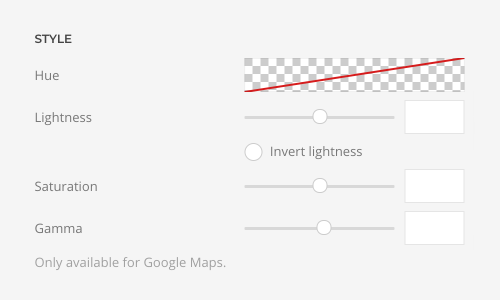
If Google Maps are used, there are additional options to style the map.
| Option | Description |
|---|---|
| Hue | Set the hue, e.g. #ff0000. |
| Lightness | Set percentage change in lightness (between -100 and 100). Optionally, invert lightness |
| Saturation | Set percentage change in saturation (between -100 and 100). |
| Gamma | Set percentage change in the amount of gamma correction (between 0.01 and 10.0 where 1.0 applies no correction). |
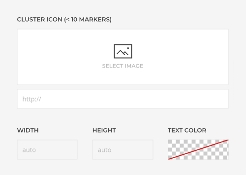
Select a custom icon for the map markers. Enable marker clustering to simplify the display of a large number of markers on the map. Optionally, select a custom cluster icon.

Display a popup when clicking a map marker. Set the max width for the popup.
| Map Option | Description |
|---|---|
| Popup max width | Set a maximum width for the popup. |

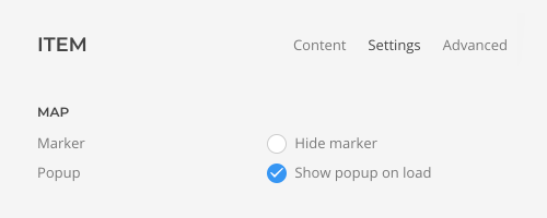
Optionally define which popup is opened on load.
| Item Option | Description |
|---|---|
| Marker | Hide marker. |
| Popup on load | Show individual popup on load. |
Options for the different content fields are very similar across all elements. They are described in the corresponding Headline, Text, Image and Button element documentation.
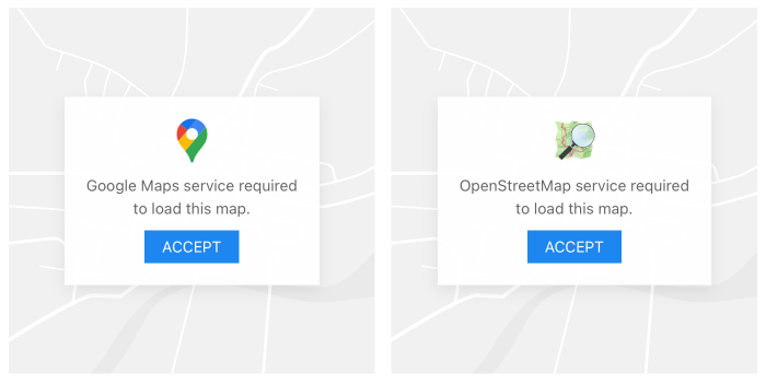
The Map element fully supports the consent manager for both OpenStreetMap and Google Maps and shows a placeholder if consent is required. The map will only be loaded on click, and before that, no external requests are sent, and no JavaScript is loaded. Change the default placeholder image in the Map element.
Nav Element
The Nav element displays a vertical navigation. It has Content, Subtitle, Image, Icon and Link fields. Take a look at the nav element demo for a detailed showcase.
Change the menu item type to Divider to separate menu items or Heading to group menu items for each item. When using dynamic content, create menu dividers and menu headings in Joomla.

Define which item should be the active item.

Note Nav item type and active state can be mapped dynamically when loading menu items, categories or tags using dynamic content.
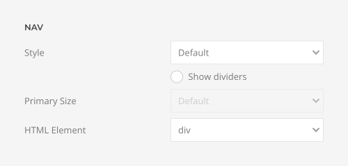
Choose the navigation style and size and show dividers between the nav items. Additionally, choose between a div and a nav HTML element to fit your semantic structure.
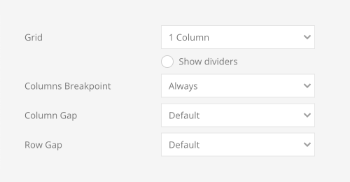
The nav items can be divided into multiple columns with optional dividers between them. Additionally, select a device for the column breakpoint.
| Option | Description |
|---|---|
| Grid | Set the number of grid columns. |
| Show dividers | Show dividers between grid columns. |
| Column Breakpoint | Set the device width from which the grid columns should apply. |
| Column Gap | Set the size of the gap between the grid columns. |
| Row Gap | Set the size of the gap between the grid rows. |
Options for the different content fields are very similar across all elements. They are described in the corresponding Image elements.
Overlay Slider Element
The Overlay Slider element displays multiple Overlay elements in an image slider. It has Image, Video, Title, Meta, Content, Link, Hover Image and Hover Video fields. Take a look at the overlay slider element demo for a detailed showcase.
The Overlay Slider element has an option to set a fixed width for all items or expand them to the width of their content. Optionally, the height of items with a fixed width can fill the available column space or take a percentage of the viewport height or the viewport height minus the next section. Optionally, subtract the height above the slider. Make sure no height is set in the section settings when using one of the viewport options.
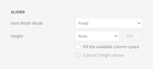
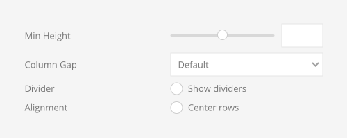
Use an optimal minimum height to prevent the slider to become smaller than its content on small devices. Set the size of the column gap between slider items and optionally, show a divider between them and center grid rows vertically.
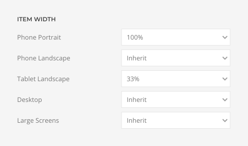
For fixed items, set the item width for each breakpoint in percentage. Inherit refers to the item width on the next smaller screen size.
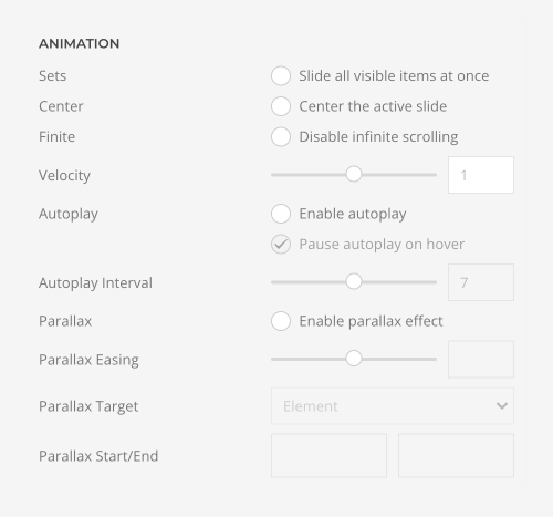
Group slider items into sets and slide all visible items at once. The number of items within a set depends on the defined item width, e.g. 33% means that each set contains 3 items. Additionally, center the active slide, disable infinite scrolling or enable autoplay.
| Option | Description |
|---|---|
| Set | Slide all visible items at once. |
| Center | Center the active slide. |
| Finite | Disable infinite scrolling. |
| Velocity | Set the velocity in pixels per millisecond. |
| Autoplay | Enable autoplay immediately, start as soon as the video enters the viewport or only on hover. |
| Interval | Set the autoplay interval in seconds. |
| Parallax | Add a stepless parallax animation based on the scroll position. |
| Parallax Target | The animation starts and stops depending on the element position in the viewport. Alternatively, use the position of a parent container. |
| Parallax Start / End | The parallax animation starts when the element enters the viewport and ends when it leaves the viewport. Optionally, set a start and end offset, e.g. 100px, 50vh or 50vh + 50%. Percent relates to the element's height. |
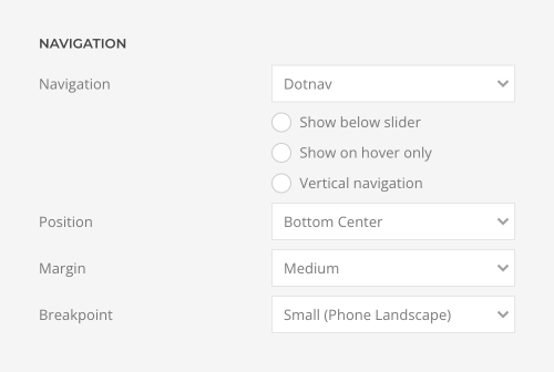
Add a dotnav navigation and define its position and margin.
| Option | Description |
|---|---|
| Type | Choose the navigation type. Optionally, only show the navigation on hover, position it below the slideshow, or use a vertical navigation. |
| Position | Align the navigation items. |
| Margin | Set the vertical margin. |
| Breakpoint | Display the navigation only on this device width and larger. |
| Color | Set light or dark color mode. |
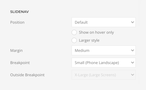
Add an additional slidenav to navigate to the previous and next slides.
| Option | Description |
|---|---|
| Position | Select the position of the slidenav. Optionally, only show the slidenav on hover and choose a larger style. |
| Margin | Apply a margin between the slidenav and the slider container. |
| Breakpoint | Display the slidenav only on this device width and larger. |
| Outside Breakpoint | Display the slidenav outside only on this device width and larger. Otherwise, display it inside. |
Overlay slider items have additional options to define their height and link.
| Option | Description |
|---|---|
| Height | Expand the height of the image to fill the available space in the item. |
| Link | Link the whole overlay if a link exists. |

By default, the overlay is always displayed. Alternatively, choose to only display it on hover or when the slide becomes active. Optionally, make only the first item active and animate the background only.

There are three options of how to recolor all overlay slider images or videos in a different tone.
| Option | Description |
|---|---|
| Background Color | Use the background color in combination with blend modes or a transparent image to fill the area if the image doesn't cover the whole page. |
| Blend Mode | Determine how the image will blend with the background color. |
| Overlay Color | Set an additional transparent overlay to soften the image by setting a color or a gradient. |

Since the Overlay Slider element displays multiple overlays, their settings are explained in the Overlay element documentation. Options for the different content fields are very similar across all elements. They are described in the corresponding Image, Headline, Text and Button elements. Options to recolor images and videos are described in the files and images documentation.
Panel Slider Element
The Panel Slider element displays multiple Panel elements in an image slider. It has Title, Meta, Content, Image, Video, Icon Link, Hover Image and Hover Video fields, and for iframe videos, an additional Video Title field. Take a look at the panel slider element demo for a detailed showcase.
The Panel Slider element has an option to set a fixed width for all items or expand them to the width of their content. Optionally, the height of items with a fixed width can fill the available column space.

Set the size of the column gap between slider items. Optionally, show a divider between them and center grid rows vertically.

For fixed items, set the item width for each breakpoint in percentage. Inherit refers to the item width on the next smaller screen size.

Note To align the images without any gaps when using a blank panel, use a panel padding instead of the slider column gap.

Group slider items into sets and slide all visible items at once. The number of items within a set depends on the defined item width, e.g. 33% means that each set contains 3 items. Additionally, center the active slide, disable infinite scrolling or enable autoplay.
| Option | Description |
|---|---|
| Set | Slide all visible items at once. |
| Center | Center the active slide. |
| Finite | Disable infinite scrolling. |
| Velocity | Set the velocity in pixels per millisecond. |
| Autoplay | Enable autoplay and optionally pause autoplay on hover. |
| Interval | Set the autoplay interval in seconds. |
| Parallax | Add a stepless parallax animation based on the scroll position. |
| Parallax Target | The animation starts and stops depending on the element position in the viewport. Alternatively, use the position of a parent container. |
| Parallax Start / End | The parallax animation starts when the element enters the viewport and ends when it leaves the viewport. Optionally, set a start and end offset, e.g. 100px, 50vh or 50vh + 50%. Percent relates to the element's height. |

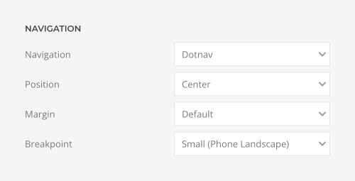
Add a dotnav navigation and define its position and margin.
| Option | Description |
|---|---|
| Type | Choose the navigation type. |
| Position | Align the navigation items. |
| Margin | Set the vertical margin. |
| Breakpoint | Display the navigation only on this device width and larger. |
Add an additional slidenav to navigate to the previous and next slides.
| Option | Description |
|---|---|
| Position | Select the position of the slidenav. Optionally, only show the slidenav on hover and choose a larger style. |
| Margin | Apply a margin between the slidenav and the slider container. |
| Breakpoint | Display the slidenav only on this device width and larger. |
| Outside Breakpoint | Display the slidenav outside only on this device width and larger. Otherwise, display it inside. |

Additionally, there are options to match panel heights and to expand the height of the image to fill the available space in the panel.

Each panel slider item also has its own panel, image, hover image and link options.
Since the Panel element displays multiple panels, their settings are explained in the Panel element documentation. Options for the different content fields are very similar across all elements. They are described in the corresponding Headline, Text, Image, Icon and Button elements.
Popover Element
The Popover element displays an image with markers which open popovers. The element itself has an Image field while its items have Title, Meta, Content, Image and Link fields. Take a look at the popover element demo for a detailed showcase.
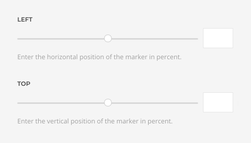
Set the horizontal and vertical position of the popover marker for each item.
| Option | Description |
|---|---|
| Left | Enter the horizontal position of the marker in percent. |
| Top | Enter the vertical position of the marker in percent. |
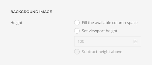
By default, the background image is either loaded in its original size or resized using the width and height options. Alternatively, expand the height of the image to fill the available space in the column or adapt the image height to the height of the viewport, and optionally subtract the header height to fill the first visible viewport. The image will cover the element's content box.
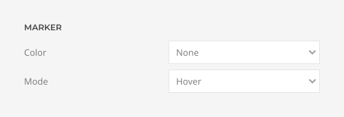
Choose whether the popover opens when clicking the marker or hovering it.
| Option | Description |
|---|---|
| Color | Set light or dark color mode. |
| Mode | Display the popover on click or hover. |
Position the popover to the top, bottom, left or right in regard to its marker. Each item can have a different position. If the popover doesn't fit the viewport, it will flip automatically.

Set the width for the popover in pixels.

Define the padding between the popover card and its content. Optionally, the image can be aligned without any padding.
| Option | Description |
|---|---|
| Padding | Define the card size by selecting the padding between the card and its content. |
| Align Image Without Padding | Attach the image to the drop's edge. |


In addition to the default style, the popover comes in primary and secondary card styles.

There are various options to link the Popover element. Either link the title, image and button separately or link the whole card. Additionally, set hover styles for the title. These styles are kept even if the whole card is linked.
| Popover Option | Description |
|---|---|
| Link | Link the whole card if a link exists. |

| Title Option | Description |
|---|---|
| Link | Link the title if a link exists. |
| Hover Style | Set the hover style for a linked title. |

| Image Option | Description |
|---|---|
| Link | Link the title if a link exists. |

Options for the different content fields are very similar across all elements. They are described in the corresponding Headline, Text, Image and Button element documentation.
Slideshow Element
The Slideshow element displays an image slideshow with text overlays. The element itself has a Link field, while its items have Image, Video, Title, Meta, Content, Link and Navigation Thumbnail fields. Take a look at the slideshow element demo for a detailed showcase.
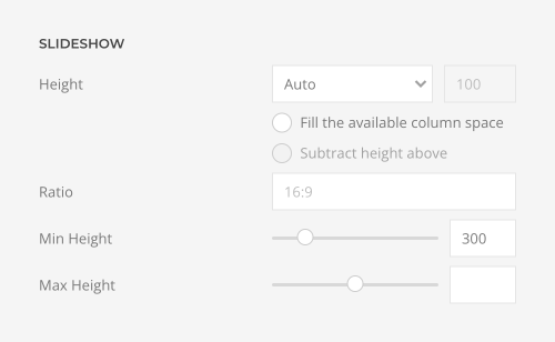
The Slideshow element has several options to define its size.
| Option | Description |
|---|---|
| Height | The slideshow always takes up the full width, and the height will adapt automatically based on the defined ratio. Alternatively, the height can adapt to the height of the viewport or to fill the available space in the column. Make sure no height is set in the section settings when using one of the viewport options. |
| Ratio | Set the slideshow ratio. It's recommended to use the same ratio as the image or video file. Simply use its width and height, e.g. 1600:900. |
| Min Height | Use an optimal minimum height to prevent the slideshow to become smaller than its content on small devices. |
| Max Height | Set the maximum height. |
Additionally, set the text color of the content and navigation to either light or dark.

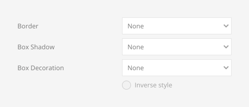
Set a border style, box shadow or a box decoration for the slideshow. Additionally, select a floating shadow or a mask as a box decoration.
| Option | Description |
|---|---|
| Border | Select the slideshow's border style. |
| Box Shadow | Select the slideshow's box shadow size. |
| Box Decoration | Select the image's box decoration style. |
| Inverse Style | Inverse the box decoration style. |
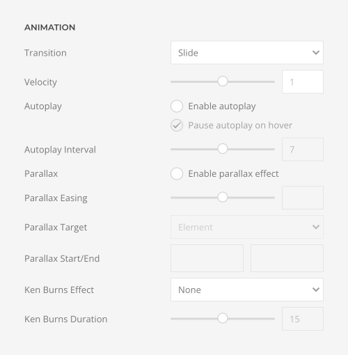
Choose one of the different slideshow transitions and add an additional Ken Burns animation for the image.
| Option | Description |
|---|---|
| Transition | Select the transition between two slides. |
| Velocity | Set the velocity in pixels per millisecond. |
| Autoplay | Enable autoplay and optionally pause autoplay on hover. |
| Interval | Set the autoplay interval in seconds. |
| Parallax | Add a stepless parallax animation based on the scroll position. |
| Parallax Target | The animation starts and stops depending on the element position in the viewport. Alternatively, use the position of a parent container. |
| Parallax Start / End | The parallax animation starts when the element enters the viewport and ends when it leaves the viewport. Optionally, set a start and end offset, e.g. 100px, 50vh or 50vh + 50%. Percent relates to the element's height. |
| Ken Burns | Select the transformation origin for the Ken Burns animation. |
| Duration | Set the duration for the Ken Burns effects in seconds. |
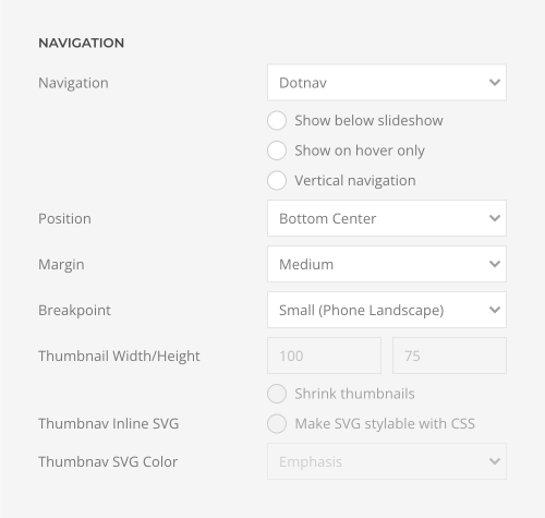
Add a dotnav or a thumbnav navigation and define its position, margin and color. If the thumbnav is selected, set the width and the height for the thumbnail image. Optionally, select a different image for the thumbnail.
| Option | Description |
|---|---|
| Navigation | Select the navigation type. Additionally, only show the navigation on hover, position it below the slideshow, or use a vertical navigation. |
| Position | Select the position of the navigation. |
| Margin | Apply a margin between the navigation and the slideshow container. |
| Breakpoint | Display the navigation only on this device width and larger. |
| Thumbnail Width/Height | Set the width and height for the thumbnail image. |
| Shrink Thumbnails | Shrink thumbnails if the container is too small. |
| Thumbnav Inline SVG | Inject SVG images into the page markup so that they can easily be styled with CSS. |
| Thumbnav SVG Color | Select the SVG color. It will only apply to supported elements defined in the SVG. |
Add an additional slidenav to navigate to the previous and next slides.
| Option | Description |
|---|---|
| Position | Select the position of the slidenav. Optionally, only show the slidenav on hover and choose a larger style. |
| Margin | Apply a margin between the slidenav and the slideshow container. |
| Breakpoint | Display the slidenav only on this device width and larger. |
| Outside Breakpoint | Display the slidenav outside only on this device width and larger. Otherwise, display it inside. |

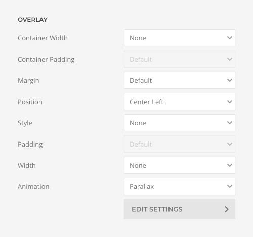
The slideshow images can have a text overlay. Define its position, style and width. If no width is set in the section or row, and the slideshow takes the full width, its overlay text can be aligned in the same way as a section container.
| Option | Description |
|---|---|
| Container Width | Set the maximum content width. Note that the section may already have a maximum width which you cannot exceed. |
| Container Padding | Set the vertical container padding to position the overlay. |
| Margin | Set the margin between the overlay and the slideshow container. |
| Position | Select the content position. |
| Style | Select a style for the overlay. |
| Padding | Set the padding between the overlay and its content. |
| Width | Set a fixed width. |
| Animation | Choose between a parallax depending on the scroll position or an animation, which is applied once the slide is active. |
Instead of an overlay transition, create a parallax effect by moving the overlay, title, meta, content and link at different speeds while sliding between the slideshow items.

| Option | Description |
|---|---|
| Horizontal Start/End | Define the start and end offset of the horizontal parallax in pixels. |
| Vertical Start/End | Define the start and end offset of the vertical parallax in pixels. |
| Scale Start/End | Define the start and end offset of the scale parallax in pixels. |
| Rotate Start/End | Define the start and end offset of the rotate parallax in pixels. |
| Opacity Start/End | Define the start and end offset opacity parallax in pixels. |
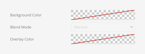
There are three options of how to recolor all slideshow images or videos in a different tone.
| Option | Description |
|---|---|
| Background Color | Use the background color in combination with blend modes or a transparent image to fill the area if the image doesn't cover the whole page. |
| Blend Mode | Determine how the image will blend with the background color. |
| Overlay Color | Set an additional transparent overlay to soften the image by setting a color or a gradient. |
Options for the different content fields are very similar across all elements. They are described in the corresponding Image, Headline, Text and Button elements. Options to recolor images and videos are described in the files and images documentation.
Social Element
The Social element displays icons linking to social media profiles. It has Link, Icon and Image fields. If available, a corresponding UIkit brand icon will be displayed automatically. Links to Google Maps, email addresses and phone numbers, like mailto:info@example.com or tel:+491570156, are also supported. Alternatively, pick a different icon or an SVG image. Take a look at the social element demo for a detailed showcase.
Socials have various style options. They can look like a button, link, iconnav or a thumbnav.

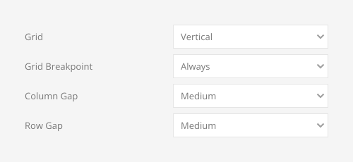
Socials can be displayed in a horizontal or a vertical grid layout. Additionally, define the breakpoint for the vertical layout from which socials will align side by side and set the gap between grid items.
| Option | Description |
|---|---|
| Grid | Choose between a horizontal or a vertical grid layout. |
| Grid Breakpoint | Set the breakpoint from which grid items will align side by side. |
| Column Gap | Set the size of the gap between the grid columns. |
| Row Gap | Set the size of the gap between the grid rows. |
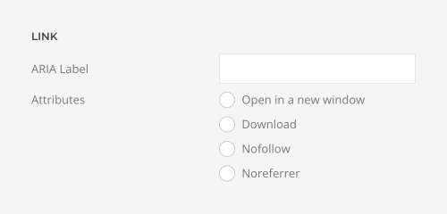
Add an option ARIA label and select the link attribute.
| Option | Description |
|---|---|
| ARIA Label | Enter a descriptive text label to make it accessible if the link has no visible text. |
| Attribute | Optionally, open the link in a new window, treat it as download, don't endorse the linked page or don't include the referrer header. |
Set the width and height for the social icons in pixels.

By default, images are loaded lazy. Enable eager loading for images in the initial viewport.

SVG images can be injected into the page markup and further styled with CSS.

Subnav Element
The Subnav element displays a horizontal navigation. It has Content, Link, Image and Icon fields. Take a look at the subnav element demo for a detailed showcase.
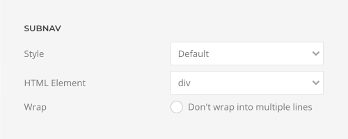
Choose the navigation style. Additionally, choose between a div and a nav HTML element to fit your semantic structure. Optionally, set whether subnav items are forced into one line or can wrap into multiple lines.
Optionally define which item should be the active item.

Options for the different content fields are very similar across all elements. They are described in the corresponding Image and Icon element documentation.
Switcher Element
The Switcher element displays a tabbed navigation which transitions through content slides. It has Title, Meta, Content, Image, Link, Navigation Label and Navigation Thumbnail fields. Take a look at the switcher element demo for a detailed showcase.
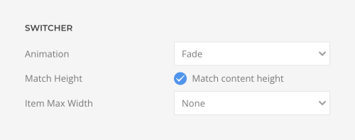
Choose one of the different switcher animations. Optionally, expand all content slides to the same height to prevent subsequent content from jumping when switching between slides and set the maximum item width.
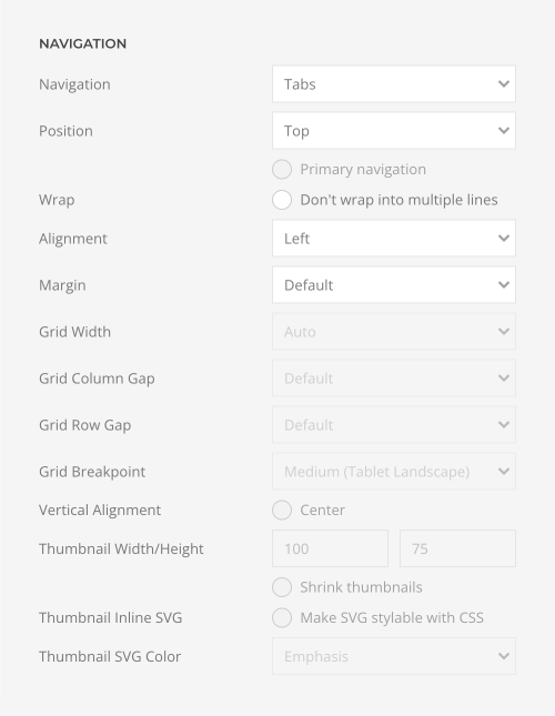
Add a tab, subnav or a thumbnav navigation and select its position and alignment in regard to the content. If aligned to the left or right, the navigation column width can be the same size as its items, a fixed width or percentage. Additionally, define the grid gaps and set the breakpoint from which the navigation stacks.
| Switcher Option | Description |
|---|---|
| Style | Select the navigation type. The pill and divider styles are only available for horizontal subnavs. |
| Position | Position the navigation at the top, bottom, left or right. A larger style can be applied to left and right navigation. |
| Wrap | Set whether navigatio items are forced into one line or can into multiple lines. |
| Alignment | Align the navigation items. |
| Margin | Set the vertical margin. |
| Grid Width | Define the width of the navigation. Choose between percent and fixed widths or expand columns to the width of their content. |
| Column Gap | Set the size of the gap between between the navigation and the content. |
| Row Gap | Set the size of the gap if the grid items stack. |
| Grid Breakpoint | Set the breakpoint from which grid items will stack. |
| Vertical Alignment | Vertically center the navigation and content. |
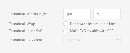
If the thumbnav is selected, set the width and the height for the thumbnail image. Optionally, select a different image for the thumbnail.
| Option | Description |
|---|---|
| Shrink Thumbnails | Shrink thumbnails if the container is too small. |
| Thumbnail Width/Height | Set the width and height for the thumbnail image. |
| Thumbnav Inline SVG | Inject SVG images into the page markup so that they can easily be styled with CSS. |
| Thumbnav SVG Color | Select the SVG color. It will only apply to supported elements defined in the SVG. |
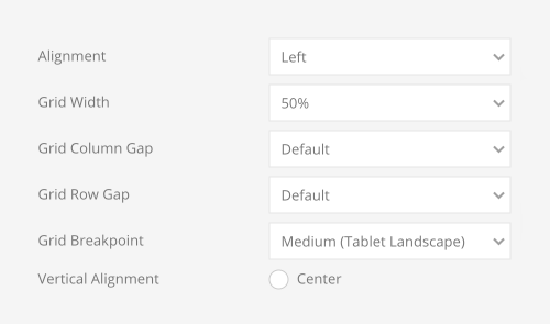
The switcher item image can be aligned in regard to the content. If aligned to the left or right, the image column width can be the same size as the image, a fixed width or percentage. Additionally, define the grid gaps and set the breakpoint from which the image stacks.
| Image Option | Description |
|---|---|
| Alignment | Align the image to the top, left, right or place it between the title and the content. |
| Grid Width | Define the width of the image within the grid. Choose between percent and fixed widths or expand columns to the width of their content. |
| Grid Column Gap | Set the size of the gap between the image and the content. |
| Grid Row Gap | Set the size of the gap if the grid items stack. |
| Grid Breakpoint | Set the breakpoint from which grid items will stack. |
| Vertical Alignment | Vertically center grid items. |
Options for the different content fields are very similar across all elements. They are described in the corresponding Panel, Headline, Text, Image and Button elements.
Table Element
The Table element displays a table. It has Title, Meta, Content, Image and Link fields. Optionally, set a table header for each content field. Take a look at the table element demo for a detailed showcase.
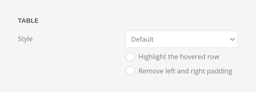
The Table element has various style options. Choose between the default, divider or a striped table. Optionally, highlight the hovered row and remove its left and right padding.
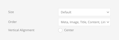
Choose the column order for the Title, Meta, Content, Image and Link fields. Additionally, align the content in the table cells and set their padding.
| Table Option | Description |
|---|---|
| Size | Define the padding between table rows. |
| Order | Define the order of the table cells. |
| Vertical Alignment | Vertically align table cells. |
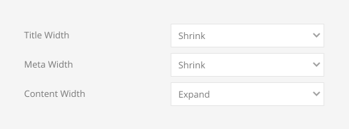
Set the width of the title, meta and content columns. Choose between a fixed width, shrink the width to fit its content or expand the width to fill the remaining space. If all columns have a fixed width, the remaining space will be distributed equally among them.
Choose whether the table should stack on small viewports or enable overflow scroll for the container.

Set the alignment for the last column.

Options for the different content fields are very similar across all elements. They are described in the corresponding Headline, Text, Image and Button elements.
