Basic Elements
Build your content with these versatile elements.
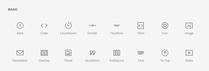
Basic elements can be found in the element library under Basic. They are the default elements in YOOtheme Pro and have their own content fields and settings. To learn more about general element settings, see the corresponding documentation.
Alert Element
The Alert element displays a success, warning or error message. It has Title, Content and Link fields. Take a look at the alert element demo for a detailed showcase.
The alert has various style options. Use an optional title and add a large padding for the alert.

The alert title can be displayed in the same line as the content.

Options for the different content fields are very similar across all elements. They are described in the corresponding Headline and Text element documentation. Mind that the Link field links the whole alert text and has no further settings.
Code Element
The Code element displays code in a preformatted text block which is why it only consists of one Content field. It has no element-specific options. Enable syntax highlighting in the Advanced settings of YOOtheme Pro.
Countdown Element
The Countdown element displays a countdown timer for a specific date. It has Date and Labels fields for days, hours, minutes and seconds. For the date, use the ISO 8601 format: YYYY-MM-DDThh:mm:ssTZD, e.g. 2017-05-01T22:00:00+00:00 (UTC time). Take a look at the countdown element demo for a detailed showcase.
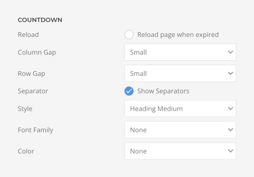
Reload the page after the countdown expires. Set the size of the column and row gaps between the numbers, and define the countdown style.
| Option | Description |
|---|---|
| Reload | Reload the page after the countdown expires. |
| Column Gap | Set the size of the column gap between the numbers. |
| Row Gap | Set the size of the row gap between the numbers. |
| Separator | Show a separator between the numbers. |
| Style | Select a predefined text style, including color, size and font-family. |
| Font Family | Select an alternative font family. Mind that not all styles have different font families. |
| Color | Select the text color. |
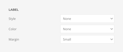
Set the style for the countdown labels.
| Option | Description |
|---|---|
| Style | Select a predefined text style, including color, size and font-family. |
| Color | Select the text color. |
| Margin | Set the margin between the countdown and the label text. |
Divider Element
The Divider element displays a horizontal divider which is why it has no content fields. Take a look at the divider element demo for a detailed showcase.
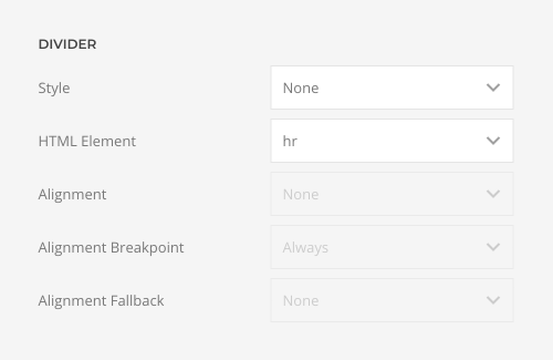
The divider has various style options. If set to Small, the divider can be aligned horizontally.
| Option | Description |
|---|---|
| Style | Choose a divider style. |
| HTML Element | Choose the HTML element independent of the style to fit the semantic structure. |
| Alignment | Set an alignment for the small divider. Center, left or right alignment may depend on a breakpoint and require a fallback. |
| Alignment Breakpoint | Define a device width from which the alignment will apply. |
| Alignment Fallback | Define an alignment fallback for device width below the breakpoint. |
Headline Element
The Headline element displays a headline. It has Content, Link, Image and Icon fields. Take a look at the headline element demo for a detailed showcase.
| Option | Description |
|---|---|
| Style | The headline has various style options. They differ in font size and font family. Optionally, outline the text. |
| Decoration | Decorate the headline with a divider, bullet or a line that is vertically centered to the heading. |
| Font Family | Select an alternative font family. Mind that not all styles have different font families. |
| Color | Select a color for the headline. |
| Link Style | If the headline has a link, select a hover effect. |
| HTML Element | Choose the HTML element independent of the style to fit the semantic structure. |
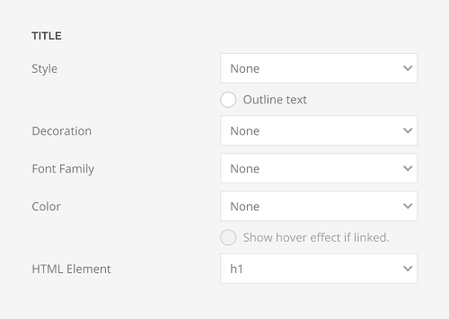
Options for the different content fields are very similar across all elements. They are described in the corresponding Image and Icon element documentation.
HTML Element
The HTML element displays custom HTML code and has one Content field. It has no element-specific options.
Icon Element
The Icon element displays an SVG icon. It has Icon and Link fields. Type in the name of the icon in the Icon field or click on the pencil to pick an icon from the icon library. Take a look at the icon element demo for a detailed showcase.
The icon has various color options. Additionally, set the icon width in pixels.
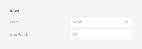
The linked icon can be displayed as a button or a link.

Image Element
The Image element displays an image. It has Image and Link fields. The image width and height options as well as the focal point and loading options are described in the files and images documentation. Take a look at the image element demo for a detailed showcase.
By default, the image is either loaded in its original size or resized using the width and height options. Alternatively, expand the height of the image to fill the available space in the column or adapt the image height to the height of the viewport, and optionally subtract the header height to fill the first visible viewport. The image will cover the element's content box.
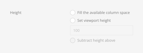
Choose between the rounded, circle and pill border style.

Set a box shadow for the image. Additionally, if the image is linked, set a separate box shadow for the image on hover.

The image comes with various box decorations. Additionally, select a floating shadow or a mask as a box decoration.

SVG images can be injected into the page markup and further styled with CSS. Optionally, enable stroke animation so that the image looks as it is being drawn.
| Option | Description |
|---|---|
| Inline SVG | Inject SVG images into the page markup so that they can easily be styled with CSS. |
| Animate Strokes | Enable stroke animation. |
| Image SVG Color | Select the SVG color. It will only apply to supported elements defined in the SVG. |

Set light or dark color mode for content shown on images.

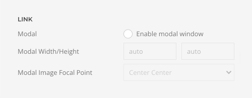
There is an option to open an image link in a modal. This could be an image, video, or YouTube or Vimeo link. Any other link will be opened in an iframe.
| Option | Description |
|---|---|
| Modal | Open the link in a modal window. |
| Modal Width/Height | Set the width and the height of the modal content, i.e. image, video or iframe. |
| Modal Image Focal Point | Set a focal point to control cropping. |
Newsletter Element
The Newsletter element displays a newsletter signup for Mailchimp or Campaign Monitor. Set their API keys in the External Services settings of YOOtheme Pro. Take a look at the newsletter element demo for a detailed showcase.
Choose whether the form fields are positioned next to each other or stacked. Additionally, if the layout stacks, make the button take the full width. In addition to the email address, the newsletter form can also collect the first and last names. There is an additional layout where the name fields are shown side by side while the email address and button stack. In this case, the button can have an extra top margin.

Set the size of the form fields as well as the gap between them.

Choose between the default and the blank newsletter style.

Select whether a button or a clickable icon inside the email input is shown. Options for the button style are described in the corresponding Button element documentation.

Overlay Element
The Overlay element displays an image with a content overlay. It has Image, Video, Title, Meta, Content, Link, Hover Image and Hover Video fields. Take a look at the overlay element demo for a detailed showcase.
By default, the height of the Overlay element is defined by its content. Alternatively, expand the height of the element to fill the available space in the column.

If the height is expanded, optionally set the bottom margin of any content field to auto to fill the available space in the element and push the following content fields to the bottom.

Choose between the rounded, circle and pill border style.

The overlay can be displayed as a cover or a caption. Show the overlay from the beginning or only on hover. Select a hover transition. Additionally, there is an option for the cover mode to only fade in the background while the overlay content is visible from the beginning.
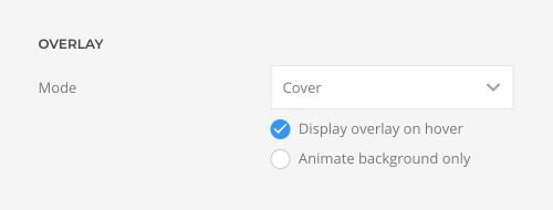
Mind, there is minimum height option for the image to prevent the content overlay from becoming larger than the background image on small devices.

The overlay has various style options. It can look like a transparent overlay or an opaque tile, or show just the content.

Set the text color for the overlay content to either light or dark. If necessary, inverse the text color on hover, for example, when using a hover image or when a different background fades in on hover. Optionally, blend the text color with image.
| Option | Description |
|---|---|
| Text Color | Set light or dark color mode for text, buttons and controls. |
| Inverse Text Color on Hover | Set an opposite text color on hover. |
| Blend with image | Blend the text color with image. |

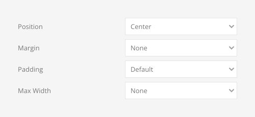
Select the padding between the overlay and its content. There are various options to position the overlay and its content in regard to the overlay image. Additionally, if a style is selected, apply a margin between the overlay and the image container and set the maximum content width.
| Option | Description |
|---|---|
| Padding | Set the padding between the overlay and its content. |
| Position | Select the overlay or content position. |
| Margin | Apply a margin between the overlay and the image container. |
| Max Width | Set the maximum content width. |
Select an image transition. If the hover image is set, the transition takes place between the two images.

Additionally, select a transition for the title, meta and content when the overlay appears on hover.

There are various options to link the Overlay element. Either link the title separately or link the whole overlay. Additionally, set the hover style for the title. The style is kept even if the whole overlay is linked.
| Overlay Option | Description |
|---|---|
| Overlay Link | Link the whole overlay if a link exists. |

| Title Option | Description |
|---|---|
| Title Link | Link the title if a link exists. |

Options for the different content fields are very similar across all elements. They are described in the corresponding Headline, Text, Image, Icon and Button element documentation. Options to recolor images and videos are described in the files and images documentation.
Note Mind that multiple overlays can also be displayed in the Gallery and Overlay Slider elements.
Panel Element
The Panel element displays content and an image in one element. It has Title, Meta, Content, Image, Video, Icon, Link, Hover Image and Hover Video fields, and for iframe videos, an additional Video Title field. Take a look at the panel element demo for a detailed showcase.
The panel has various style options. It can look like a card, tile or a blank panel. If a card style is selected, the image can also be aligned without padding.

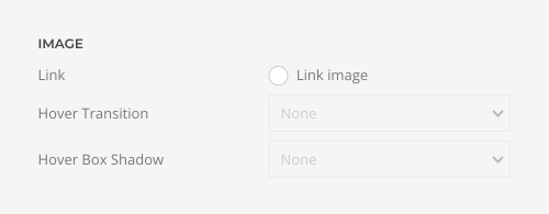
There are various options to link the Panel element. Either link the title, image and button separately or link the whole panel. Additionally, set hover styles for the title and image. These styles are kept even if the whole panel is linked.
| Panel Option | Description |
|---|---|
| Link | Link the whole panel if a link exists. Optionally, add a hover style. |

| Title Option | Description |
|---|---|
| Link | Link the title if a link exists. |
| Hover Style | Set the hover style for a linked title. |

| Image Option | Description |
|---|---|
| Link | Link the image if a link exists. |
| Hover Transition | Set the hover transition for a linked image. |
| Hover Box Shadow | Select the image's box shadow size on hover. |
By default, the height of the Panel element is defined by its content. Alternatively, expand the height of the element to fill the available space in the column. Optionally, expand the height of the image to fill the available space in the panel.

If the height is expanded, optionally set the bottom margin of any content field to auto to fill the available space in the element and push the following content fields to the bottom.

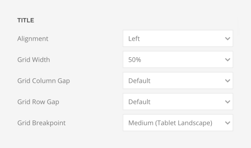
The panel title can be aligned to the left of the content. The title column width can be the same size as the title, a fixed width or percentage. Additionally, define the grid gaps and set the breakpoint from which the title stacks. Choose whether the meta text is aligned above or below title or content.
| Title Option | Description |
|---|---|
| Alignment | Align the title to the top or left in regards to the content. |
| Grid Width | Define the width of the title within the grid. Choose between percent and fixed widths or expand columns to the width of their content. |
| Grid Column Gap | Set the size of the gap between the title and the content. |
| Grid Row Gap | Set the size of the gap if the grid items stack. |
| Grid Breakpoint | Set the breakpoint from which grid items will stack. |
| Meta Option | Description |
|---|---|
| Meta Alignment | Align the meta text above or below title or content. |

The Panel element also has an option to force left alignment for the content. This way the whole panel can be centered, and only the content is left aligned.

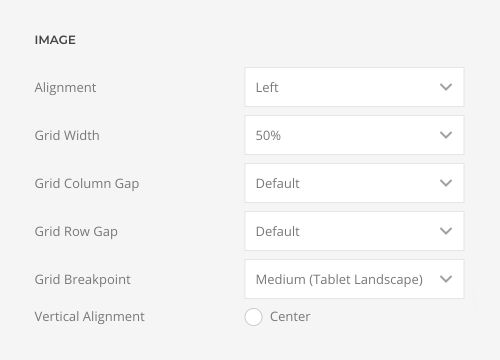
The panel image can be aligned in regard to the content. If aligned to the left or right, the image column width can be the same size as the image, a fixed width or percentage. Additionally, define the grid gaps and set the breakpoint from which the image stacks.
| Image Option | Description |
|---|---|
| Alignment | Align the image to the top, left, right or place it between the title and the content. |
| Grid Width | Define the width of the image within the grid. Choose between percent and fixed widths or expand columns to the width of their content. |
| Grid Column Gap | Set the size of the gap between the image and the content. |
| Grid Row Gap | Set the size of the gap if the grid items stack. |
| Grid Breakpoint | Set the breakpoint from which grid items will stack. |
| Vertical Alignment | Vertically center grid items. |
Options for the different content fields are very similar across all elements. They are described in the corresponding Headline, Text, Image, Icon and Button element documentation.
Note Mind that multiple panels can also be displayed in the Grid and Panel Slider elements.
Quotation Element
The Quotation element displays a quotation. It has Content, Author, Author Link and Footer fields. Take a look at the quotation element demo for a detailed showcase.
The quotation has various link style options.

Sublayout Element
The Sublayout element allows you to create sublayouts within the page builder. Sublayouts are regular page builder layouts but without sections. They consist of rows, columns and elements. This is because sections always take up the full width of the viewport and cannot be nested into each other.
For example, use sublayouts to nest page builder rows into each other or multiply a group of rows dynamically. Simply set a multiple items source on the Sublayout element and use it as a parent source within the sublayout.
Note Sublayout element has its own Rows layout type in the layout library. If Layout or Section layouts are loaded, all their sections will be stripped and just rows will be loaded.
Text Element
The Text element displays plain text and therefore has one Content field. Take a look at the text element demo for a detailed showcase.
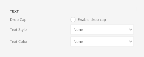
The text can display first letter of the paragraph as a large initial. It also has various style options. Additionally, choose a text size and color.
| Option | Description |
|---|---|
| Drop Cap | Display the first letter of the paragraph as a large initial. |
| Text Style | Select a predefined text style, including color, font size and font family. |
| Text Color | Select the text color. |
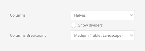
The text can be divided into multiple columns with optional dividers between them. Additionally, select a device for the column breakpoint.
| Option | Description |
|---|---|
| Columns | Set the number of text columns. |
| Show dividers | Show dividers between text columns. |
| Column Breakpoint | Set the device width from which the text columns should apply. |
Totop Element
The Totop element displays an icon which scrolls back to the top of the page. It has Title and Link Title fields. Take a look at the to-top element demo for a detailed showcase.
By default, the Totop element only displays an icon. Alternatively, type in the title which will be displayed next to the icon.
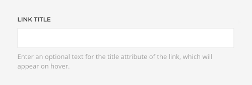
Options for the title field are described in the corresponding Headline element documentation.
Video Element
The Video element displays a video file or a YouTube or Vimeo video. It has Video, Poster Image and Play Icon fields, and for iframe videos, an additional Video Title field. The focal point option is described in the files and images documentation. Take a look at the video element demo for a detailed showcase.
Set the video dimensions. Make sure to add both width and height to prevent layout shifts.

By default, the video is either loaded in its original size or resized using the width and height options. Alternatively, expand the height of the video to fill the available space in the column or adapt the video height to the height of the viewport, and optionally subtract the header height to fill the first visible viewport. The video will cover the element's content box.

Load the video eagerly, lazily when it enters the viewport, or only after a placeholder image is clicked. If YouTube and Vimeo videos are loaded on click, no external requests are sent, and no JavaScript is loaded until the video is played. Additionally, if no placeholder image is selected for a YouTube video, YOOtheme Pro automatically displays the YouTube thumbnail. The image is downloaded and stored on the local server, ensuring no external requests are sent to YouTube.

Disable autoplay, start autoplay immediately or as soon as the video enters the viewport or only on hover. Optionally, if the autoplay starts when in view or on hover, restart the video from beginning.

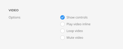
The video can show controls, loop, mute, and it can additionally play inline on mobile devices. Mind that the video file only autoplays on mobile when muted.
Choose between the rounded, circle and pill border style.

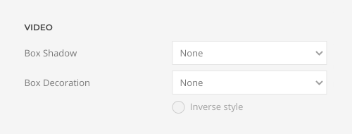
Set a box shadow or a box decoration for the video. Additionally, select a floating shadow or a mask as a box decoration.
Set light or dark color mode for content shown on videos.

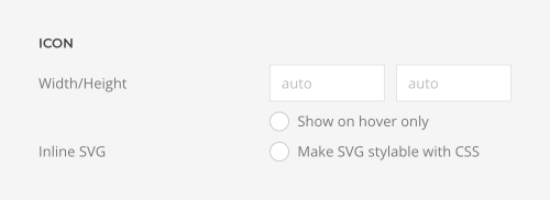
Choose an optional play icon if the video is loaded on click. Set its width and height, show it on hover only and make it stylable with CSS.
The Video element fully supports the consent manager for YouTube videos. Simply add the prebuilt YouTube script to show a placeholder if consent is required. The YouTube video will only be loaded on click, and before that, no external requests are sent, and no JavaScript is loaded. YOOtheme Pro automatically uses the YouTube thumbnail as the placeholder image. It's downloaded and stored locally, ensuring no external requests are sent to YouTube. Alternatively, select a different placeholder image in the Video element.
