YOOtheme Pro 4 – Next-Level Dynamic Content, Accessibility and Productivity
Today we are thrilled to announce the release of YOOtheme Pro 4, and it's huge! It brings dynamic content to the next level with game-changing features like parent sources, dynamic multiplication and nested multiple items sources. It also comes with a big accessibility update to make your sites WCAG-compliant, significant productivity update to speed up your workflow and tons of refinements for the page builder. Are you in? Let's go!
Make sure to subscribe to our YouTube channel and join our Discord Chat Server for all news and discussions.
Parent Source
The next three features build upon each other and together bring dynamic content to a whole new level. Let's start with the first one: parent sources. Now you can set a content source on a section, row or column and use it as a parent source by the elements within. So, for example, if multiple elements load content from the same source, you only need to select the source once and not for each element separately. This saves time and decreases the number of database queries which improves the overall page speed. Now rows also have the dynamic content option, so they can be used as a parent source just like section and columns.
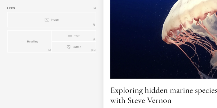
And to indicate a parent source is selected, we have a new dynamic content p status icon.
Dynamic Multiplication
The second feature is dynamic multiplication. As you all know, multiple items elements like the Grid element render as many items as available in the content source. Now you can do the same with sections, rows, columns and elements. Why would you do that? Well, multiple items elements do have a large variety of options, but sometimes that's just not enough. So now you can multiply a section, row or column and design a repeated layout part with the page builder. For example, set a multiple items source on a row and use it as a parent source in the elements within. The row will multiply as many times as available in the content source. Think about it! This opens up so many possibilities! For example, you are no longer limited to the number of content fields available in the Grid element. This is great!
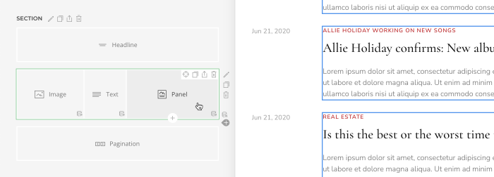
To indicate that a multiple items source is used, and a section, row, column or element is multiplied, we highlight it green, and add a new dynamic content n status icon, which stands for a natural number.
There are just a few things you need to keep in mind. If you multiply sections, make sure to remove the top or bottom padding to prevent double padding. If you multiply a single column, use the Whole layout and just set the width for the multiplied column. There is also a new alignment option for columns. By default, they expand to fill the row, but you can also keep the width and align them to the left or center. And we have new conditions to show or hide elements depending on the index of the multiple items source. This is very useful if a divider is part of your repeated layout, so you can hide it for the last item.
Nested Multiple Items Sources
You probably know where this is going, right? These two features lift a long-standing limitation of dynamic content: rendering nested multiple items sources. For example, if you want to render a list of categories with their latest posts. Now this is possible when a multiple items source is used as a parent source. This is because if a section, row or column renders the multiple items source, the element can render the related multiple items source.
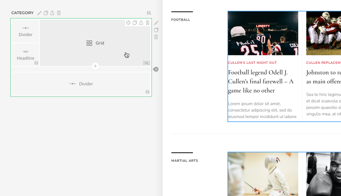
Since it is a multiple items source from a parent source, the element will show a pn status icon.
Nested multiple items sources are a real game-changer! Thanks to this feature, we were able to boil down the Categories layouts in some themes to just one repeating row.
Now let's add the Sublayout element into the mix.
Enhanced Sublayout Element
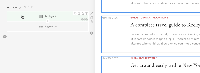
The Sublayout element now has general and advanced settings. This means you can set the position for the whole element, add a parallax animation, give it a name and, here it comes, select a dynamic content source. It can then be used as a parent source within the sublayout. This means you can multiply a group of rows by only setting a multiple items source on the Sublayout element. This is awesome, right?
Dynamic Content Sources
To get the most out of parent sources and dynamic multiplication, we have some additions to complement the content sources. Let's go through them one by one.
First, we extended custom taxonomy sources, like category and tag sources, so you can now load their articles as a related multiple items source.
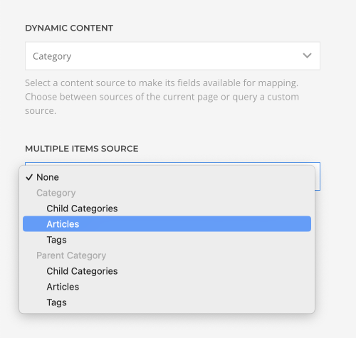
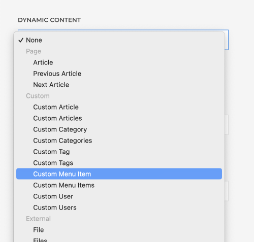
Second, we added all page sources as single item sources. This has two advantages. You can access their related multiple items sources like article tags, and use them instead of the multiple items source to show a single item. This way you won't have a highlighted green element in the layout with the n status icon when it is not multiplied.
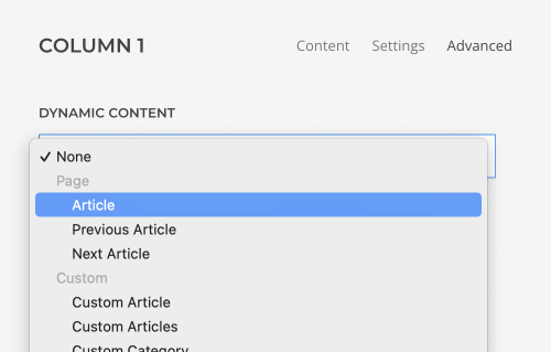
Finally, we added a single custom menu item source with its related child menu items, so, for example, now you can get sibling menu items. That's it!
We are really thrilled about this update! Parent sources speed up the workflow and database queries, dynamic multiplication gives you tons of new possibilities to create layouts, and rendering nested multiple items sources will significantly streamline your dynamic layouts. And guess what? We've reworked all dynamic content layouts in our theme packages to make use of the latest features.
That's all for dynamic content. Next is the accessibility update.
Accessibility
One of the takeaways from the JoomlaDay last year was how important accessibility is among the Joomla community. This is why YOOtheme Pro 4 comes with a huge accessibility update. It makes use of all accessibility improvements that we introduced in UIkit 3.16.
Our interactive JavaScript components, for example, slideshow and dropdown, are accessible for keyboard users. We've implemented the common keyboard navigation conventions in which the tab and shift+tab keys move focus from one component to another, while other keys like arrow keys move focus inside of components that include multiple focusable elements.
We also set relevant WAI-ARIA roles, states and properties to make sure the JavaScript components are readable and operable using assistive technologies like screen readers. Additionally, YOOtheme Pro automatically adds aria labels when necessary, for example, for form controls, search, logo link and breadcrumbs. Also, links in YOOtheme Pro have an additional aria label option.

Skip Navigation Link
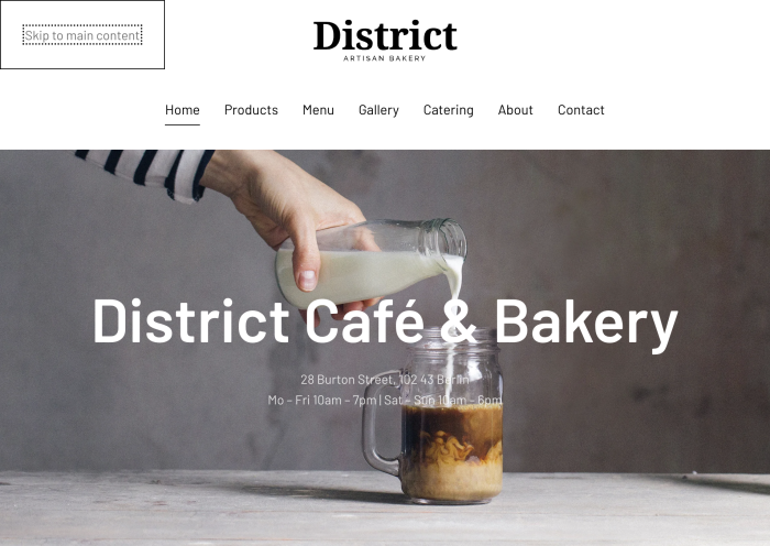
To avoid navigating a long list of links in the header navigation, YOOtheme Pro adds a Skip to main content link. It is hidden by default and becomes visible on focus by pressing the tab key.
Semantic HTML Elements
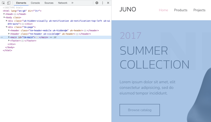
Last but not least YOOtheme Pro now uses the <header> and <footer> elements to define the site-wide header and footer sections, and the <main> element to identify the main content of any page.
And you can now select different content sectioning elements in the page builder to organize the layout into logical pieces. Containers like section, row, column and the Sublayout element can now use the <address>, <article>, <aside>, <footer>, <header>, <hgroup>, <nav> or <section> element.
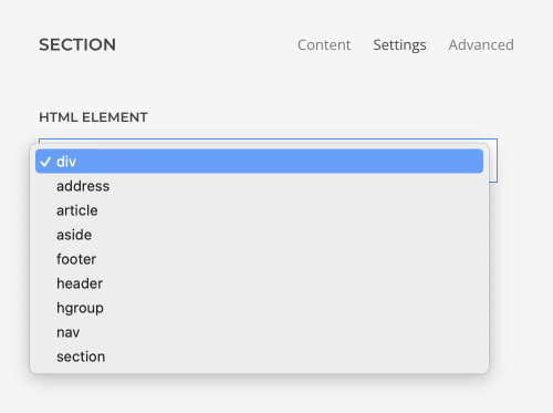
The Nav, Text, Panel and Overlay elements and items of multiple items elements have an HTML element option as well. This allows you to mark up the content of your website semantically in a way that is meaningful to assistive technologies.
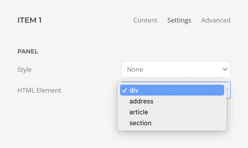
And to indicate which HTML element is selected, we have new HTML element status icons.
We are really excited that you can now create websites with YOOtheme Pro which comply with WCAG 2.1 standards. Of course, accessibility will still depend on your color contrasts and custom markup. Just check our new accessibility documentation for further details.
All right, that's accessibility for YOOtheme Pro. Next is our productivity update. Based on the feedback from the JoomlaDay, we have added a couple of power-user features to boost your productivity when working with YOOtheme Pro.
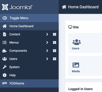
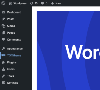
YOOtheme Quick Start Link
You can now open YOOtheme Pro directly from the menu in the WordPress and Joomla administration panels. So no matter where you are in Joomla or WordPress, YOOtheme Pro is just a click away.
Scroll Into View Icon
The next one is a real time-saver. If you have a large page layout, finding an element might be quite tedious. There is a new scroll into view icon right next to the edit icon in the sidebar that will automatically scroll the required element into view in the preview on the right and highlight it with a blue border. The same happens if you click the icon in the preview. Here the page builder sidebar will scroll into view.
Article Edit Button
Have you ever wished to edit custom fields of an article while working in the page builder? Now you can! Just hover the layout title and click the edit icon. This will open the Edit Article view from Joomla where you can change the article title and all its custom fields.
Element Transform
Next we have a feature many of you have been waiting for! You can now transform an element into a different builder element. This is great in so many ways! Obviously, if your element has static content, you can just switch to a different element without having to copy all your content. But even if you are using dynamic content, you save so much time because the dynamic content sources and all the relevant element settings are kept. What is really cool is that you can even transform your element into an element preset. Here only the settings will be adopted. This way you can click your way through the Pro preset library and see how your content looks with different element presets.
Parallax Option
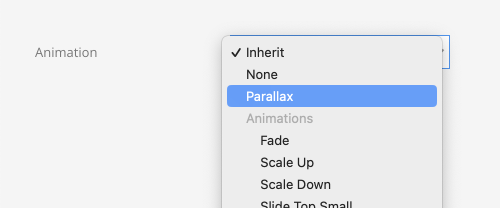
This is a small thing, but if you are working with the Parallax animation, you will love it. We moved the Parallax option to the top of the animation options and grouped all the other individual animations. No more scrolling for you!
That's our productivity update. Next are page builder refinements.
Image Focal Point
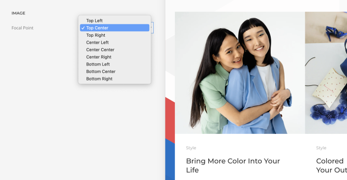
YOOtheme Pro 4 comes with a new focal point option for images across all elements. As you know, YOOtheme Pro resizes and crops images automatically. However, before, when cropped, the images were always centered, which was especially tricky for images that display persons. After all, you do not want to cut somebody's head off. Now you can set a focal point and choose the direction how the images are cropped.
Parallax Blur
There is also a new blur property in the Parallax settings. So you can follow the trend and blur out elements on scrolling.
6 Column Layouts
Since grid elements can have up to six columns, we also added 6-column layouts for rows. There are three presets, but of course you can define the column widths individually as usual. This may be just the thing for your next footer layout.

Element Updates
We have even more improvements across different elements. Let's go through them one by one.
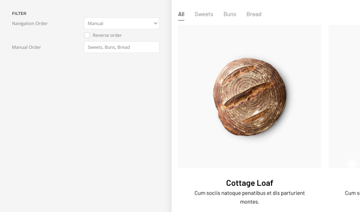
You can now manually order the filter navigation in Grid and Gallery elements.
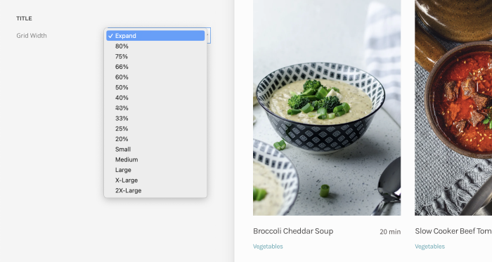
The Panel, Grid, Panel Slider and Switcher elements can now expand the title width to push a short content to the right if they are aligned side by side.
We added field mapping for the ID option across all elements.

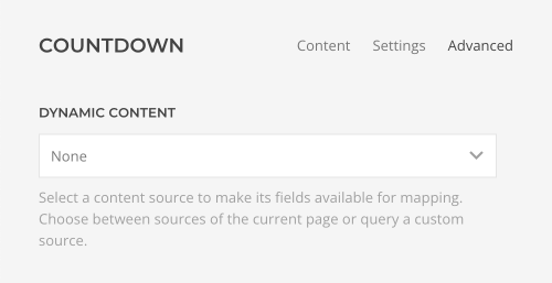
The Countdown element has the dynamic content option, so you can now map the date dynamically.
And the Social element has an inline SVG option to style the icons with CSS.

Transition Border
Remember the new transition border we introduced with the Dennis Miller theme for the Panel, Grid, Overlay and Gallery elements? Well, now it has a direction mode option. The border can animate inside or outside an image or a video.
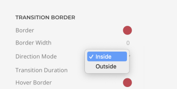
We also updated all styles and added a nice transition border for each. So just update YOOtheme Pro and start using it for your images or videos.
Category Template Filter
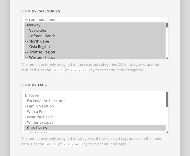
For one of our upcoming theme packages we want to have a page with articles filtered by category and tag. In Joomla, you can simply add a menu item for the category blog page and select tags there to filter the articles. And in WordPress you have to set a URL parameter to filter the category archive page by additional tags. To create a dedicated template for these pages, we changed the filter for the template assignment of the category blog page. Before you could limit the template to tags of the category, which doesn't make much sense. Now the tags are actually article tags, so you can create a specific template for a category blog page with articles, which are additionally filtered by a tag.
Header Social Icons
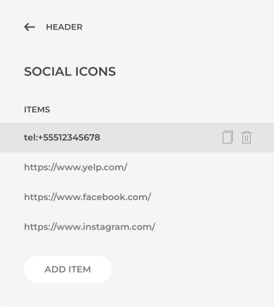
We also updated the social icons settings in the header and mobile header layouts. We replaced the links with content items, just like you know from the Social element. This means you are no longer limited to 5 links, and you can select a specific icon or an image for each link.
Favicon
There is an optional SVG favicon which will be used instead of the PNG image by modern browsers.
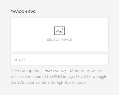
What's nice about it is that you can use CSS to toggle the SVG color scheme for light/dark mode. Here is an example of how you can do it.
<svg xmlns="http://www.w3.org/2000/svg" width="96" height="96" viewBox="0 0 96 96">
    <style>
        path { fill: #222; }
        @media (prefers-color-scheme: dark) {
            path { fill: #fff; }
        }
    </style>
    <path d="…"/>
</svg>
In WordPress the favicon will be used in the admin area as well.
Image Quality
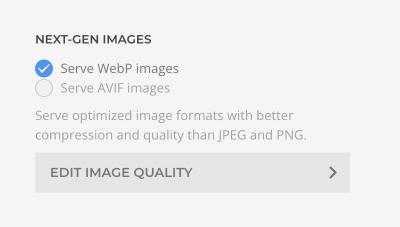
As you know, YOOtheme Pro is a real Pro when it comes to serving images. It resizes them on the fly, auto-generates up to 6 sizes and even in different next-gen formats. Now you can also define the image quality in percent for all the different formats. We recommend to keep the default values, unless, for example, you are a photographer and need higher image quality. But keep in mind this will have a negative impact on page loading times.
WordPress Popular Posts
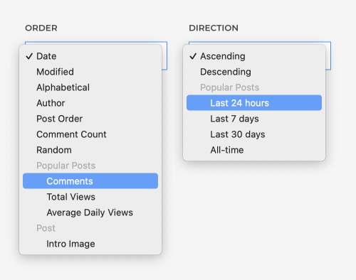
Remember WordPress Popular Posts? We use this plugin as an equivalent to Joomla hits to sort posts by popularity. Until now, you had to use a separate custom source. This was quite limiting because it also meant that related sources could not be ordered by popularity. Now you can order posts by popularity in the oder and direction options, just as you would expect.
German Translation
On JoomlaDay last year we noticed the German translation of YOOtheme Pro was not ideal. So we took some time and completely revised the German version. But we still need your help with the other languages. So if you want to contribute to existing translations, please sign up to the OneSky App. We truly appreciate it!
Further Improvements
YOOtheme Pro 4 comes with some further smaller improvements and fixes. For example, disabled elements are no longer shown in the customizer preview. So no more confusion.

Smooth scrolling works with absolute URLs as well. The page locale and url fields are available for mapping in the site source.
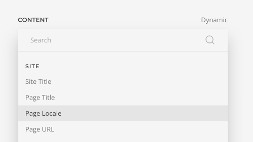
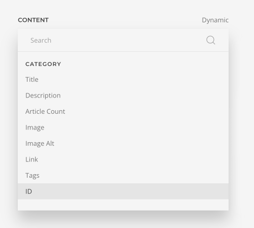
And the id field in general for any source.
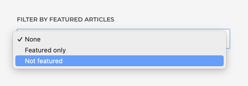
You can exclude featured articles from custom sources in Joomla.
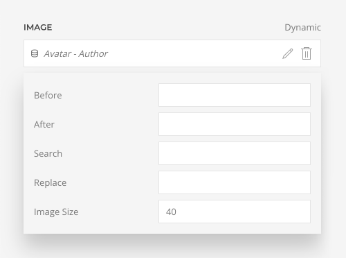
And in WordPress you can set the size for the user avatar field.
Oh, and we now support YouTube Shorts URLs in the Video element. The Leaflet library, as well as GoogleMaps Markerclusterer scripts, are now loaded locally and not from a CDN. The fewer requests to a third-party service, the better for GDPR. Last but not least, we raised the required PHP version from 7.2 to 7.4 and updated the GraphQL library to 15.2. For the full list of features and fixes, check out the changelog.
Breaking Changes
YOOtheme Pro 4 itself does not have any breaking changes for end users. However, we refactored parts of the framework as a preparation for upcoming features. This could break backward compatibility for third-party extensions. But we are very thankful that our developer community is so active and already updated their extensions during the beta phase. Kudos to you guys 🙌 So make sure to update all your YOOtheme Pro third-party extensions to the latest version first, and only then update YOOtheme Pro itself.
If you are using a child theme and override the index.php file in Joomla, or header.php and footer.php files in WordPress, you have to update them according to YOOtheme Pro 4 by adding the <main> and <footer> elements. Otherwise, the transparent header option will stop working. Also, do not forget to add the <header> element to the templates/header.php.
Last but not least, since we also refactored the element markup, some custom CSS may break in really rare cases. Unfortunately, there is one in the Dennis Miller layouts. But we have prepared a Dennis Miller support thread where you can see how to get it fixed.
Next Steps
What an update, right? Parent sources, dynamic multiplication and nested multiple items sources unlock so many new possibilities for your layouts. And together with the accessibility and productivity updates, as well as all the other page builder refinements, we think YOOtheme Pro 4 will make a difference in so many ways.
Next, we plan to switch back from yearly major releases to a shorter release cycle. We already have a couple of theme packages in the works which will be bundled with smaller YOOtheme Pro feature releases.
Now go ahead and take YOOtheme Pro 4 for a spin. As always, we are looking forward to your feedback, so let us know what you think in the comments below.
