Dennis Miller – A Photographer Theme for WordPress and Joomla
Say "Cheese" and welcome Dennis Miller – our new theme package for WordPress and Joomla. It's perfect for a personal website for a photographer, director or any other artist where you can showcase your work and services. The creative topic of our new theme package is reflected both in the style and the layouts. Dennis Miller comes with 11 content-rich page layouts, great looking styles and many beautiful images. Intrigued? Let's get right into it.
Make sure to subscribe to our YouTube channel and join our Discord Chat Server for all news and discussions.
Page Layouts
Dennis Miller comes with 11 different layouts for all kinds of page types. All layouts can easily be loaded from the layout library with just a click. Here is a walk-through of all the highlights.
| Page | Type | Description |
|---|---|---|
| Home | Page | The Home page presents the photographer and his work in fluid sections with no clear visual boundaries. Steplike layouts of images and videos are connected by vertically aligned bold typography and a parallax effect creating a dynamic look. The page ends with a call to action section and a footer using a nice parallax effect. |
| Work | Page | The Work page is an overview of all projects. Here again the images and videos and are shown in a steplike gap-free layout with the absolutely positioned typography and the parallax effect. The page looks like one large section, very fluid and dynamic. At the end there is a call to action. |
| Jacob Peterson | Page | The Jacob Peterson page is a case study of a project. It starts with a hero section with a prominent image and project date vertically aligned on top. It is followed by an informative about section, steplike-arranged image impressions alternating with small text sections and a call to action at the end. |
| Daniel Brighton | Page | This is an alternative case study, this time for a video project and in a secondary style. The hero section has a play button to open the video. Next comes an about section, followed by an image gallery in a grid layout. Unlike the previous page, the focus here is on the image impressions and not text. The page ends with a more prominent call to action section. |
| About | Page | There is an About page that starts with the photographer's image, quote and links to social media profiles showed in a side by side layout. Next comes the biography followed by CV and a list of clients. Of course, there is a call to action at the end, this time with an image slideshow that expands to the right. |
| Services | Page | The Services page is an overview page that starts with a hero section followed by a grid presenting all services with links to their sections. Each service has a vertically aligned typography as the section heading. Here again the images have a shifted steplike layout, but more horizontally arranged. Next comes a section with additional services and two call to actions divided by a list of clients. |
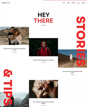
| Blog | Template | Dennis Miller also has a Blog page that starts with a greeting and shows the latest news in a steplike layout. The first row shows articles in three columns followed by two rows of two columns. A nice effect is created with the box decoration that visually connects the post image and its title. |
| Post | Template | The Post page starts with the full-screen post image followed by the post title and the post itself centered in the middle. Vertically aligned typography is positioned on the left and right side of the content and is slightly animated on scrolling. Latest posts are shown at the bottom. |
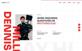
| Contact | Page | Of course, there is also a Contact page that shows all the important information like the location of the studio, links to social media profiles and contact possibilities. |
| Imprint | Page | Dennis Miller has an Imprint page for the legal information. |
| Error 404 | Template | Finally, there is also an Error 404 page in a secondary color showing a link back to the home page. |
Fluid and Dynamic Layouts
The Dennis Miller website comes with really creative layouts where sections smoothly flow into each other with no visual boundaries. Images and videos have different orientation and are arranged side by side without any gaps creating a steplike layout. We used vertically aligned headlines which slide across different sections making it look as if everything was one large fluid section. What brings everything together is the pattern in the foreground which has the same color as the vertical headlines. Thanks to the mix of images and videos and the heavy use of parallax effects, all Dennis Miller layouts look dynamic, fluid and truly unique.
Style
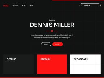
Dennis Miller has a modern flat style with a bold primary and a dark secondary color. This contrast is emphasized by primary and secondary cards and buttons which switch colors on hover. The same effect is used in forms that have a thick bottom border which on focus changes to the primary color. The Dennis Milles style also has bold typography with a sans-serif font and uppercase headlines. Rounded corners for buttons across different UI elements as well as a hand-drawn asterisk divider icon add to the playfulness of the theme. Together with the checked pattern in the foreground the Dennis Miller style will give your site a bold artistic look.
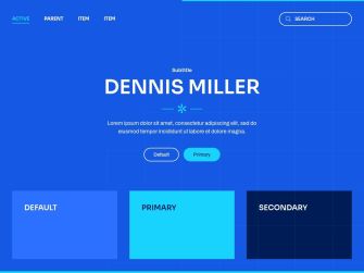
In addition to the default style Dennis Miller comes with 5 other style variations, each with a different beautiful color scheme. In this theme, we went all in with the colors again. There is one more white style with a more reserved olive green color and two black styles. The first one is basically the same as the default style, but in black, while the second one has a bright green primary color. But we also created two really special colored styles. You can choose between a red background and a striking yellow primary color or a blue background and a striking turquoise primary color. Both color combinations can be seen in brutalist web design and are quite daring. As always, you can switch the whole look and feel of your website with just a click. Simply choose what fits your website best!
Foreground Pattern
One of the first things that catch the eye when looking at the Dennis Miller style is its custom-made foreground. It has a checked pattern which covers the entire page but does not prevent you from accessing and clicking the content. Since it is semitransparent, it sometimes looks as if it was in the background, but it isn't, which makes it so interesting. And since it has a reduced version of the primary color, the pattern perfectly fits any style.

Image Border on Hover
There is a new hover effect for images in the Overlay, Gallery and Overlay Slider elements. It shows a thick border in a bold primary color on hover. The border animates from the outer corner inwards and in addition with a scale up transition really brings attention to any image or video.
Mask and Box Decorations
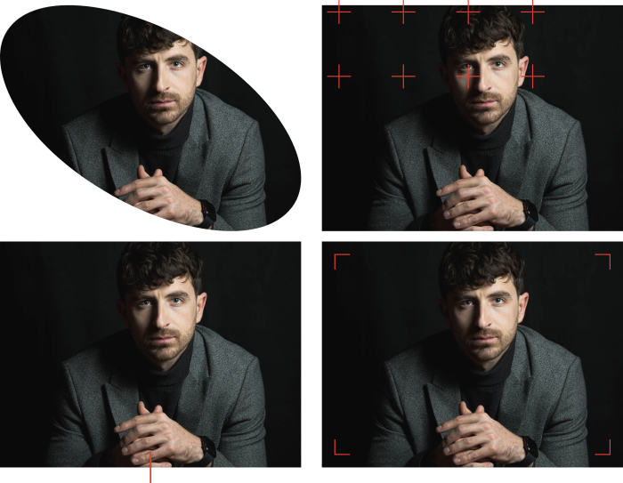
Dennis Miller comes with an ellipse mask and 3 different box decorations. Two box decorations use camera-inspired icons matching the photography topic, while the primary box decoration is perfect to connect a text following the image.
Page Border
Another creative element in the Dennis Miller theme is its top page border. This thick line in a primary color starts at the center of the page right at the beginning of the foreground pattern. At the bottom, the page border has the same line as at the top but across the whole page.

Content Types and Custom Fields
Since Dennis Miller does not focus on content structure, it only uses dynamic content for its blog and post pages and has only 1 custom field in WordPress for the post intro image.
Post
The default Post has 1 custom field in WordPress for the intro image.
| Post Field | Type (J) | Type (WP) | Description |
|---|---|---|---|
| Intro Image | - | image | Intro image used to tease the post |
Free Quality Stock Images
Dennis Miller comes with more than 70 lovingly curated and free-to-use images. They can be found in the Dennis Miller collection in the Unsplash library.

3rd Party Integrations
The Joomla and WordPress demo websites make use of several 3rd party plugins. We support WooCommerce, Advanced Custom Fields, Toolset, Custom Post Type UI, WordPress Popular Posts, the Regular Labs Articles Field and more. For more information on all pre-installed and activated plugins, take a look at the installation documentation for Joomla and WordPress.
So these are the features of our new Dennis Miller theme package for Joomla and WordPress. Now go ahead and explore it yourself. As always, let us know what you think in the comments below.
- A photographer website
- 11 premium page builder layouts
- 6 beautiful styles
- 70+ lovingly curated and free-to-use images
- Ready-to-use Joomla and WordPress demo websites


