Union Dental – A Doctor's Office Theme for WordPress and Joomla
Say hello to Union Dental – our new theme package for WordPress and Joomla. It's perfect for a doctor's office website, for example for dentists, physicians, dermatologist, or any other medical or health related websites. Union Dental showcases all the latest YOOtheme Pro 2.7 features like the tile styles for grid elements and sticky columns. It comes with 16 content-rich page layouts, great looking styles and many handcrafted icons and illustrations. Let's get right into it.
Make sure to subscribe to our YouTube channel and join our Discord Chat Server for all news and discussions.
Page Layouts
Union Dental comes with 16 different layouts for all kinds of page types. To show all the different health services in a diverse and more exciting way, we have added 5 services layouts. All layouts can easily be loaded from the layout library with just a click. Here is a walk-through of all the highlights.
| Page | Type | Description |
|---|---|---|
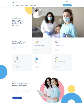
| Home | Page | The Home page presents the dentists' office starting with a hero section and an overview of main services. It is followed by two about sections with an image gallery as well as a grid of benefits. The page ends with a contact section and a call to action. |
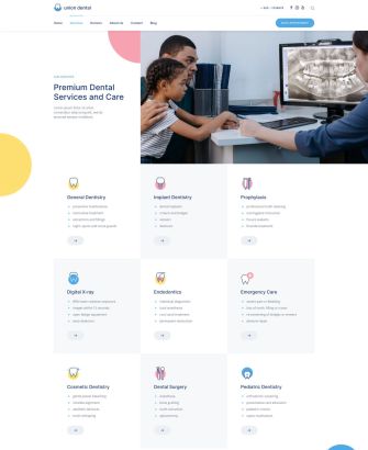
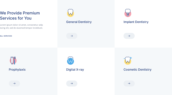
| Services | Page | Services is an overview page that starts with a hero section followed by a grid presenting all services with links to their pages. The highlight here is the gap-free chess pattern used for the grid items. Next comes another grid with benefits as well as FAQs. |
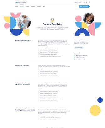
| General Dentistry | Page | The General Dentistry page has a two column layout. The column on the right sticks to the top of the viewport while scrolling down. The page ends with a doctors section and a call to action. |
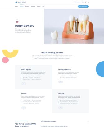
| Implant Dentistry | Page | The Implant Dentistry page is another service layout but it is further divided into even smaller services. Here too a chess pattern is used, there is a FAQs section, links to doctors and a call to action. |
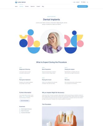
| Dental Implants | Page | The Dental Implants page starts with a prominent hero section with geometric shapes. It is followed by more information about the service with a sticky column, this time on the left. And as other services layouts, the page ends with a doctors section and a call to action. |
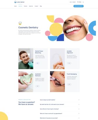
| Cosmetic Dentistry | Page | Another typical services page which could also be used as an overview. It starts with a hero section using geometric shapes image, followed by a grid with its further services. The page ends with FAQs and a link to doctors pages. |
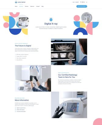
| Digital X-ray | Page | Finally, last services page has an alternating layout and a link to the doctors pages. |
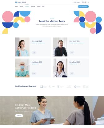
| Doctors | Page | The Doctors page presents the team with a link to their detail pages and a call to action section. |
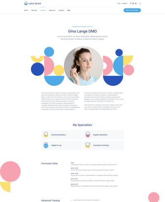
| Gina Lange DMD | Page | This detail page is an example for a doctors page. It starts with a prominent hero section with the image, information about the person, CV and contact information. |
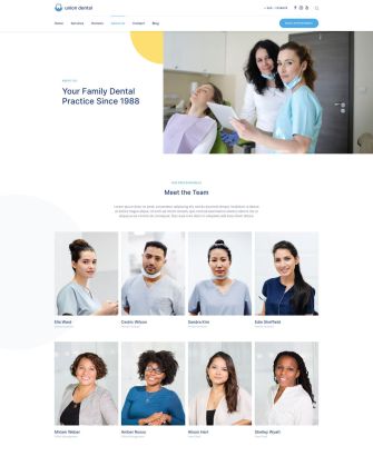
| About Us | Page | The About Us page shows the information about the dental office along with a full team and a list of values. The office images are shown in a slideshow followed by open positions and latest news. |
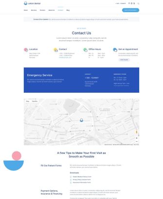
| Contact | Page | There is also a mandatory Contact page that starts with an alert which shows important information. It is followed by a hero section with the contact information like the location, office hours and contact possibilities. Next comes an emergency contact section and a map. The page ends with further useful information and a call to action. |
| Blog | Template | Union Dental also has a Blog page that shows the latest news in a three-column layout. |
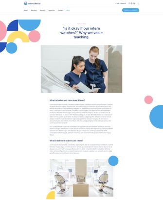
| Post | Template | The Post page starts with the post title followed by the image and the post itself. The page ends with the information about the post author and links to latest posts. |
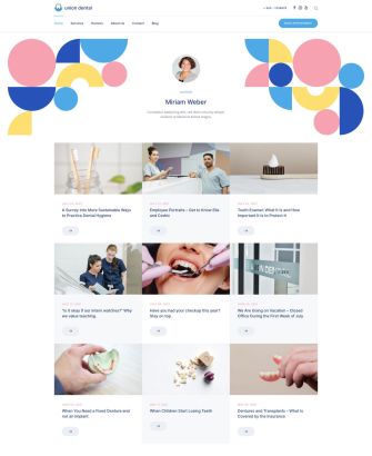
| Author | Template | The Author page starts with the author image, name and description. It is followed by all author posts displayed in a three-column layout. |
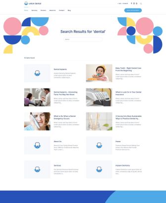
| Search | Template | There is also a Search page with the search form in the navbar. The search results are shown in a two-column layout. |
| Error 404 | Template | Finally, Union Dental has a colorful 404 Error page with the secondary background color showing a link back to the home page. |
Grid Tiles
Doctors often provide many different medical services. To display them in a well-arranged services grid, we created a chess pattern for the grid items. Here we use alternating default and muted tiles which we introduced in our recent YOOtheme Pro 2.7 release. This is a neat way to present many services and a nice option for your future layouts.
Geometric Shapes
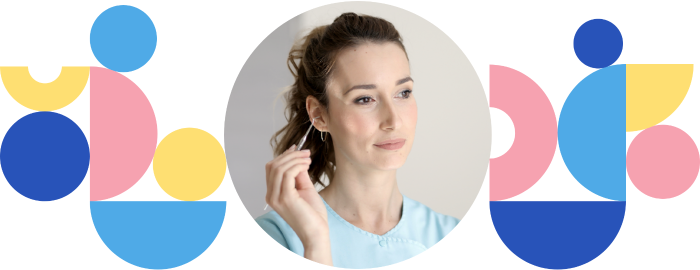
To make a welcoming impression and set the visitors in a good mood, Union Dental uses colorful geometric shapes throughout its layouts. They are absolutely positioned in the layout as well as used in content images creating different patterns and reflecting the colors used in the style. Their colors and shapes give the site a high recognition value and make the whole topic more inviting and friendly.
Sticky Column
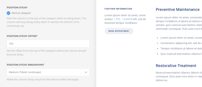
The Dental Implants layout uses another option from YOOtheme Pro 2.7 that allows sticking the column to the top of the viewport while scrolling down. This way the information in the column, in our case the download files and contact information, is sticky and shows until the end of the row is reached.
Style
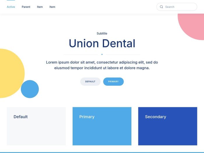
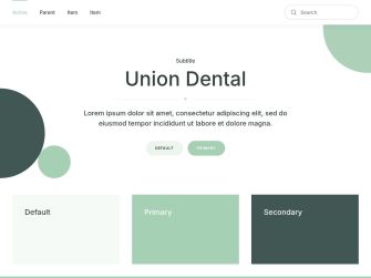
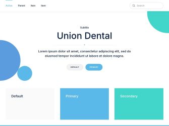
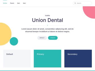
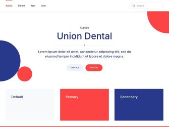
Union Dental has a versatile flat style with bright pleasant colors chosen specifically to lighten up the dentistry topic. This cheerful color scheme is used throughout the UI components and geometric shapes. Even the typography is not black but deep blue. Speaking of typography, for Union Dental we went for a modern but practical sans-serif font. Semibold headlines ensure good legibility, which is very important for such a serious topic. Union Dental style also mostly has sharp edges, except for the buttons, forms and labels which are rounded. The forms are also outlined and have thick borders making them more prominent. Even though the style is flat, the sticky navbar has a slight box shadow to clearly separate it from the rest of the page. All in all, the Union Dental style will give your website a pleasant and professional look.
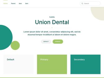
In addition to the default style Union Dental comes with 5 other style variations, each with a different beautiful color scheme. All 6 styles are colorful and have a white background. Of course, you can switch the whole look and feel of your website with just a click. Simply choose what fits your website best!
Box Decoration
Union Dental comes with 3 different box decorations that use colorful geometric forms on two opposite image corners. They are absolutely positioned in the foreground and thanks to their different color and form will make any image or video an eye-catcher.

Ripple Effect
We added a new ripple effect to the buttons and cards. When hovering an element, a smooth ripple animation starts from the bottom center of the element and moves upwards until it fully covers it with the new color. The effect uses muted colors except for elements with the primary color which change to the secondary color and vice versa. The ripple effect gives users a nice visual feedback when browsing the site.
Hover Animations
There is a new animate mode for the pagination, slidenav and totop buttons. On hover their arrow icon slides away and quickly comes back. The text button also has a hover animation. Here a bold line in the primary color slides in from left to right underlining the button.
Handcrafted Icons
We added new icons specifically for our Union Dental theme package. These display different dental services in a playful colorful manner. Of course, you can change their color and use them with any style.
Content Types and Custom Fields
Since Union Dental does not focus on content structure, it only uses dynamic content for its blog and post pages.
Post
The default Post has 1 custom field in WordPress for the intro image.
| Post Field | Type (J) | Type (WP) | Description |
|---|---|---|---|
| Intro Image | - | image | Intro image used to tease the post |
Author
In Joomla the User has 3 custom fields to display the avatar and biography while in WordPress these fields are available by default.
| User Field | Type (J) | Type (WP) | Description |
|---|---|---|---|
| Image | media | - | User image |
| Image Alt Text | text | - | User image alt text |
| Description | textarea | - | User biography |
Free Quality Stock Images
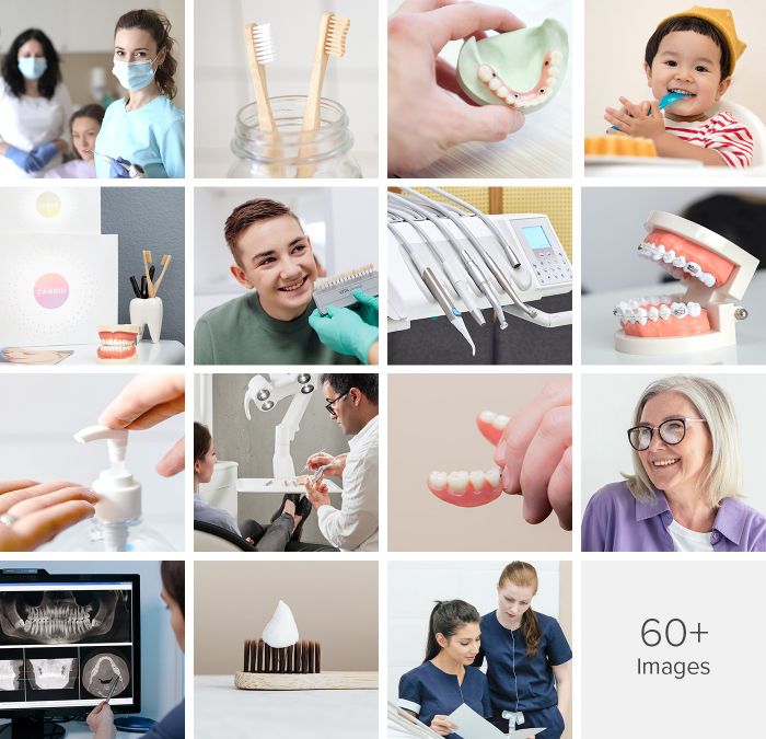
Union Dental comes with more than 60 lovingly curated and free-to-use images. They can be found in the Union Dental collection in the Unsplash library.
3rd Party Integrations
The Joomla and WordPress demo websites make use of several 3rd party plugins. We support WooCommerce, Advanced Custom Fields, Toolset, Custom Post Type UI, WordPress Popular Posts, the Regular Labs Articles Field and more. For more information on all pre-installed and activated plugins, take a look at the installation documentation for Joomla and WordPress.
So these are the features of our new Union Dental theme package for Joomla and WordPress. Now go ahead and explore it yourself. As always, let us know what you think in the comments below.
- Doctor's office website
- 16 premium page builder layouts
- 6 beautiful styles
- 60+ lovingly curated and free-to-use images
- Ready-to-use Joomla and WordPress demo websites
