Circle – An App Theme Package for WordPress and Joomla
Who's ready for a new theme package? Say hello to Circle – our new theme package for WordPress and Joomla. It's perfect for software, apps or any other product-related websites. Circle is one of those themes where it is all about the design. For the style we went with glassmorphism with glowing gradients and combined it with some stunning sticky parallax effects in the layout introduced in our latest YOOtheme Pro 3.0 release. Circle comes with 14 content-rich page layouts, great-looking styles and many handcrafted icons and illustrations. This and more coming up!
Make sure to subscribe to our YouTube channel and join our Discord Chat Server for all news and discussions.
Page Layouts
Circle comes with 14 different layouts for all kinds of page types. They can easily be loaded from the layout library with just a click. Here is a walk-through of all the highlights.
| Page | Type | Description |
|---|---|---|
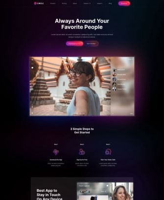
| Home | Page | The Home page shows the product hero section followed by multiple feature sections with alternating layouts. The main highlight is the parallax effect with an image in the center slowly moving down. It is surrounded by floating images which are animated with different speed while scrolling. To top it off we added a rotating swirl image in the background. Next comes an overlay slider with latest customer reviews. The page ends with a colorful call to action section in a primary color which reveals the sticky footer section underneath. |
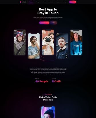
| Product | Page | The Product page has even more eye-catching sticky parallax effects. It starts with a hero section with five images which move in different directions on scrolling. Here again, there is a rotating swirl image in the background. The next three product features have a sticky image in the center and floating elements in the fore- and background. They are followed by two feature sections with grid layouts. The next one is really cool. Here we have text panels on the left and corresponding sticky images on the right which fade in on scrolling. Then comes a classic feature grid with icons followed by a feature section with a sticky background video and animated text on top. It looks like movie credits. The page ends with a call to action revealing the footer. |
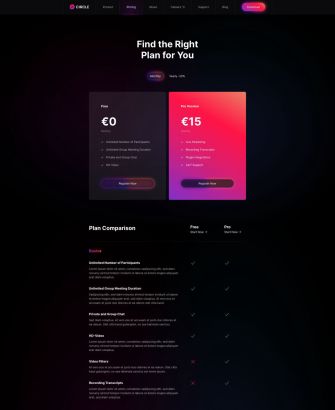
| Pricing | Page | The Pricing page shows a typical pricing table. Here you can switch between monthly and annual pricing. Next comes a table comparing the plans followed by a contact link, FAQs and a call to action. |
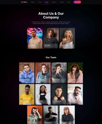
| About | Page | The About page shows the information about the company and its values. Here you will find the founders, team, a link to careers as well as the company's philosophy. The event images are beautifully arranged using the position option and are animated with the parallax effect. The swirl image is rotating underneath. Next there is an overlay slider with user reviews as well as a contact call to action. |
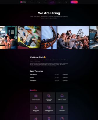
| Careers | Page | As the name suggests, the Careers page presents all open positions. It starts with an overlay slider of company events followed by a list of open positions and a grid with benefits. |
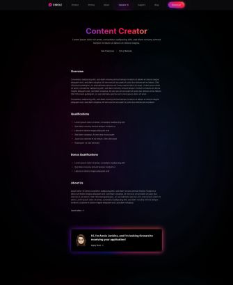
| Job Description | Page | The Job Description page is a detail page for a specific position. It provides all the needed information like qualifications and a contact link. |
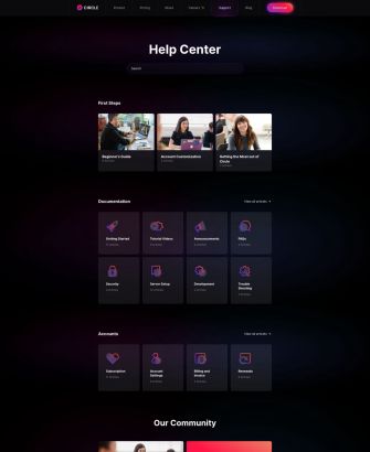
| Support | Page | The Circle theme also has a typical Support page that starts with a prominent search bar at the top followed by grids with links to tutorials, documentation, account and community benefits. |
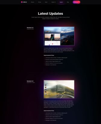
| Updates | Page | The Updates page is basically a changelog of latest updates. The app version is shown in a sticky column on the left, while the improvements and fixes are shown on the right. The page ends with a link to the support page. |
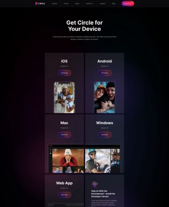
| Downloads | Page | Since Circle is an app, there is a specific Download page with download links for different operating systems. |
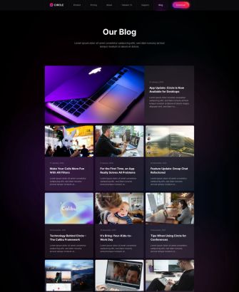
| Blog | Template | Circle also has a Blog page that starts with the latest blog post shown at the top followed by all other news presented in a three-column layout. The page ends with a call to action section. |
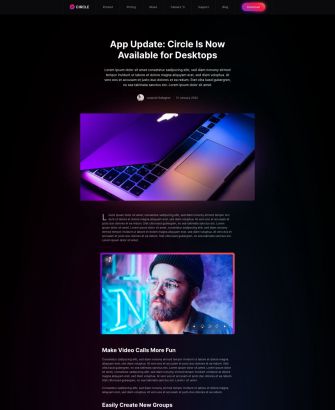
| Post | Template | The Post page starts with the post title, into text, meta information followed by the post image and content. Latest posts are shown at the bottom together with a call to action section. |
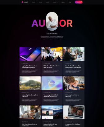
| Author | Template | The Author page starts with the author image, name and description. It is followed by all author posts displayed in a three-column layout. |
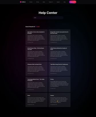
| Search | Template | There is also a Search page with the search form on the support page. The search results are shown in a two-column layout. |
| Error 404 | Template | Finally, our Circle theme has a fun 404 Error page with a link back to the home page. |
Sticky Parallax Effects
Have you seen all those cool sticky parallax effects? This is one of the new features of YOOtheme Pro 3.0 which we wanted to show in action. Now let's take a look at how they work.
In the simple case, we make a section or a row multiple viewports high, set one column to sticky and then add elements with parallax effects. Often the main element is centered within the column while others are positioned absolutely in the fore- or background.
If you have more than one main element, you can of course use multiple sticky columns.
In some cases, the section or row don't have a fixed height. Instead, we have an additional column which is not sticky. The content of this column defines the height and therefore the duration of the parallax animation.
To create a sticky background effect, you need a row with a column which has a height of one viewport and is sticky within its section. Add a background image or video to your column. In the second row, add elements with the parallax effect and make sure that their height is larger than the viewport. At last, pull the second row above the previous one using margin-top: -100vh.
If this sounds too complicated, just load the corresponding page layout with one click from the layout library.
Reveal Sticky Section
Circle makes use of the new sticky effects for sections. Its footer section is revealed by the previous section. Here it looks even more prominent because the previous section is the colorful call to action. Of course, on scrolling up the footer is again covered by the call to action.
Style
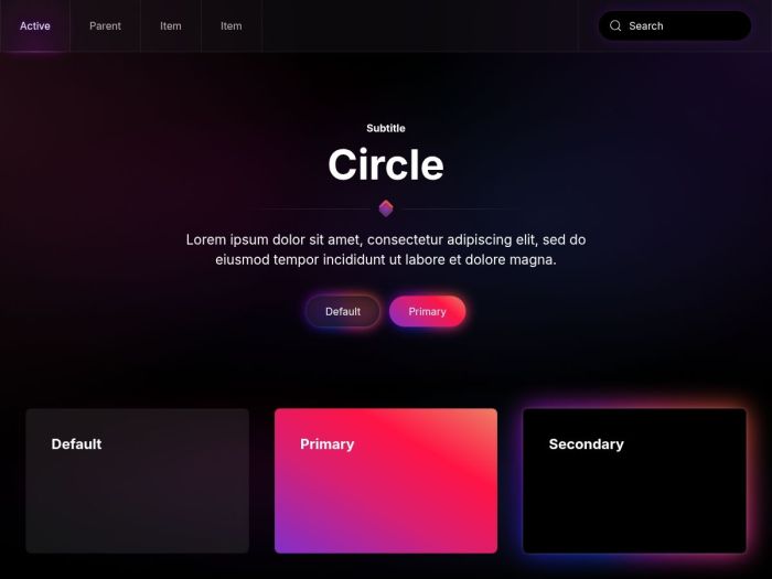
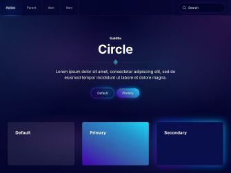
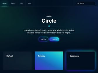
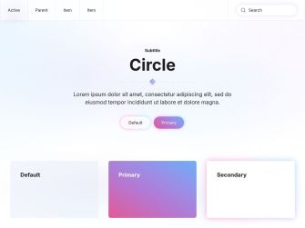
Our Circle theme package is all about glassmorphism and glowing gradients. UI elements in the default style have a black frosted-glass effect with a glowing backlight. In the secondary style they have the same color as the background so that the glow looks even more prominent. And for the primary style, we use flashy gradients. In addition to the colored conic glow, we also have a more subtle plain glow for forms and the navbar. For typography, we went with a modern sans-serif font with bold headlines. Finally, rounded corners, border gradients for dividers and little details like the divider icon add to the playfulness of the theme and give it a dynamic look.
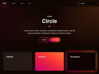
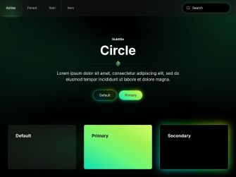
In addition to the default style, Circle comes with 5 other style variations, each with a different beautiful color scheme. We have 3 black and 2 dark style variations with striking primary colors. And there is one style variation with a white background and more pastel colors. Of course, you can switch the whole look and feel of your website with just a click. Simply choose what fits your website best!
Conic Gradients
We are especially proud of our glowing gradients. It was quite tricky to position a blurred conic gradient in the background of a UI element which even has a smooth transition on hover or focus. But we did it! And it works perfectly in all browsers.

Navbar
Circle has a sticky navbar with a black frosted-glass effect which blurs the background behind. The navbar items are separated with borders. The highlight here is the glow effect that can be seen when hovering an item or when an item is active. It looks like the item is being lit by a glowing border at the bottom. This really puts the item in the spotlight.
Box Decorations
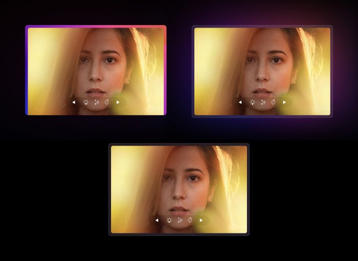
Circle also comes with 3 different box decorations. The default box decoration shows a frame with a conic gradient on three sides of an image or a video. The primary box decoration uses a full frosted-glass frame with an outer glow effect. The same frame but without the glow is used for the secondary box decoration. Another type of the box decoration is the floating shadow which uses the same outer glow effect. So no matter which box decoration you choose, your image or video will definitely be an eye-catcher.
Glassmorphic Illustrations
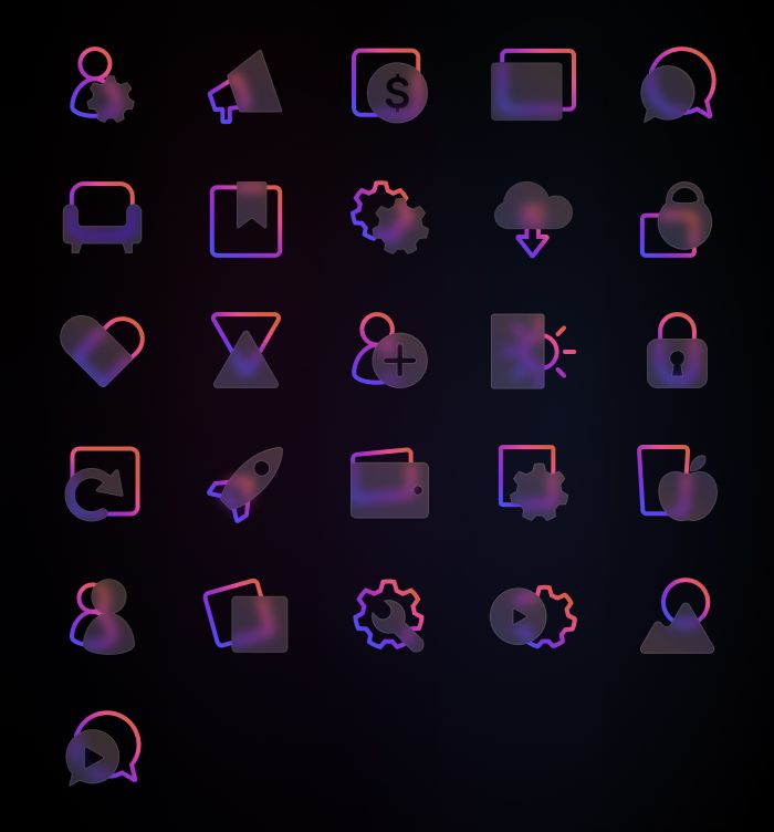
To accentuate the glassmorphic style even more, we created unique SVG illustrations for all Circle features. They have a frosted-glass effect using a background blur and the same color gradients that are used throughout the UI components, so they perfectly fit the overall look of the site.
Background Swirl
And there is also an SVG image that looks like a swirl. It is used throughout the layouts with a subtle parallax effect where it rotates on scrolling.
Content Types and Custom Fields
Since Circle does not focus on content structure, it only uses dynamic content for its blog and post pages.
Post
The default Post has only 1 custom field for the excerpt.
| Post Field | Type (J) | Type (WP) | Description |
|---|---|---|---|
| Excerpt | textarea | - | The post excerpt |
| Intro Image | - | image | Intro image used to tease the post |
Author
In Joomla the User has 3 custom fields for the avatar while in WordPress all fields are available by default.
| User Field | Type (J) | Type (WP) | Description |
|---|---|---|---|
| Image | media | - | User image |
| Image Alt Text | text | - | User image alt text |
| Description | text | - | User description |
Free Quality Stock Images
Circle comes with more than 130 lovingly curated and free-to-use images. They can be found in the Circle collection in the Unsplash library.

3rd Party Integrations
The Joomla and WordPress demo websites make use of several 3rd party plugins. We support WooCommerce, Advanced Custom Fields, Toolset, Custom Post Type UI, WordPress Popular Posts, the Regular Labs Articles Field and more. For more information on all pre-installed and activated plugins, take a look at the installation documentation for Joomla and WordPress.
So these are the features of our new Circle theme package for Joomla and WordPress. Now go ahead and explore it yourself. As always, let us know what you think in the comments below.
- Software website
- 14 premium page builder layouts
- 6 beautiful styles
- 130+ lovingly curated and free-to-use images
- Ready-to-use Joomla and WordPress demo websites
