YOOtheme Pro 4.3 – Slider Parallax, Expand Height and Transparent Navbar
Today we are excited to introduce YOOtheme Pro 4.3. This first release of the year comes with three main features. You can turn any slider or slideshow into a cool parallax animation with just a click, refine your layouts by expanding the height of elements and their content to fill columns and make your sticky navbar always transparent. Let's get started!
Make sure to subscribe to our YouTube channel and join our Discord Chat Server for all news and discussions.
Slider and Slideshow Parallax
With YOOtheme Pro you can create stunning sticky parallax effects. For example, in Gravity Tower we created an effect where images slide in from right to left while scrolling down the page.
However, if you ever tried to build the same layout from scratch, you probably know that it requires quite some time and effort. What if we told you, you can now do it with just a click? Thanks to UIkit 3.18, the Slideshow, Overlay Slider and Panel Slider elements have an option to enable a parallax animation. Browse through all the slides with a stepless animation while scrolling down the page. The navigation is disabled but will show the active slide.
Oh, and the Overlay Slider element which can show its overlay on hover now can also show it when the slide moves into the view. This looks especially great with the parallax animation since the overlays will automatically appear with a nice animation while you scroll down the page.
And now imagine all the different types of sliders and slideshows from the element library with this effect. And, of course, you can even make them sticky. This gives you so many new possibilities to create stunning layouts with sticky parallax effects, and it's all just a click away.
That's it for the slider and slideshow parallax animation. Next are some layout refinements.
Expand Height
As you probably know, rows in YOOtheme Pro have an option to match the height of all elements styled as a card. However, this option was quite limited, which is why we refactored the functionality altogether. Instead, the Panel element now has an option to match the height of its column. So if you have a multiple column layout with single panels, you have to enable this option separately for each panel to match their height.
It will take a few clicks more, but the option is much more flexible and precise. Not only does it work with any panel style, no matter if it's a card, tile, or if it has no background, but it also matches the height of any content in the other columns. For example, you can have multiple elements, a lot of text or even stacked cards in the other columns, and the panel will expand its height to fill the available column space. Even if the panel is followed by other elements, it will still expand to take up the available space pushing the elements down.
And… guess what? The same option is now available for the Image and Video elements, so you can expand their height to fill the available column space. The image or video source will cover the content box of their element just like you know from background images. The option for all three elements gives you so much flexibility to create new layouts.
But that's not all, the next feature builds upon this option and takes its functionality even further.
Expand Content
If you match the height of multiple Panel elements, you might also want to align their Read More buttons at the bottom. To do that, you would need to fill the available space within the element itself, for example, by expanding the content. This way the button will be pushed to the bottom. Alternatively, and this is more of an edge case, you can also expand the panel image instead of the content. Of course, the option only works if there is any available space, which is only the case if the panel already expands its height to fill the available column space.
Other elements which consist of panels, that is Grid and Panel Slider, have this option too. In the Grid element, the items already have the same height, unless of course it is a masonry grid. Here you can now additionally expand the content height of the items to fill the available panel space and push the links to the bottom.
The Panel Slider element, on the other hand, already has an option to match the panel height. If enabled, you can additionally expand the content height of the items as well.
All right, that's all for expanding layout heights. Next up is the transparent header.
Always Transparent Header
As you all know, hero sections in YOOtheme Pro have an option to make the header transparent. If the navbar is set to sticky, the default navbar without transparency will show up once you have scrolled below the hero section. So far so good. Now there is an option to make the header transparent for any page, and the navbar will even be transparent when sticky. Thanks to UIkit 3.18 the sticky navbar will automatically adjust its color depending on the section behind! Wow, right? And that's not all. There is even an option to color navbar parts differently. Of course, the same options are available for the mobile header as well.
Now a technical detail. A transparent header on hero sections and the always transparent header behave slightly differently when used with a dropbar. In Kojiro, for example, the transparent header is only set for the hero section, so here we open the dropbar below the navbar and remove the navbar transparency. This is also the reason why the navbar and dropbar have different backgrounds.
If, on the other hand, you enable the always transparent header, the transparency from the navbar will not be removed. Instead, the dropbar opens behind the navbar, so the navbar content shows on top of the dropbar background. And of course, the navbar will adapt its text color automatically.
Transparent Header Color
Before, whenever you made the header transparent, you also had to set the text color for the transparent navbar, for example, on sections, the boxed site layout and the top module position. Unfortunately, if you switched the style to one with different background colors, you'd have to change all these text color options again. This is why we removed these text color options, and you only need to enable the transparent header. The text colors are now defined in the style customizer for each UIkit component. We added the color mode option for the default and muted sections, the primary and secondary sections already have one, for the theme page container used by the boxed site layout and finally for the dropbar. Now, if you switch the style, the navbar text color will adapt accordingly.
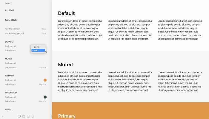
Keep in mind, if you select an image or a video as a section background or as a site background for the boxed layout, you still need to set the text color there, so if you switch the style, these colors are kept. The same option is now also available across all elements that contain an image, for example the Image and Video elements, but also Panel, Grid, Gallery and more.

That's our transparent header update! Now to some general improvements.
Opacity Parallax for Sections and Columns
In YOOtheme Pro you can add a transparent color overlay for a background image or a video of a section to soften it. Now you can animate the opacity of this overlay on scrolling, for example, to fade the background image to black. The same option is also available for column backgrounds. This will allow you to create some nice transitions between section.
Next Section Parallax Target
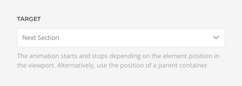
Here is a question. How do you add a parallax effect to an element in a sticky container? The parallax animation only runs if the element changes its position in the viewport. So if it's sticky, it doesn't work. In YOOtheme Pro this is the case for elements in sticky columns or in sections which use a cover or reveal sticky effect. The solution is to make the parallax animation depend on something outside of the sticky container. So now you can set the next section as the target so the animation starts and stops depending on its position in the viewport. Pretty smart, right?
Section and Column Heights
In YOOtheme Pro, there already are quite a few options for the section height. But sometimes it's just not enough. Now there is a new option to define a custom viewport height, so you no longer need to write any custom CSS.
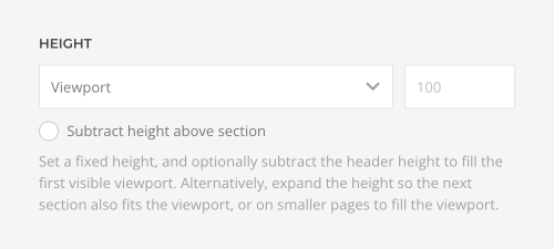
Since hero sections should often just fill the viewport, they need to take the height of the header and its navbar into account and cannot just be set to 100% of the viewport height. YOOtheme Pro did this automatically for sections in the first half of the first visible viewport. However, there are cases where you would want the section to be exactly one viewport, for example if a transparent header is on top of the section or if the section is sticky. Now, by default the height is fixed, and you can optionally subtract the height of everything above the section. Additionally, you can now also set the height in pixels.
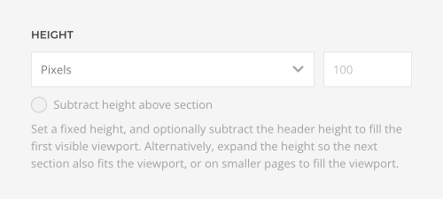
We updated the height option for rows, Slideshow, Overlay Slider and Map elements as well as the top and bottom WordPress widget areas or Joomla module positions accordingly.

3XL Heading
We also added an option to select the new 3XL heading style which is perfect for hero sections.

Nav Size
Additionally, the primary navigation has a new size option. This looks great, for example, in dropbars that cover the whole viewport. You can find the new option anywhere where you can add a navigation, so in the Nav and Module/Widget elements, but also in the menu position and module settings.
Video Element
Instead of extending the Video element to fill the available column space, you can also force its height to one viewport. This is the same option as for the Image element introduced in YOOtheme Pro 4.1. Here as well, the video source will cover the content box of the Video element, just like for background images.
Further Improvements
Of course, YOOtheme Pro 4.3 also comes with further improvements and fixes. After some time of resistance, and seeing that Elon is not going to change his mind, we were forced to replace the good old Twitter icon with the new X icon. Speaking of X, follow us on our new accounts on Bluesky, Mastodon and Instagram where you can meet the team behind YOOtheme and see what's happening behind the scenes. Oh, and our Social element will automatically show icons for Mastodon, X and Threads for the corresponding URL, and of course the icons will be available in the icon library. Additionally, we added external and arrow-up-right icons, and finally, as everyone has been waiting for it, there is a new YOOtheme icon.

The focal point option now also works for videos in section and column backgrounds.

Finally, the List element can mark up its links as an HTML nav element.

As always, for the full list of features and fixes, check out the changelog.
Next Steps
Phew, the update got bigger than we thought… But hey, now you can start the new year by polishing up your layouts with YOOtheme Pro 4.3. Add some stunning slideshow and slider parallax animations and refine the alignment of different elements by expanding their height. Or check out how your site will look like with an always transparent navbar.
Next up is a theme package which will showcase all the new features. And that's not all, we have even more feature releases and dedicated theme packages coming your way soon.
Now go ahead and take YOOtheme Pro 4.3 for a test drive. As always, we are looking forward to your feedback, so let us know what you think in the comments below.
