Kojiro – A Restaurant Theme for WordPress and Joomla
Who's ready for a new theme package? Meet Kojiro – our new theme package for WordPress and Joomla. It's perfect for a restaurant, cafe, or any other business-related websites. Kojiro features a lot of fancy parallax effects and is a great example for all the dynamic content features from YOOtheme Pro 4. And guess what? It even uses new features, which is why it comes bundled with YOOtheme Pro 4.1. Of course, Kojiro also comes with 9 content-rich page layouts, great looking styles and many beautiful images. Intrigued? Let's take a look.
Make sure to subscribe to our YouTube channel and join our Discord Chat Server for all news and discussions.
Page Layouts
Kojiro comes with 9 different layouts for all kinds of page types. They can easily be loaded from the layout library with just a click. Here is a walk-through of all the new features, parallax effects and other highlights!
| Page | Type | Description |
|---|---|---|
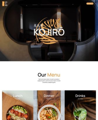
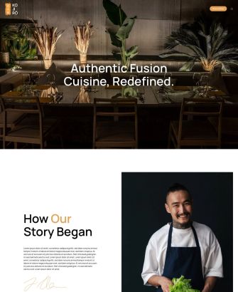
| Home | Page | The Home page starts with a hero section which stretches for multiple viewports. In the background, we have a video, and on top – the restaurant title and logo which blur out when scrolling revealing information about the restaurant. Here we used the new parallax blur introduced with YOOtheme Pro 4. Next we have a really special menus section where menus fly in from the right and fly out to the left. There is also an about section and a full-screen image which zooms out while scrolling revealing a nicely arranged image gallery. The page ends with a footer section. |
| Dialog | Dropdown | For Kojiro we created a Dialog menu layout with the full-height image on the left and menu and socials on the right. |
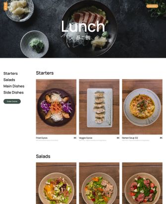
| Lunch | Template | Our Kojiro restaurant has three menus, for lunch, dinner and drinks, so we chose a similar layout for all three of them, but with a special touch for each. The Lunch page starts with a background video, followed by the menus section. The lunch dishes are shown in a three-column layout, and on the left there is a sticky navigation to jump to different dish categories. A small section with allergens is displayed at the bottom. |
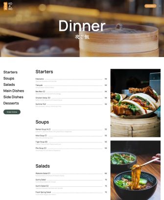
| Dinner | Template | The Dinner page has a similar layout with a sticky navigation. But here, since the dinner menu is usually longer, we went for a more text-focused layout but with image impressions from the dinner menu on the right. The different column heights are nicely justified at the bottom with a smooth parallax animation. |
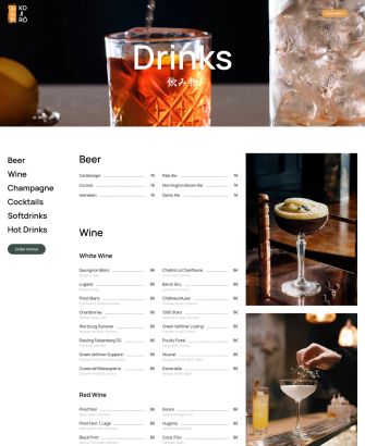
| Drinks | Template | The Drinks menu is even longer, so drinks are shown in two columns side by side, and impression images are displayed with the parallax animation on the right. |
| About | Page | There is also an About page which starts with a full-width hero section, followed by information about the chef. Next we have a timeline with chef's career and restaurant history. To separate different time sections, the years nicely slide in from the left when scrolling, while images blur out when leaving the viewport. |
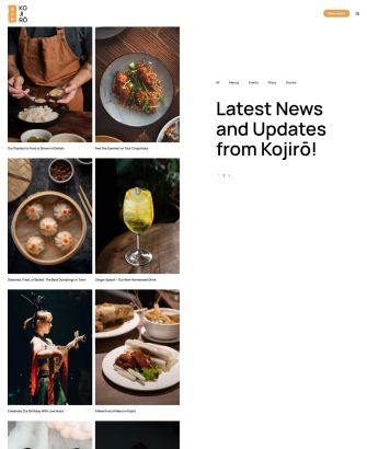
| News | Template | Kojiro has a News page with a very unusual split layout. On the right, we have a sticky column with subcategories, a prominent headline and pagination, and on the left, we have a two-column image layout with blog articles which animate when scrolling until they justify at the bottom. |
| Post | Template | The Post page is also split. But here, we have a sticky column on the left with the post image which covers the whole viewport, and on the right, we have the post headline, content and meta information. Since Kojiro is all about food, we also added some custom fields for additional images. In the same column on the right, we built a previous and next pagination with article intro images. |
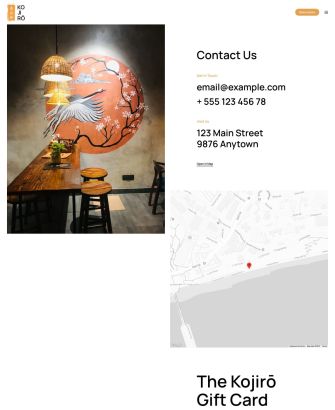
| Contact | Page | Of course, there is also a Contact page. Just like in the Post template, we have a sticky image on the left, and on the right, there is contact information with a map and a gift card section. |
YOOtheme Pro 4.1
If you followed our YOOtheme Pro 4 blog post, you know we've decided to switch our release strategy and include smaller YOOtheme Pro releases into theme releases. So today we want to introduce YOOtheme Pro 4.1 with all the features needed for our new Kojiro theme. Let's check them out.
Joomla 5 Support
First of all, Joomla 5 is around the corner. We are really excited about it, and of course YOOtheme Pro is ready. Today with YOOtheme Pro 4.1 you can upgrade to Joomla 5 with just a click. Everything will work like a charm.
Smooth Scroll Offset
As you know, when you click on a link with a URL fragment, the page scrolls to the point where the ID is located in the markup. This is the case, for example, on the Lunch page where the sidebar navigation links to dish categories. Before, if you have a sticky navbar, the navbar would cover the headlines. Now we added the height of the sticky navbar as scroll offset. It even works when the scroll target moves away with a parallax animation.
Row Parallax Justify
The row has a new parallax justify option, so columns with different heights reach the bottom at the same time. This is the case on the Dinner page where the menu aligns with the image impressions. What's great about it, is that you no longer need to bother with matching the content height in the columns, it will look nice no matter how many images you add. To give you more control over the duration of the animation, we also added start and end options, just like you know from the general parallax settings.
Grid and Gallery Elements
Just like for the rows, we added the parallax justify option to the Grid and Gallery elements. So if grid columns have different heights, which is the case for masonry grids or here on the Blog page where columns have an uneven number of items, they will reach the bottom at the same time. Of course, we also added start and end options for the parallax animation.
And the Grid and Gallery elements have a new masonry pack option which will sort items into columns with the most room. To show the items in their natural order, as before, use the next option.
Collapsing Columns
As you know, columns collapse if the elements within load dynamic content, but the content is empty. The other columns expand to fill the remaining space. In some cases, you would want that. There is now an option to prevent columns which load dynamic content from collapsing. For example, on the Posts page, we used dynamic content to create the previous and next pagination. Here, if there is no previous article, which is the case for the latest article, we want to still keep the width of the column and not expand the remaining column.
Transparent Header
We have some minor updates for the header as well. First, we removed the option to disable the transparent header on mobile. This means if a hero section has a transparent header, it will look the same on any device. Second, we have a visual improvement for transparent navbars which have dropbars. Before, when you opened the dropbar, which takes the full width of the page, the navbar stayed transparent, which did not look that good. This is actually the reason why we didn't use dropbars in theme packages with transparent navbars. Now we automatically remove the transparent background when the dropbar opens. This is so much better!
Image Element
We have a new option for the Image element to force the height to one viewport. The image source will cover the content box of the Image element, just like you know from background images. This is very handy if you want to have a two-column layout with a sticky image like we used here for the Post template.

Pagination Element
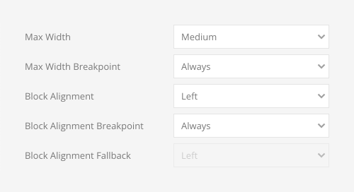
The Pagination element now also has general max width and block alignment options so you can better align it with other content in the layout, like here in the Post template.
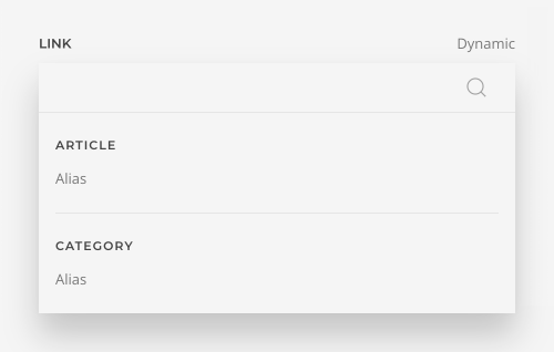
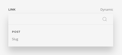
Joomla Alias Field and WordPress Slug Field
You can now map the alias field in Joomla or the corresponding slug field in WordPress dynamically. This is useful if you want to create an SEO-friendly page navigation with URL fragments. The perfect example is the Lunch page. Here, we mapped the Alias field of the category to the link field in the side navigation and added # in the Before option. Finally, we mapped the alias field in the corresponding headline element to the ID field. Now, if you click the side navigation, the page will jump to the corresponding dishes category. And look what a small and dynamic this layout is! If you add another category, say, for Pasta, the category will automatically show up in the side navigation linking to the Pasta section in the main content together with all the dishes. No need to change anything in the layout.
Advanced Settings
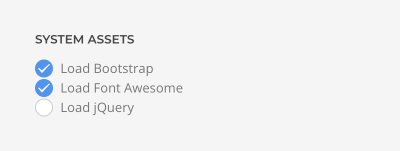
Last but not least, we added an option to the advanced settings in Joomla to disable loading Font Awesome if you don't need it in your pages.
That's it for YOOtheme Pro 4.1, now let's have a closer look at the Kojiro styles.
Style
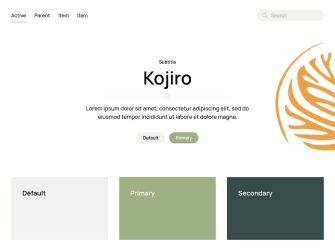
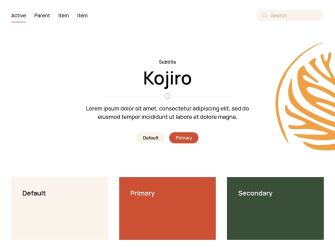
Kojiro is quite a fancy restaurant, so we went for a classy flat style with elegant reserved colors. The heavy use of the primary color throughout all UIkit components makes the style very colorful, especially since it is perfectly complemented by the secondary color. While most UI elements are plain with crisp edges, buttons are rounded and have a light border on hover just like icon button and dotnav. Cards also show a border on hover, but it's darker. A special divider icon adds a little playfulness to the style. Finally, modern refined typography with a sans-serif font as well as a thin bottom border on forms will give your website an elegant and sophisticated look.
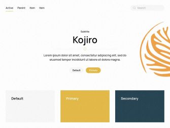
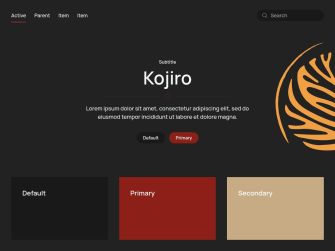
In addition to the default style, Kojiro comes with 5 other style variations, each with a different beautiful color scheme. There are five white and one dark styles, all with classy reserved colors. The white yellow style variation additionally has a page foreground with a grainy texture that covers all UI elements. As always, you can switch the whole look and feel of your website with just a click. Simply choose what fits your website best!
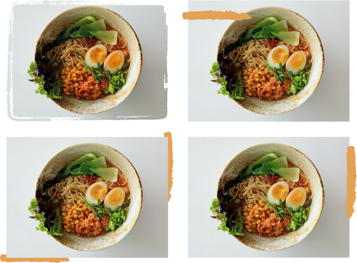
Box Decorations
Kojiro also comes with 3 different box decorations with paint strokes in primary color on top or behind the image or video. There is also a mask with a torn border.
Content Types and Custom Fields
Kojiro comes with a fully functional demo website with one Dish content type in addition to the default post.
Dish
Dishes are grouped into three categories – lunch, dinner and drinks. The categories themselves have 2 custom fields for the title image and image impressions.
| Dish Category Field | Type (J) | Type (WP) | Description |
|---|---|---|---|
| Title Image | media | media | Category title image |
| Category Images | subform | repeater | Category image impressions |
The Dish content type has 1 custom field to show the dish price and another custom field in WordPress for the intro image.
| Dish Field | Type (J) | Type (WP) | Description |
|---|---|---|---|
| Intro Image | - | image | Intro image used to tease the dish |
| Dish Price | text | text | Dish price |
Post
The default Post has 1 custom field for additional images and another custom field in WordPress for the intro image.
| Post Field | Type (J) | Type (WP) | Description |
|---|---|---|---|
| Intro Image | - | image | Intro image used to tease the post |
| Images | subform | repeater | A list of images |
Author
The User has 1 custom field for the avatar.
| User Field | Type (J) | Type (WP) | Description |
|---|---|---|---|
| Image | media | - | User image |
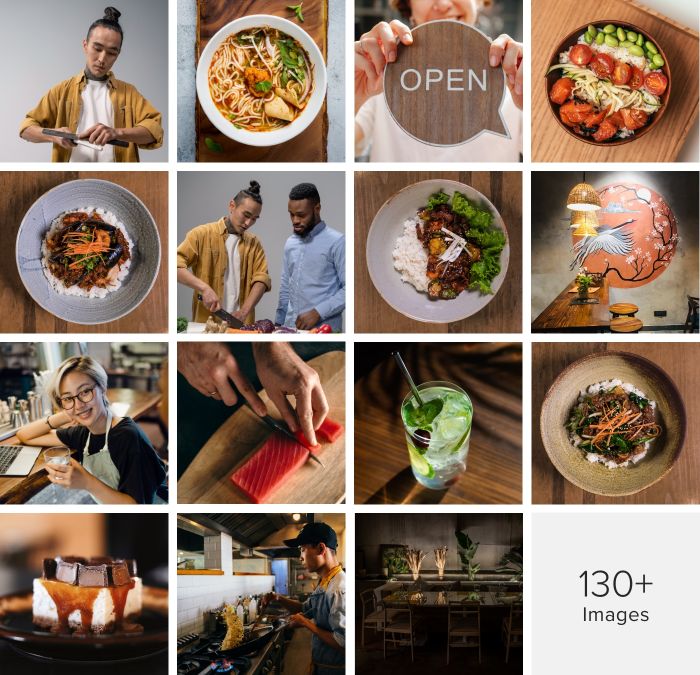
Free Quality Stock Images
Kojiro comes with more than 130 lovingly curated and free-to-use images. They can be found in the Kojiro collection in the Unsplash library.
3rd Party Integrations
The Joomla and WordPress demo websites make use of several 3rd party plugins. We support WooCommerce, Advanced Custom Fields, Toolset, Custom Post Type UI, WordPress Popular Posts, the Regular Labs Articles Field and more. For more information on all pre-installed and activated plugins, take a look at the installation documentation for Joomla and WordPress.
So these are the features of our new Kojiro theme package for Joomla and WordPress. Now go ahead and explore it yourself. As always, let us know what you think in the comments below.
- Restaurant website
- 9 premium page builder layouts
- 6 beautiful styles
- 130+ lovingly curated and free-to-use images
- Ready-to-use Joomla and WordPress demo websites
- YOOtheme Pro 4.1 with Joomla 5 support
