Gravity Tower – A Real Estate Theme for WordPress and Joomla
Happy New Year, everyone! Let's start this year with a new theme package! Meet Gravity Tower – our new theme package for WordPress and Joomla. It's perfect for a real estate, architect project or any other building-related website. This theme is all about sticky parallax effects, and we created some really special ones. Gravity Tower comes with 9 content-rich page layouts, great looking styles and many beautiful images. Want to know more? Let's take a look.
Make sure to subscribe to our YouTube channel and join our Discord Chat Server for all news and discussions.
Page Layouts
Gravity Tower comes with 9 different layouts for all kinds of page types. All layouts can easily be loaded from the layout library with just a click. Here is a walk-through of all the highlights.
| Page | Type | Description |
|---|---|---|
| Home | Page | The Home page starts with a really special hero section. The property image stretches for multiple viewports and presents its details in popovers. Cloud images slightly animate on scrolling giving the property a more realistic look. Further project details are shown in varied sections. There are multilayered images which move with different speeds on scrolling, a video with a parallax effect that opens in a lightbox, as well as animated text. A real highlight is the interior section. Here the images are positioned side by side, and thanks to the parallax effect, the section scrolls horizontally looking like a slideshow. Next there is a slider with images showing places in the neighborhood and a contact section. It reveals the footer and shows the project name with a parallax effect which gives the page a nice ending. |
| Development | Page | The Development page is a case study of the project. Here again the page starts with a long section where images are absolutely positioned in the fore- and background of the headline and move with different speeds while scrolling. Next comes an about section with multilayered images and information about the architect which reveals a section with key facts about the property. It is followed by a grid with amenities and a sticky section with a background video and floating images. Here you will also find a list of partners and a call to action section. |
| Location | Page | The Location page also has tons of parallax effects. It starts with a prominent video which scales up to fully cover the viewport. It is followed by a quote with integrated images and a sticky section with a map showing the neighbourhood. Then there are two sections with neighbourhood impressions. First, we have a sticky parallax section with multilayered images followed by a nice image on image section with a horizontally scrolling headline. Next comes a section with images moving in the fore- and background and a call to action section. |
| Apartments | Page | The Apartments page starts with a hero section with absolutely positioned images. Next there is a sticky section where the headline is in the background and animated impression images in the foreground. It is followed by a nice-looking interior section with full-width images. The kitchen and bathroom are shown in a series of images with a sticky text column. The page ends with two pricing tables and a call to action. |
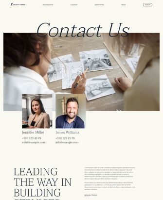
| Contact | Page | Of course, there is also a Contact page. It starts with a background video and images of the sales team followed by further information about them. The page ends with a call to action section. |
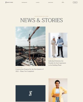
| News | Template | Gravity Tower also has a News page that starts with a parallax effect. It shows the latest news in a 2 column layout. What's really special is that the post images have different orientation and are shown in a shifted layout. They even scale up on hover. |
| Post | Template | The Post page starts with the post title and meta information followed by the post image which scales up to take the whole viewport. The post itself is aligned on the left, and information about the author is sticky on the right. Latest posts are shown at the bottom. |
| Imprint | Page | Gravity Tower has an Imprint page for the legal information with a sticky column. |
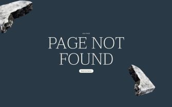
| Error 404 | Template | Finally, there is also an Error 404 page in a secondary color showing a link back to the home page. |
Parallax Effects
Our Gravity Tower theme package is packed with fancy parallax effects. They are often used with sections which are multiple viewports high. For Gravity Tower we used three different types of the parallax effects.
Horizontal Scrolling
This is a new one! We are so excited we could create a horizontal scrolling effect in YOOtheme Pro. Now let's see how it works. We start as usual, with a section that is multiple viewports high (in our case 3 viewports) and a sticky column within. In this column we have 4 images. First of all, set the absolute position of all images except for the first one so they stack on top of each other. Now using custom CSS, we need to move each image 100% further to the right so they appear side by side. Finally, we just need to animate the horizontal position of the images in the parallax options to -300%. This will move the whole row to the left while scrolling. Pretty cool, right?
Sticky Background
Next we have a sticky background effect as used for the amenities section on the Development page. Here we have a row with a column which has a height of one viewport and is sticky within its section. We also added a video to the column background. And in the second row, we added relatively positioned elements. Finally, using custom CSS we pull the second row above previous one.
Sticky Column
We also have various sticky columns, for example in the bathroom and kitchen section on the Apartments page. Here we have one sticky column and another column that defines the height of the row.
If you want to know how to create sticky parallax effects in general, take a look at our dedicated documentation. Alternatively, just load any of the Gravity Tower layouts from the layout library and use these parallax effects on your site right away.
Style
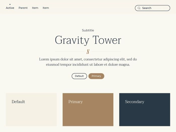
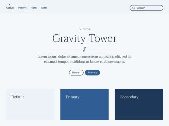
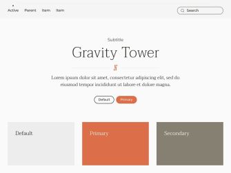
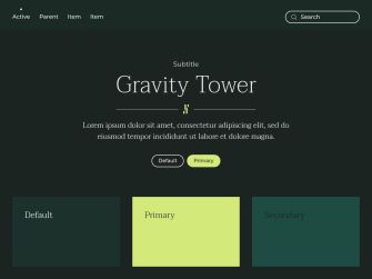
Gravity Tower has a modern flat style with elegant pastel colors. A beige background contrasts with a darker blue secondary color. The same color scheme is used throughout the UI elements, like buttons and forms which switch these colors on hover or focus. A little playfulness is added with rounded buttons and a nice button text animation. But especially the combination of the refined thin serif font for headlines and the sans-serif font for the running text as well as a thin bottom border on forms will give your website a classy and sophisticated look.
In addition to the default style Gravity Tower comes with 5 other style variations, each with a different beautiful color scheme. There are three more light styles and two dark styles, all with elegant classy colors. As always, you can switch the whole look and feel of your website with just a click. Simply choose what fits your website best!
Header Layout
As the first theme, Gravity Tower uses the Horizontal Justify layout introduced in YOOtheme Pro 3.0 where all navbar items are equally distributed within the navbar.

Content Types and Custom Fields
Since Gravity Tower does not focus on content structure, it only uses dynamic content for its blog and post pages. It has 1 custom field in WordPress for the post intro image and 2 custom fields for the author in both Joomla and WordPress.
Post
The default Post has 1 custom field in WordPress for the intro image.
| Post Field | Type (J) | Type (WP) | Description |
|---|---|---|---|
| Intro Image | - | image | Intro image used to tease the post |
Author
The User has 2 custom fields for the avatar and job title.
| User Field | Type (J) | Type (WP) | Description |
|---|---|---|---|
| Image | media | - | User image |
| Job Title | text | text | User job title |
Free Quality Stock Images
Gravity Tower comes with more than 70 lovingly curated and free-to-use images. They can be found in the Gravity Tower collection in the Unsplash library.

3rd Party Integrations
The Joomla and WordPress demo websites make use of several 3rd party plugins. We support WooCommerce, Advanced Custom Fields, Toolset, Custom Post Type UI, WordPress Popular Posts, the Regular Labs Articles Field and more. For more information on all pre-installed and activated plugins, take a look at the installation documentation for Joomla and WordPress.
So these are the features of our new Gravity Tower theme package for Joomla and WordPress. Now go ahead and explore it yourself. As always, let us know what you think in the comments below.
- Real Estate website
- 9 premium page builder layouts
- 6 beautiful styles
- 70+ lovingly curated and free-to-use images
- Ready-to-use Joomla and WordPress demo websites


