Elements
Elements are the main part of the layout since they display actual content. Many element settings like content fields, options to position the element in the layout and animations recur across all elements.
Click on an element to open the element settings. Three tabs are shown right next to the element’s name: Content, Settings and Advanced.
| Tab | Description |
|---|---|
| Content | Contains content fields and in case of multiple items elements content items. |
| Settings | Contains element-specific and general settings. |
| Advanced | Contains advanced settings. |
For element-specific settings take a look the basic, multiple items and system element documentations.
Note Options have a description under its fields. If the option name and field are aligned side by side, hover the name to show the description in a tooltip.
Content Fields
All content fields of an element are shown in the Content tab. Here is a list of common content fields.
| Content Field | Description |
|---|---|
| Title | A text field for headings |
| Meta | A text field for the meta text like the author or published date |
| Content | A text area for the main text |
| Image | An image field which opens the media manager |
| Icon | An icon field which opens the icon picker |
| Video | A video field which opens the media manager |
| Link | A link field which opens the file picker |
| Date | A text field for dates |
Content Items
Multiple items elements, like the Gallery or the Grid element, allow creating multiple content items. The Content tab shows the list of all created items. To edit an item, simply click on it. A panel will open where you can change the item's content and settings. Use the Copy and Delete icons which appear on hover to duplicate or delete the item. Change the order of the items using drag and drop.
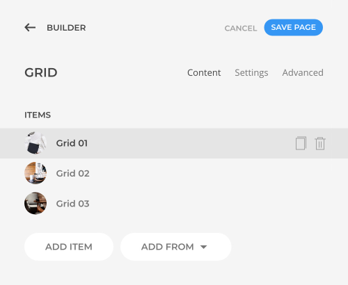
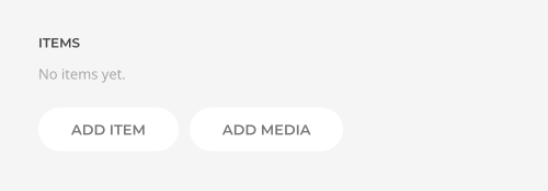
To add a new item, click the Add Item button. Alternatively, click the Add Media button to add multiple items at once from the media manager. For each selected image or video, a new item will be added. The file name will be used as the item's title.
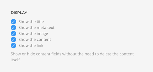
Each item has the same content fields: Title, Meta, Description, Image or Video and Link. Below the items there is a list of Display Settings to quickly hide these content fields without having to edit each item.
HTML Element
Organize the layout into logical pieces using the HTML element option. Containers like section, row, column and the Sublayout element can use the <address>, <article>, <aside>, <footer>, <header>, <hgroup>, <nav> or <section> element. Builder elements and their items have a corresponding HTML element option as well. This allows you to mark up the content of your website semantically in a way that is meaningful to assistive technologies.

General Settings
The Settings tab contains all element-specific settings. These are divided into smaller groups. At the end of the settings list, there is a group of General layout settings which recur across all elements. They include options to position the element, define its size and text alignment, animations and visibility on different devices.
| Option | Description |
|---|---|
| Position | Define the position of the element. Static positions it in the normal content flow. Relative – in the normal flow but with an offset relative to itself. Absolute removes it from the flow and positions it relative to the containing column. |
| Left | Set the horizontal offset of the element's left edge in pixels. A different unit like % and vw can also be used. |
| Right | Set the horizontal offset of the element's right edge in pixels. A different unit like % and vw can also be used. |
| Top | Set the horizontal offset of the element's top edge in pixels. A different unit like % and vw can also be used. |
| Bottom | Set the horizontal offset of the element's bottom edge in pixels. A different unit like % and vw can also be used. |
| Blend | Blend the element with page content. |
| Push | Push following elements to the bottom of the column by expanding the height of the element to the available column space. |
| Z Index | Position the element above or below other elements. If they have the same z-index, the position will depend on the order in the layout. |
| Margin Top | Keep the existing top margin, set a specific margin or remove the margin. Mind that the first element's top margin is always removed. Setting the top margin to auto fills the available space in the column and pushes the element itself and its preceding elements to the bottom. |
| Margin Bottom | Keep the existing bottom margin, set a specific margin or remove the margin. Mind that the last element's bottom margin is always removed. Setting the bottom margin to auto fills the available space in the column and pushes the following elements to the bottom. |
| Max Width | Set the maximum content width. |
| Max Width Breakpoint | Define the device width starting from which the element's max-width will apply. |
| Block Alignment | Define the alignment in case the container exceeds the element’s max-width. |
| Block Alignment Breakpoint | Define the device width starting from which the alignment will apply. |
| Block Alignment Fallback | Define an alignment fallback for device widths below the breakpoint. |
| Text Alignment | Center, left and right alignment may depend on a breakpoint and require a fallback. |
| Text Alignment Breakpoint | Define the device width starting from which the alignment will apply. |
| Text Alignment Fallback | Define an alignment fallback for device widths below the breakpoint. |
| Animation | Overwrite the animation settings from the section. This won’t have any effect unless animations are enabled for the section. Or enable a parallax animation for this element. |
| Visibility | Show or hide the element on this device width and larger. If all elements are hidden, columns, rows and sections will hide accordingly. |
Parallax Settings
The Parallax settings are used to animate an element depending on the scroll position of the document. To configure a parallax animation, set the Animation to Parallax in the General settings.

Create a parallax effect by animating one of the following properties. The range slider sets a value in a default unit. To set a specific value or use a different unit, use the input field to the right.
| Option | Default Unit | Description |
|---|---|---|
| Translate X | Pixel | Animate the horizontal position. Optional units are %, vw and vh. |
| Translate Y | Pixel | Animate the vertical position. Optional units are %, vw and vh. |
| Scale | Vector | Animate the scaling vector, e.g. 2 is 200% and 0.5 is 50% scale. Optional units are px, vw and vh. |
| Rotate | Degree | Animate the rotation clockwise in degrees between 0 and 360. |
| Opacity | Number | Animate the opacity, e.g. 0 is 0% and 1 is 100% opacity. |
| Blur | Pixel | Animate the Gaussian blur in pixels. |
An animation sequence consists of one or multiple animation stops. Use the Add and Delete icons which appear on hover on the right to add or delete the animation stops.
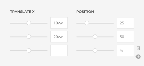
Setting just one animation stop animates the element from its initial value to the defined stop value. Setting two animation stops animates the element from the first stop value to the second stop value. Setting multiple stops adds intermediate stops along the animation sequence. By default, the animation is equally distributed between the stops. Alternatively, specify percentage to position the stops along the animation sequence.
Note The position value is set in percent without the percent unit.
There are additional options to control the behavior of the parallax animation.
| Option | Description |
|---|---|
| Transform Origin | Define the origin of the element's transformation when scaling or rotating the element. |
| Easing | Adjust the speed of the animation over time. 0 transitions at an even speed. A negative value starts off quickly slowing down until complete while a positive value starts off slowly increasing the speed until complete. |
| Target | The animation starts and stops depending on the position of the element in the viewport. Alternatively, use the position of a parent container. |
| Start and End | The animation starts when the element enters the viewport and ends when it leaves the viewport. Optionally, set a start and end offset in px, % or vh, for example, 100px, 50vh or 50vh + 50%. Percent relates to the target's height. Basic mathematics operands, + and - are supported. |
| Z Index | Set a higher stacking order. |
| Breakpoint | Display the parallax effect only on this device width and larger. It is useful to disable the parallax animation on small viewports. |
Sticky Parallax Effects
Parallax settings can be combined with sticky columns to create advanced sticky parallax effects directly in YOOtheme Pro. Here is the concept behind the sticky parallax effects.
First of all, add a section or a row which is multiple viewports high. This will define the duration of the parallax animation. Within this section or row, add a sticky column which has a height of one viewport. And finally in this column add elements that have the parallax effect. Since the column is sticky, the elements will not scroll out of the viewport, but will be animated while scrolling.
Lets start the implementation with an actual example in YOOtheme Pro. Set the section height to, for example, 2 Viewports. Open the row settings and set the row height to Viewport. In the column settings, set the position sticky option to Column within Section. Now the column is one viewport high and will be sticky while scrolling the section which is 2 viewports high. Finally, add elements with parallax effects to the sticky column. Make sure to set the parallax Target option to Section so the animation starts and stops depending on the section's height. By default the animation starts when the section enters the viewport and stops when it has left the viewport. Optionally, set both Start and End offsets to 100vh. This will start the animation once the section fully covers the viewport and end it when the section starts leaving the viewport. Often the main element is centered within the column while others are positioned absolutely in the fore- or background.
Note To use a row instead of a section as sticky container, set the row height manually in the CSS field in the Advanced row settings.
.el-row {
    height: 200vh;
}
If there is more than one sticky main element, just use multiple sticky columns.
Instead of setting a fixed height on a section or row, the height can be defined by elements of a column which is not sticky.
To create a sticky background effect, add a row with a column which has a height of one viewport and is sticky within its section. Add a background image or video to the column. This column is only used for the background and does not contain other elements. In the second row, add elements with the parallax effect and make sure that their height is larger than the viewport. At last, pull the second row above the previous one using custom CSS.
.el-row {
    position: relative;
    z-index: 1;
    margin-top: -100vh;
}
To create a sticky parallax effect where elements fade in and out equally distributed along the animation sequence, use the start and end offsets to give each element the same duration. There is a trick to make calculating those offsets more easy. Just set the End offset to 100vh + 100% so the end of the animation is the same as its start. Now you can just subtract the sum of the start offset and the duration.
For example, let's divide a parallax effect into two visual parts using a section with a height of 200vh. Since the animation should start once the section is fully visible, meaning at 100vh, there are 100vh left for the whole duration of the animation. So each part will be animated for 50vh.
| Part | Start | End | Duration |
|---|---|---|---|
| Part 1 | 100vh |
100% + 100vh - 150vh |
50vh |
| Part 2 | 150vh |
100% + 100vh - 200vh |
50vh |
To add a third part with the same duration, use a custom section height of 250vh.
| Part | Start | End | Duration |
|---|---|---|---|
| Part 1 | 100vh |
100% + 100vh - 150vh |
50vh |
| Part 2 | 150vh |
100% + 100vh - 200vh |
50vh |
| Part 3 | 200vh |
100% + 100vh - 250vh |
50vh |
If the section has a height of 300vh, there are 200vh left for the whole duration of the animation. So each part will be animated for 66.666vh.
| Part | Start | End | Duration |
|---|---|---|---|
| Part 1 | 100vh |
100% + 100vh - 166.666vh |
66.666vh |
| Part 2 | 166.666vh |
100% + 100vh - 233.333vh |
66.666vh |
| Part 3 | 233.333vh |
100% + 100vh - 300vh |
66.666vh |
Advanced Settings
The Advanced tab contains settings which are not directly related to the layout. They also recur across all elements.
| Option | Description |
|---|---|
| Name | Define a name to easily identify this element inside the page builder. The name will appear in the builder overview. |
| Status | Disable the element or the element item and publish it later. |
| Dynamic Content | Set the fields source for the dynamic content. |
| ID | Define a unique identifier for the element. Use this identifier as a URL fragment in any link to navigate to this element, e.g. #myId. |
| Classes | Define one or more class names for the element. Separate multiple classes with spaces. |
| Attributes | Define one or more attributes for the element. Separate attribute name and value by = character. Use one attribute per line. |
| CSS | Enter your own custom CSS. |
| Transform | Transform the element into another element while keeping its content and settings. Unused content and settings are removed. Transforming into a preset only keeps the content but adopts all preset settings. |
Custom CSS
The CSS field allows you to apply custom styling to any element. YOOtheme Pro provides the special class selector .el-element to select the element. Custom CSS rules will only apply to this specific element.
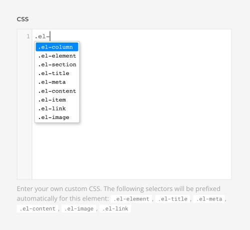
There are even more selectors available for specific visual content parts of an element, e.g. .el-title, .el-meta, .el-content, .el-image and .el-link. All available selectors for an element are listed below the CSS field. Auto-completion is also activated, so if you start typing .el-, a dropdown will suggest all available selectors for the current element.
Examples
/* Select this element */
.el-element { background: red; }

/* Select all direct child elements of this element */
.el-element > * { background: red; }

/* Select all direct child <span> elements of this element */
.el-element > span { background: red; }

/* Select all child elements with the .uk-button class of this element */
.el-element .uk-button { background: red; }

/* Select the title of this element */
.el-title { background: red; }
