Element Library
Display content by using a huge collection of ready-to-use elements, from text and images to slideshows and galleries. Save configured elements as presets and reuse them later.
To open the element library, click the Add element icon in the page builder. The element library will open in a modal. Start with a new element or load your saved element from the presets.
Elements
The Elements tab shows all available elements. To load an element into the current layout, simply click the element icon. Elements are grouped into Basic, Multiple Items and System elements. Custom elements added by a child theme are grouped under Custom. Use the search to easily find the needed element.
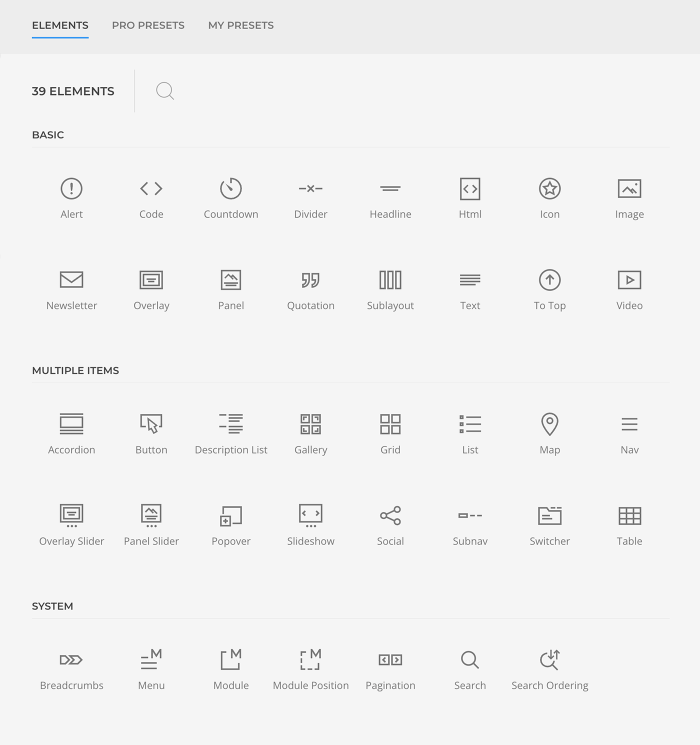
Basic Elements
Basic elements are mostly common elements which have simple content. Learn more in the basic elements documentation.
| Element | Description |
|---|---|
| Alert | Display an error message. |
| Code | Display code in a preformatted text block. |
| Countdown | Display a countdown timer for a specific date. |
| Divider | Display a horizontal divider. |
| Headline | Display a headline with an optional link. |
| HTML | Display custom HTML code. |
| Icon | Display an SVG icon with an optional link. |
| Image | Display an image with an optional link. |
| Newsletter | Display a newsletter signup for Mailchimp or Campaign Monitor. |
| Overlay | Display an image with a content overlay. |
| Panel | Display a panel or a card with text and image. |
| Sublayout | Display a sublayout within the page builder. |
| Quotation | Display a quotation. |
| Text | Display plain text. |
| To Top | Display an icon which scrolls back to the top of the page. |
| Video | Display a video file or a YouTube or Vimeo video. |
Multiple Items Elements
Multiple items elements repeat content items in a given layout. Learn more in the multiple items elements documentation.
| Element | Description |
|---|---|
| Accordion | Display a collapsable list of items. |
| Button | Display one or multiple buttons aligned horizontally. |
| Description List | Display a description list. |
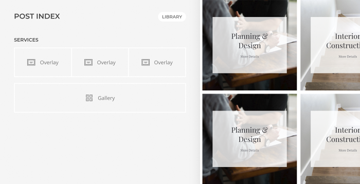
| Gallery | Display multiple Overlay elements within a grid. |
| Grid | Display multiple Panel elements within a grid. |
| List | Display a vertical list. |
| Map | Display a map from Google Maps or OpenStreetMap with markers. |
| Popover | Display an image with markers, which open popovers. |
| Overlay Slider | Display multiple Overlay elements in a slider. |
| Panel Slider | Display multiple Panel elements in a slider. |
| Slideshow | Display an image slideshow. |
| Social | Display icons linking to social media profiles. |
| Subnav | Display a horizontal navigation. |
| Switcher | Display a tabbed navigation which transitions through content slides. |
| Table | Display a table. |
System Elements
System elements add Joomla functionality into your layouts. Learn more in the system elements documentation.
| Element | Description |
|---|---|
| Breadcrumbs | Display the breadcrumb navigation. |
| Menu | Display a Joomla menu or render a taxonomy as a menu. |
| Module | Display a Joomla module. |
| Position | Display all Joomla modules assigned to a specific position within a grid. |
| Pagination | Display the pagination. |
| Search | Display the search. |
| Search Ordering | Display a button to order search results on the search page. |
Pro Presets
The Pro Presets tab shows all available element presets built by YOOtheme. New presets are added to this cloud library on a regular basis. To load a preset into the current layout, simply click the preset preview image. Use the filter options to find the needed preset. Either browse all presets or select a builder element to show its available presets. Hover the preset to see which builder element it is based on and the option it showcases.
Note YOOtheme Pro presets can only be loaded with an API key of an active YOOtheme Pro subscription.
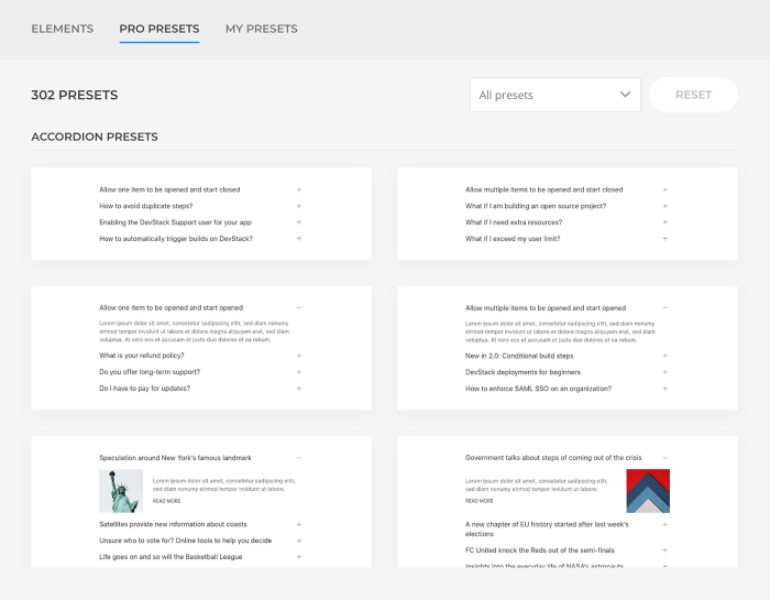
My Presets
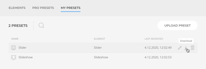
The My Presets tab shows a list of your saved presets which include the content and settings of an element. To load a preset into the current layout, simply click its name. Actions to Rename, Download and Delete the preset will appear on hover. The last modified date shows when the preset was changed. Additionally, the search can be used to easily find the needed preset.
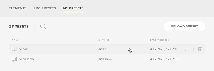
Save Presets
To save an element as preset, click the Save in Library icon which appears on hover.
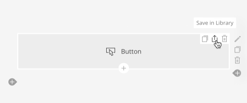
Download and Upload Presets
Presets can be downloaded as JSON file and uploaded again to reuse them across different projects. The Download action appears when hovering the preset, while the Upload Preset button is available in the upper right corner. There is also a Download All button to download all element presets at once.
Layout Techniques
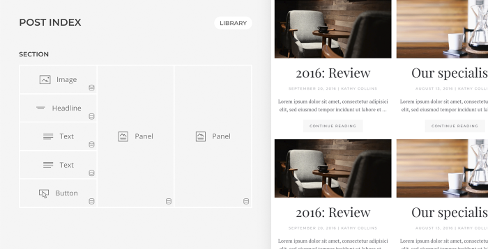
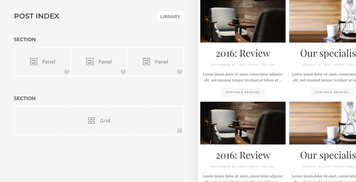
The same layout can be built using different elements. A group of basic elements can be replaced with an element which has the same group of content fields. If this element is repeated several times, there may be a multiple items element which can be used instead. To keep layouts clearly arranged, it’s recommended to use as few elements as possible. This makes it easier to adjust the layout later, for example when changing the order in the layout. However, if the more complex elements have too limited options, fall back on combining basic elements.
Panel and Grid
The Panel element has title, meta, content, image and link fields. So whenever any combination of these fields is needed, use the Panel element instead of separate Text, Image and Button elements. When using multiple panels side by side, use the Grid element which can display multiple panel items.
Overlay and Gallery
The Overlay element displays an image with a content overlay. When using multiple overlays side by side, use the Gallery element which can display multiple overlay items.
