Variables
Dive deeper into the Style Customizer and learn more about the advanced style possibilities.
Since YOOtheme Pro is built with the front-end framework UIkit, the Style Customizer is actually a style customizer for UIkit. It uses variables from the CSS pre-processor Less to style its components. Every time an option is changed, the UIkit Less sources are re-compiled into CSS using the new values for the changed Less variables. This makes the Style Customizer a powerful tool which can change the whole style by modifying a few global Less variables.
The following documentation explains how to use the advanced capabilities provided by UIkit and Less. There is also a comprehensive UIkit documentation, which is a great resource to learn from as well.
UIkit Components
UIkit offers more than 70 UI components, like buttons and cards, which YOOtheme Pro is built upon. Here is a short overview of the terminology.
| Type | Example | Description |
|---|---|---|
| Component | .uk-card |
The component itself abstracts recurring parts of a website into a reusable HTML/CSS module. |
| Sub-Object | .uk-card-title |
A sub-object is a single part of a component that helps to form the component as a whole. |
| Modifier | .uk-card-primary |
A modifier alters the style of a component and its sub-objects. Often used to change the color or size. |
Many settings in YOOtheme Pro derive from the names of UIkit components and their sub-objects and modifiers. In the YOOtheme Pro page builder, for example, you can choose whether a Panel element looks like a default card or a primary card. This implies that the UIkit Card component is used. When you inspect the page markup with the browser's web developer tools, you will find classes like .uk-card and .uk-card-primary.
Naming Conventions
The HTML classes of the UIkit components follow a certain naming convention:
.{namespace}-{component}-{sub-object}-{modifier}@{breakpoint}

// Examples
.uk-card-title    // .{namespace}-{component}-{sub-object}
.uk-card-primary  // .{namespace}-{component}-{modifier}
.uk-margin-xlarge // .{namespace}-{component}-{modifier}
.uk-align-left@m  // .{namespace}-{component}-{modifier}@{breakpoint}
Note All components listed in the Components menu are UIkit components. Their HTML classes are all prefixed with the uk- namespace. Classes starting with tm- are additional classes by the theme and can be customized in the General → Theme panel.
Naming Variables
Variables in UIkit are named very similarly to the HTML class naming convention:
@{component}-{sub-object}-{modifier}-{state}-{property}-{breakpoint}

// Examples
@card-default-color         // @{component}-{modifier}-{property}
@card-title-font-size       // @{component}-{sub-object}-{property}
@button-primary-hover-color // @{component}-{modifier}-{state}-{property}
@align-margin-horizontal-l  // @{component}-{property}-{breakpoint}
This naming convention is very important for the Style Customizer, because all sub-panels are automatically generated by analyzing all Less variables. Every component creates a sub-panel. Properties of the component itself are displayed first inside the panel; properties of sub-objects are grouped and labeled; properties are pre-sorted by their states (no state, hover, active, focus, disabled), then alphabetically and lastly by breakpoint. Here is a quick example:
card:

    default:
        Background
        Color

button:

    Line Height
    Font Size

    Primary:
        Background
        Color
        Hover Color
        Hover Background

align:

    Margin Horizontal
    @L Margin Horizontal
Important Hovering any property in the Style Customizer will show a tooltip with the full name of the Less variable. This is very useful for developers who modify Less and have their own style.
Variable Mapping
In UIkit, component variables are often mapped to global variables or calculated depending on another component property. For example, the background color of the primary button is mapped to the global primary background color. In Less it looks like this:
@button-primary-background: @global-primary-background;
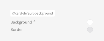
In the Style Customizer this Auto-calculated values are represented by a small A which appears when hovering a property. This is just a helpful notice, but you can undo the mapping by changing the property value.

Global Variables
Global variables are mapped and used across many single components. There are global variables available for the typography, text and background colors, borders, box-shadows, spacings and breakpoints. Adjust these global variables first, and you might not need to go into single components.
For example, changing the global border width will change the border width in all single components which have a border width.
Breakpoint Variables
Some properties have different values depending on the breakpoint for different device sizes.
| Breakpoint | Short | Description |
|---|---|---|
| Small | @s |
Affects device widths of 640px and larger. |
| Medium | @m |
Affects device widths of 960px and larger. |
| Large | @l |
Affects device widths of 1200px and larger. |
| XLarge | @xl |
Affects device widths of 1600px and larger. |
The breakpoint variables can be changed at the very bottom of the General → Global panel. Nonetheless, it's recommended to leave them as they are.