Rows
Rows control the grid layout of your content. Their columns are filled with elements – the actual content of your page.
Hover a row and click the Edit button in the top right corner to open the row settings which are grouped into general Settings and Advanced settings tabs.
Row Layout
A newly created row has one column taking up the whole width. To change the number of columns and their layout, click the preview image. Available column layouts will open in a modal. To load a layout, simply click on it. There are three basic types of column layouts.
| Type | Description |
|---|---|
| Equal Layouts | Split the row into up to six columns that all have the same width. |
| Variable Layouts | Split the row into up to six columns of different widths. |
| Fixed Layouts | Split the row into up to three columns where one column has a fixed width. The other column(s) will automatically fill the remaining space equally. |
Edit Layout
For multi-column layouts an Edit Layout button appears that allows further customizations of the column widths. Mind that choosing another column layout will reset all customizations.

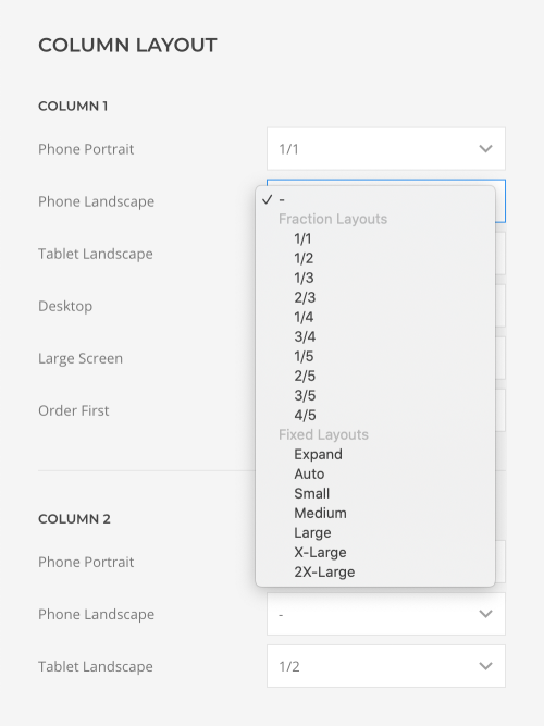
Each column has an option to set its width for the different device widths.
| Widths | Description |
|---|---|
| None | If no column width (–) is selected, the width of the next smaller screen size is applied. |
| Fraction Layouts | Choose Halves, Thirds, Quarters and Fifths as fraction widths. The combination of widths should always take the full width. |
| Fixed Layouts | Choose Small, Medium, Large, X-Large or 2X-Large as a fixed width, Auto to base the width on the content, or Expand to fill up the available space. A fixed layout always needs at least one Expand width so the row takes the full width. |
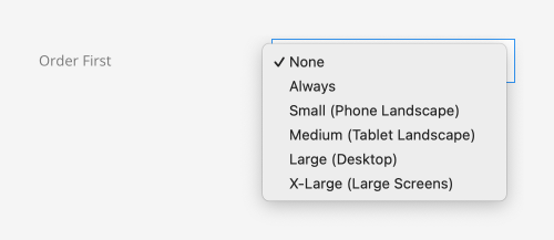
There is an additional option to change the column order. Select the breakpoint from which columns will start to appear before other columns. On smaller screen sizes, the columns will appear in their natural order.
Edit Columns
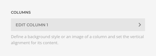
Depending on the chosen layout, an Edit Column button appears to edit the settings of each column. See the column settings below.
Gap
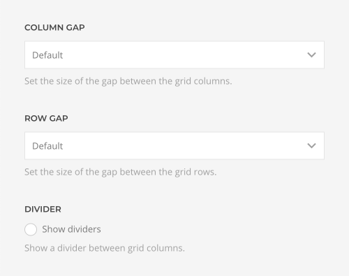
The Column Gap option defines the size of the gap when the columns are aligned side by side while the Row Gap option defines the size of the gap when columns stack on smaller viewports. Click Show dividers to display a line between the columns.
Alignment
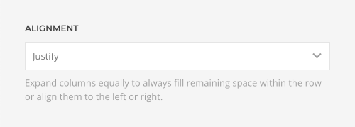
Expand columns equally to always fill remaining space within the row, center them or align them to the left.
Max Width
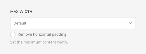
Set the maximum content width for a row. Choose between the Default, Small, Large and X-Large to set a fixed max width. Expand takes the full width including a small padding while None has no padding at all. Additionally, you can remove the horizontal padding of the row.
Important The section may already have a max width which the row cannot exceed. To edit as few settings as possible, it’s recommended only to set a maximum width for the section. Don’t set a max width for the row unless it’s smaller than that of the section.
Column Height
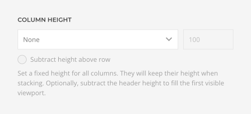
Set the height for all columns. They will keep their height when stacking.
| Option | Description |
|---|---|
| None | The height of a row is defined by its content. |
| Pixels | Set a fixed row height in pixels. |
| Viewport | Set a fixed row height in viewport units, and optionally subtract the height above the row to fill the first visible viewport. |
Important The section may already have a set height which the row cannot exceed.
Margin
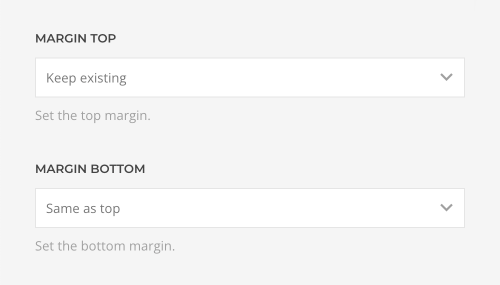
Set the vertical margins of the row using the Margin Top and Margin Bottom options. The first grid's top margin and the last grid's bottom margin are always removed. Define these in the section padding option instead.
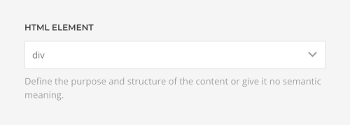
HTML Element
Define the purpose and structure of the content or give it no semantic meaning. This allows you to mark up the content of your website semantically in a way that is meaningful to assistive technologies.
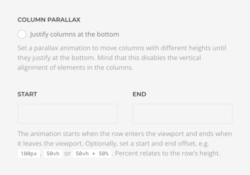
Column Parallax
Set a parallax animation to move columns with different heights while scrolling until they justify at the bottom. Mind that this disables the vertical alignment of elements in the columns. The animation starts when the row enters the viewport and ends when it leaves the viewport. Optionally, set a start and end offset, e.g. 100px, 50vh or 50vh + 50%. Percent relates to the row's height.
Advanced Row Settings
The Advanced tab contains row settings for the HTML markup and CSS.
| Option | Description |
|---|---|
| Status | Disable the row and publish it later. |
| ID | Define a unique identifier for the row. Use this identifier as a URL fragment in any link to navigate to this element, e.g. #myId. |
| Classes | Define one or more class names for the row. Separate multiple classes with spaces. |
| Attributes | Define one or more attributes for the row. Separate attribute name and value by = character. Use one attribute per line. |
| CSS | Enter your own custom CSS. |
Custom CSS
The CSS field allows you to apply custom styling to any row. YOOtheme Pro provides the special class selector .el-row for each row. Custom CSS rules will only apply to this specific row.
Columns
Columns contain elements which in turn display actual content. Click the Edit Column icon in the row settings to open the column settings. Settings are divided into three tabs: Content, Settings and Advanced.
| Tab | Description |
|---|---|
| Content | Contains content fields shown in the layout. |
| Settings | Contains appearance, layout and behavior settings. |
| Advanced | Contains administrative and HTML attribute settings. |
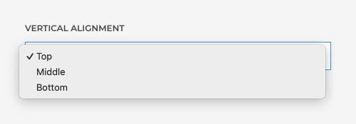
Vertical Alignment
Vertically align elements in the column. This will only have a visual effect if the columns have different heights or a height is set in the row.
Column Background
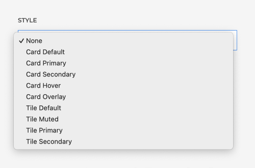
By default, a column has no style. Select the background style, image or video for the column. Each style can be edited in style customizer.
| Style | Description |
|---|---|
| None | The column has no background. |
| Default | Adds a default background, often white or light gray. |
| Muted | Adds a muted background, often slightly darker than the default background. |
| Primary | Adds a primary background, often a vibrant color. |
| Secondary | Adds a secondary background, often dark gray. |
The Primary or Secondary column styles often result in a colorful or dark column and require a light text color. Check the Preserve text color option to disable automatic text recoloring. For example, cards have their own background color. So when using cards inside columns, select this option so their content is not recolored. Learn more about how the theme style automatically recolors content.
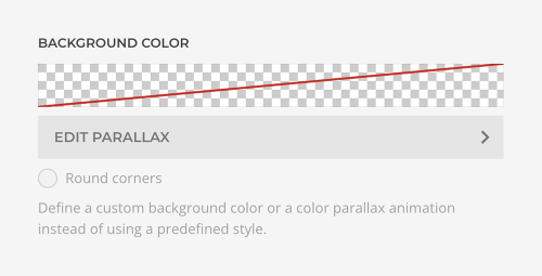
Instead of using a predefined style, define a custom background color or a gradient. Optionally, set a color parallax animation and round corners for the column background.
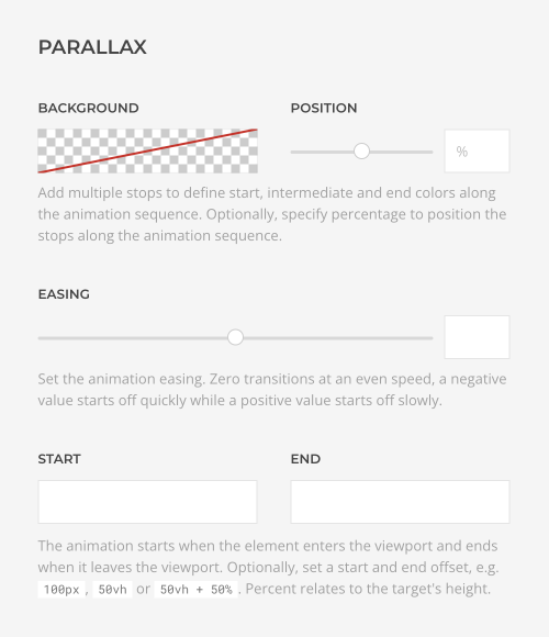
Add multiple stops to define start, intermediate and end colors along the animation sequence, set the easing and change the start and end offset for the animation. Learn more about parallax animation in the general elements documentation.
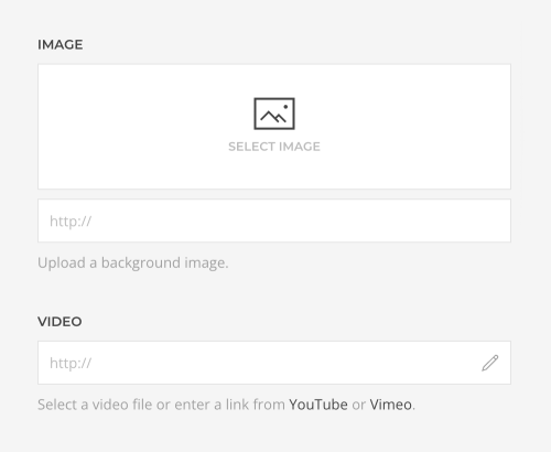
Additionally, a background image or video can be selected in the Content tab.
| Content Field | Description |
|---|---|
| Image | An image field for the colum background which opens the media manager. |
| Video | A video field for the section background which opens the media manager. |
Mind that once an image is selected, the video field is hidden. Remove the selected image to show the video field again. The same applies if a video is selected.
Once an image or a video is selected, a button appears to additional settings.
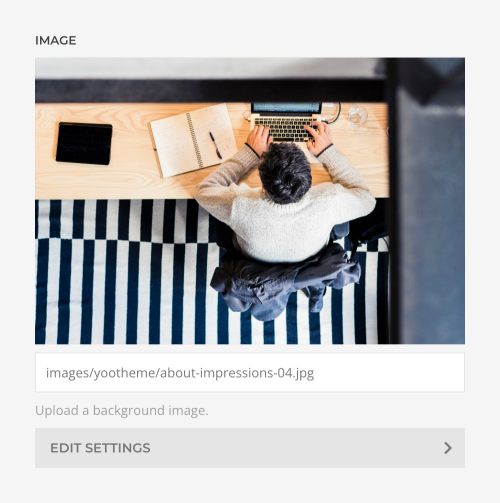
| Option | Description |
|---|---|
| Width and Height | Set the width and height in pixels. Learn more about image dimensions and responsiveness in the files and images documentation. |
| Focal Point | Set a focal point to adjust the image focus when cropping. Learn more in the files and images documentation. |
| Loading | By default, images are loaded lazy. Alternatively, enable eager loading for images which appear in the first viewport. |
| Image Size | Determine whether the image will fit the section dimensions by clipping it or by filling the empty areas with the background color. By default, the image will not be resized. |
| Image Position | Set the initial background position relative to the column layer. By default, the image is centered. |
| Image Effect | Add a parallax effect or fix the background with regard to the viewport while scrolling. |
| Image Visibility | Display the image only on this device width and larger. This may be necessary if the content becomes illegible on small viewports. |
There are three options on how to recolor the image and video in a different tone.
| Option | Description |
|---|---|
| Background Color | Use the background color in combination with blend modes or a transparent image, or to fill the area if the image doesn't cover the whole column. |
| Blend Mode | Determine how the image or video will blend with the background color. |
| Overlay Color | Set an additional transparent overlay to soften the image or video by setting a color or a gradient. Optionally, animate the color overlay on scrolling using parallax settings. |
Learn more in the color picker documentation.
Text Color
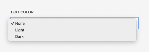
By default, content looks great on any column style. However, there might be cases when the text color needs to be adjusted. For example, when using a background image or video, select the appropriate Text Color depending on whether it’s a dark or a light image or video. Only choose Light or Dark if Default doesn't look good.
Padding
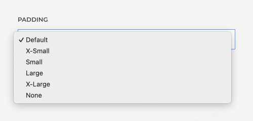
Set the padding of the column.
Position Sticky
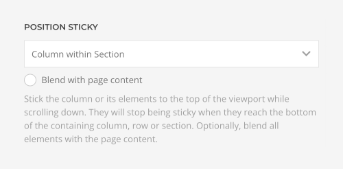
Stick the column or its elements to the top of the viewport while scrolling down. Optionally, blend all elements with the page content. Mind that sticky elements and columns don't expand the height of their containing column or row.
| Option | Description |
|---|---|
| Elements within Column | The elements will stop being sticky when they reach the bottom of its containing row. |
| Column within Row | The column will stop being sticky when it reaches the bottom of its containing row. |
| Column within Section | The column will stop being sticky when it reaches the bottom of its containing section. |
Sticky Elements
If the content of columns has different heights, the elements of a smaller column can stick to the top of the viewport. The elements stop being sticky when they reach the bottom of their containing row. This is typically used in a sidebar with related content that should stay visible while scrolling the main content.
Sticky Parallax Effects
Sticky columns can be used to create advanced parallax effects. Their elements will not scroll out of the viewport, but will be animated using the parallax options while scrolling. To achieve this, the containing section or row should be multiple viewports high. This will define the duration of the parallax animation. The sticky column within this section or row should have a height of one viewport. Finally, add parallax animation to elements within this column and use the target option to apply the animation relatively to the position of the section or row.
Top and Bottom Offset
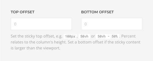
Set the offset from the top of the viewport where the column or its elements should become sticky, e.g. 100px, 50vh or 50vh - 50%. Percent relates to the column's height. Set a bottom offset if the sticky content is larger than the viewport.
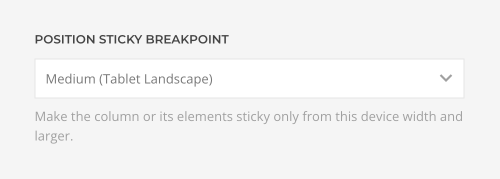
Position Sticky Breakpoint
Make the column or its elements sticky only from this device width and larger.
Empty Dynamic Content
By default, columns collapse if the elements within load dynamic content, but the content is empty. The other columns expand to fill the remaining space. Disable this behavior to keep the width of the column and not expand the remaining columns.

Advanced Column Settings
| Option | Description |
|---|---|
| Dynamic Content | Set the fields source for the dynamic content. |
| ID | Define a unique identifier for the column. Use this identifier as a URL fragment in any link to navigate to this element, e.g. #myId. |
| Classes | Define one or more class names for the column. Separate multiple classes with spaces. |
| Attributes | Define one or more attributes for the column. Separate attribute name and value by = character. Use one attribute per line. |
| CSS | Enter your own custom CSS. |
Custom CSS
The CSS field allows you to apply custom styling to any column. YOOtheme Pro provides the special class selector .el-column for each column. Custom CSS rules will only apply to this specific column.
Examples
/* Select this column */
.el-column { background: red; }

/* Select all direct child elements of this column */
.el-column > * { background: red; }

/* Select all child elements with the uk-button class of this column */
.el-column .uk-button { background: red; }