Customizer
Manage theme settings, customize styles and build page layouts all in one YOOtheme Pro customizer interface.
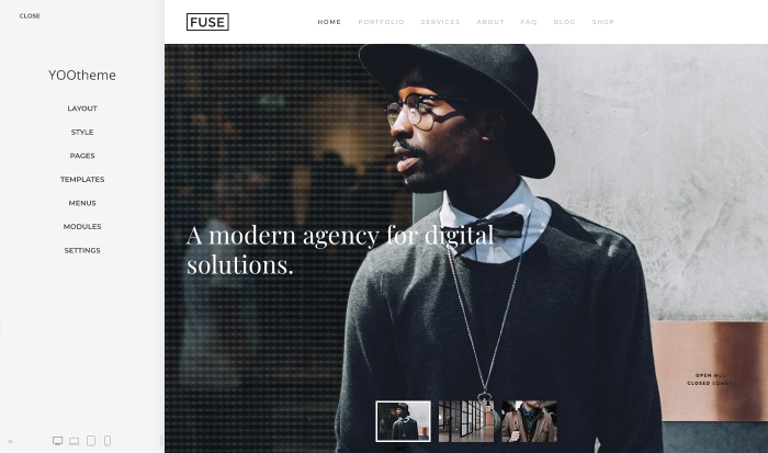
The YOOtheme Pro customizer is split into a sidebar on the left and a real-time preview on the right. The sidebar offers a navigation across the different setting panels of YOOtheme Pro.
Open the Customizer
To open the customizer, click the YOOtheme menu item Joomla administration panel.
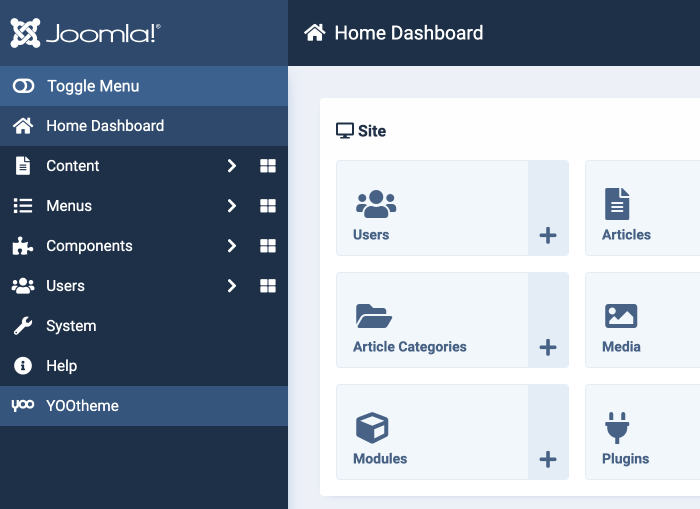
Sidebar Panels
Here is a short overview of all YOOtheme Pro setting panels and their content.
| Panel | Description |
|---|---|
| Layout | Open layout-related settings for the site & logo, header & navbar, mobile header, top, bottom and sidebar, blog and post as well as the footer builder. |
| Style | Open the style customizer to change the style of your site. |
| Pages | Open the page builder to layout individual posts and pages shown in the preview. |
| Templates | Manage templates and their layouts. |
| Menu | Manage menus and their items quickly. |
| Modules | Manage modules and their settings quickly. |
| Settings | Open settings for the favicon, css, scripts, consent manager, API key, external services, advanced, system check and about. |
Save, Cancel and Close
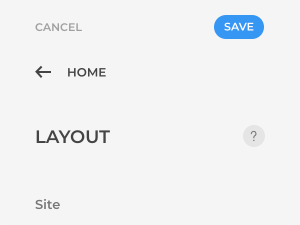
If you change any settings in the YOOtheme Pro customizer, the live preview on the right updates, and Save and Cancel buttons appear at the top of the sidebar. These buttons give you a choice to either save and publish all theme settings or cancel them. There is also an arrow icon in the top left corner that allows you to navigate up one level in the sidebar and the Close button to exit the YOOtheme Pro customizer.
Contextual Help
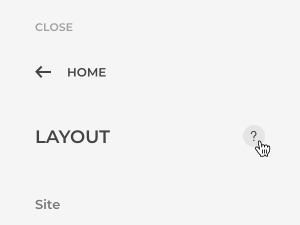
YOOtheme Pro comes with a context-sensitive help for each YOOtheme Pro setting panel. To open it, click the help icon on the right side of the panel's title.
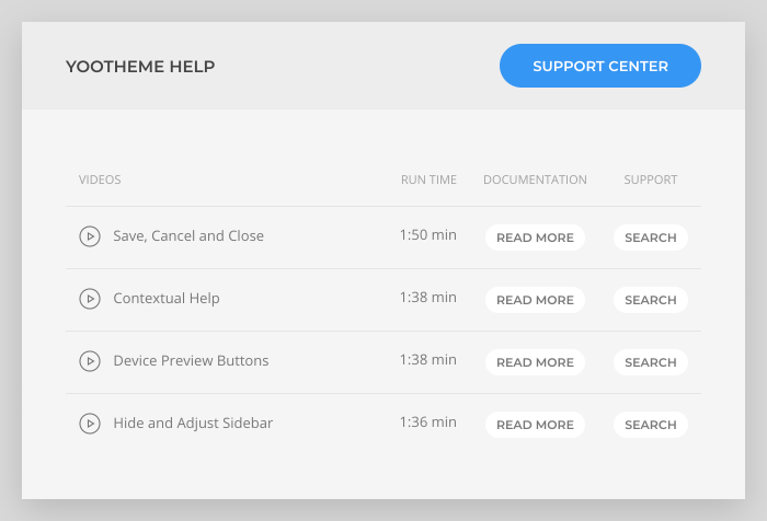
The help window shows instructional videos for all settings of the current YOOtheme Pro panel. There are also contextual links to the documentation and an option to search the specific topic in the support center. To open the support center itself use the button in the top right corner.
Device Preview Buttons
The device preview buttons can be found at the bottom of the sidebar. Use the device icons to check how your site looks on different device sizes.

Note Clicking twice at the tablet or phone icon will switch between portrait and landscape mode.
Hide and Adjust Sidebar
Hide and open the sidebar by clicking the arrow icon to the left of the device preview buttons. This is useful if you are using a smaller screen and want to check how your site will look on the full screen.

Sidebar Width
Adjust the width of the sidebar by dragging the icon to the right. This is useful if you are writing code or a lot of text in a text area field.

