Style Customizer
The YOOtheme Pro style customizer allows you to change any aspect of your site’s appearance without writing any CSS.
Start with one of the pre-built styles from the style library and customize its colors, fonts, spacings and more with just a few clicks.
YOOtheme Pro and all its styles and layouts are created with the UIkit front-end framework. UIkit provides pre-defined HTML classes for buttons, cards, typography and more. Changing the style of these UIkit classes means changing the YOOtheme Pro style as well. Since UIkit styles are written in Less, the YOOtheme Pro style customizer is basically a Less-based style customizer for UIkit. It provides a powerful interface to customize all UIkit components and their modifiers. There is a comprehensive documentation for each component in the UIkit documentation, which is a great resource to learn from.
Style Customizer
The select box at the top shows the current style. Clicking the select box will open the style library in a modal where a different style can be selected. Browse the preview on the right to see how the style looks like on your site.
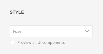
Every time a style is changed or customized, Save and Cancel buttons appear in the top right corner. Clicking Cancel will discard all theme settings since the last saving.
Preview UI components
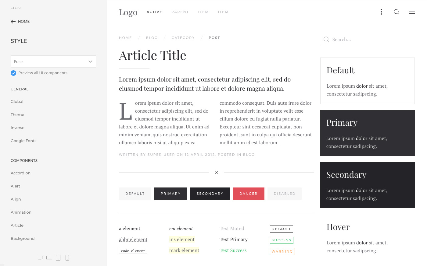
The option Preview all UI components replaces the actual page in the preview to the right with an overview of all UI components. This is great to get a quick feeling of how the style looks like across all components. A detailed preview of each component and all its variations will open when a specific component is customized.
Style Customization
The settings to customize the style are divided into different UI components each with its own settings panel. Settings which are used globally across all UI components are grouped under General, while the single UI components can be found under Components.
Here is an overview of all the settings panels under General and their content.
| Panel | Description |
|---|---|
| Global | Customize global variables which are used across all UI components. It's recommended to adjust them before customizing single UI components. |
| Theme | Customize YOOtheme Pro UI components that do not come from UIkit, like page container, toolbar and box decoration. |
| Inverse | Customize UI components for inversed backgrounds. |
| Google Fonts | Customize which Google font variants are loaded. |
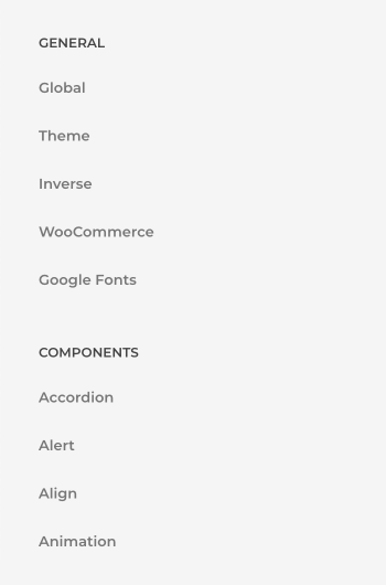
A full list of single UI components is grouped under Components. Click a component to open a sub-panel with all style settings available to customize. All components are UIkit components, and the settings in each panel simply show an interface to change the component variables. See the UIkit documentation for detailed information about each component and its variables.
UI Component Finder
To easily identify components within your website, just hover an item in the sidebar, and all its representations in the live preview will be highlighted with a blue border. Similarly, hovering any content in the live preview will show a tooltip that indicates which components are used in this specific part of the website. This is a good hint as to which components to check in order to customize it.
Fields
UI component can be modified using variables which are written in Less and are then compiled into CSS. Each CSS property has a Less variable in UIkit. You can change these variables in the style customizer using different field types – color and font pickers, select fields as well as input fields.
Reset Customizations
When an option is changed in any of the component sub-panels, a grey dot will appear on the left indicating that the component has been modified. Hovering that dot will show an X, which, when clicked, resets the option back to the default value of the selected style.
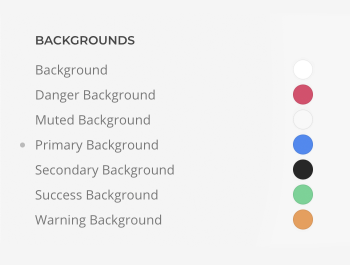
There is also a reset button to reset all options from one component.
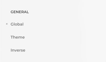
Hit Reset to Defaults button at the bottom of the sidebar to reset all attributes to the style default values.

Download Less
All customizations added in the style library can be downloaded as a Less file. Unlike the style preset saved in the style library, Download Less button only downloads the Less customizations without the used style. The downloaded style.less file automatically groups all variables according to their components, making it easy to understand the code. This way style modifications can be put into a child theme when creating a custom style later.

Recompile Style
By default, the style is automatically compiled after a change in the style customizer or after a YOOtheme Pro update. But in some cases the style needs to be recompiled manually, for example when creating a custom Less style in the child theme. To do that, simply click the Recompile Style button.

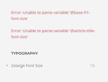
Less Error
Inserting invalid values in the style customizer, e.g. typos like 10x instead of 10px, will result in one line of invalid CSS, which is ignored by the browser. Special characters like @, :, {} and others may cause a Less syntax error. A red error message is shown in the main panel of the style customizer at the top. Because the Less source can't be compiled into CSS anymore, the style customizer will stop working. To solve this, just browse back to the affected component’s sub-panel and reset the customizations by clicking the gray dot on left of the modified property.
