Modules
Extend any part of YOOtheme Pro with custom functionalities. For example, add settings sections and panels to the YOOtheme Pro customizer, add elements or content sources to the page builder or load needed asset files into the site.
YOOtheme Pro has a modular and extensible application architecture. Its code is structured into modules. A module is a package of code that extends functionality of YOOtheme Pro.
Getting Started
The easiest way to get started is to take a look at the example module on Github or the modules included in YOOtheme Pro. If you are using the YOOtheme Starter Plugin, just generate an example module using the composer create:module command.
Included Modules
YOOtheme Pro modules are a useful resource to get started when creating a custom module. They can be found in the packages directory in YOOtheme Pro.
Module Definition
At its simplest, a YOOtheme Pro module is a PHP file, typically named bootstrap.php, which returns an array with a module definition. The module definition is used to provide bootstrapping, routing and other configuration options. Here you can listen to events, add custom classes and your own controllers. In the child theme the equivalent file is the config.php file.
<?php

return [

    // Set theme configuration values
    'theme' => [

    ],

    // Register event handlers
    'events' => [

    ]

];
Use the following property keys in the module definition array.
| Option | Description |
|---|---|
events |
Register event handlers. |
theme |
Set theme configuration values. |
routes |
Register routes. |
actions |
Register Joomla event handlers or WordPress action handlers. |
filters |
Register WordPress filter handlers. |
config |
Set application configuration values. |
extend |
Extend service definitions. |
services |
Register services. |
aliases |
Register service aliases. |
Events
Register event handlers and listen to various events that are triggered during the execution of the theme application.
| Event | Description |
|---|---|
theme.init |
Fires after the theme is initialized |
theme.head |
Fires before the head is rendered |
customizer.init |
Fires before customizer is initialized |
source.init |
Fires before the source schema is initialized |
The order of event handlers is defined by their priority. The default priority is set to 0. Higher priorities are executed earlier.
include_once __DIR__ . '/src/MyListener.php';

return [

    'events' => [

        'theme.head' => [
            MyListener::class => 'initHead'
        ],

        'theme.init' => [
            MyListener::class => ['initTheme', 10]
        ],

        'customizer.init' => [
            MyListener::class => ['initCustomizer', -10]
        ]

    ]

];
Event handlers are defined in their own listener class.
class MyListener
{
    public static function initHead() {}

    public static function initTheme() {}

    public static function initCustomizer() {}
}
Extend Configuration
The customizer configuration defines all settings in the customizer. Add new settings by extending it with a custom JSON file. Simply register an event handler SettingsListener::initCustomizer to the customizer.init event.
include_once __DIR__ . '/src/SettingsListener.php';

return [

    'events' => [

        'customizer.init' => [
            SettingsListener::class => 'initCustomizer'
        ]

    ]

];
Use the YOOtheme\Config service and its YOOtheme\Config::addFile() method to add a JSON configuration file to the global configuration of YOOtheme Pro. In this example it's added to the customizer configuration. The Path::get() helper method resolves the path relative to the file the method is called from.
use YOOtheme\Config;
use YOOtheme\Path;

class SettingsListener
{
    public static function initCustomizer(Config $config)
    {
        $config->addFile('customizer', Path::get('./customizer.json'));
    }
}
Now the customizer.json is loaded into the customizer configuration. For example, it can be used to add new settings to the customizer or to add custom Less files into the style customizer.
Add Asset Files
To add custom asset files to the head of the HTML document, register an event handler AssetsListener::initHead to the theme.head event.
include_once __DIR__ . '/src/AssetsListener.php';

return [

    'events' => [

        'theme.head' => [
            AssetsListener::class => 'initHead'
        ]

    ]

];
Use the YOOtheme\Metadata service and its YOOtheme\Metadata::set() method to add metadata elements like in this case the assets files. The first argument defines the meta data type and after the : a unique identifier is given. The second argument is either an array of attributes or the content of the HTML element.
use YOOtheme\Metadata;

class AssetsListener
{
    public static function initHead(Metadata $metadata)
    {
        // Style file
        $metadata->set('style:my-css', ['href' => Path::get('../assets/css/custom.css')];

        // Inline style
        $metadata->set('style:my-inline-css', 'body {color: blue}');

        // Script file
        $metadata->set('script:my-js', 'src' => Path::get('../assets/js/custom.js'), 'defer' => true]);

        // Inline script
        $metadata->set('script:my-inline-js', 'var custom = 123;');
    }
}

Add Settings
Sections are top-level entry points which have their own menu items in the YOOtheme Pro customizer, for example the Layout and Settings sections. Typically, a section contains a settings panel with a group of fields, but it can also have a navigation to deeper nested panels. To add a section or a panel to the customizer, first extend the customizer configuration with a custom JSON file.
JSON Configuration
The JSON configuration defines the sections and panels and how the editing interface should look like inside the builder. Make sure to use unique keys for sections, panels and fields.
| Property | Description |
|---|---|
title |
Label in the customizer |
width |
Width of the customizer sidebar when editing the element |
priority |
Define where the section is shown in the customizer navigation. |
fields |
Define the fields of the section. |
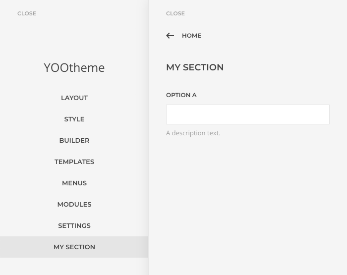
The following example adds a My Section menu item to YOOtheme Pro which opens a simple section configuration with a field.
{
    "sections": {
        "my-section": {
            "title": "My Section",
            "width": 400,
            "priority": 100,
            "fields": {
                "option_a": {
                    "label": "Option A",
                    "description": "A description text."
                }
            }
        }
    }
}

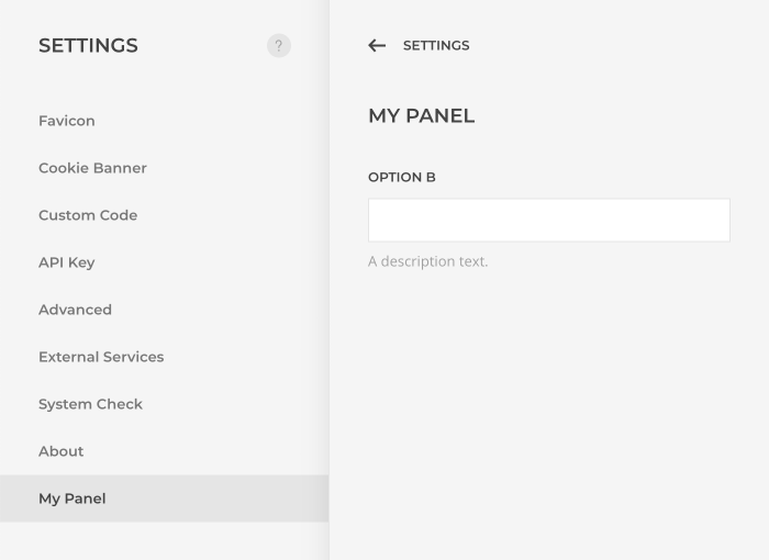
The following example adds a My Panel menu item to the Settings section in the customizer which opens a simple panel configuration with a field.
 {
    "sections": {
        "settings": {
            "fields": {
                "settings": {
                    "items": {
                        "my-panel": "My Panel"
                    }
                }
            }
        }
    },
    "panels": {
        "my-panel": {
            "title": "My Panel",
            "width": 400,
            "fields": {
                "option_b": {
                    "label": "Option B",
                    "description": "A description text."
                }
            }
        }
    }
}

The configuration of the Layout section and all its panels is a useful resource to get started when creating new sections and panels. It can be found in the respective module directory under packages/theme/config/customizer.json in YOOtheme Pro. Learn more about fields and their types in the custom element documentation.
PHP Configuration
If a dynamic configuration is needed, use the YOOtheme\Config service to directly modify the configuration instead of using a static JSON file.
The following example adds a My Section menu item to YOOtheme Pro which opens a simple section configuration with a field.
use YOOtheme\Config;

class SettingsListener
{
    public static function initCustomizer(Config $config)
    {
        $config->set('customizer.sections.my-section', [
            'title'  => 'My Section',
            'width'  => 400,
            'priority'  => 100,
            'fields' => [
                'option_a' => [
                    'label' => 'Option A',
                    'description' => 'A description text.'
                ]
            ]
        ]);
    }
}
The following example adds a My Panel menu item to the Settings section in the customizer which opens a simple panel configuration with a field.
use YOOtheme\Config;

class SettingsListener
{
    public static function initCustomizer(Config $config)
    {
        $config->set('customizer.panels.my-panel', [
            'title'  => 'My Panel',
            'width'  => 400,
            'fields' => [
                'option_a' => [
                    'label' => 'Option A',
                    'description' => 'A description text.'
                ]
            ]
        ]);

        $config->set('customizer.sections.settings.fields.settings.items.my-panel', 'My Panel');
    }
}
Add Less Files
To add a custom Less file to the theme configuration, register a custom component name and the path to the Less file under the styles.components key. Use the same file basename as the component name.
return [

    'theme' => [
        'styles' => [
            'components' => [
                'my-component' => Path::get('./assets/less/my-component.less'),
            ],
        ],
    ],

];
All defined Less variables will appear in the new component panel in the style customizer. Mind that variables prefixed with internal will not show up in the style customizer.
// Name:            My Component
// Description:     This is my custom component
//
// Component:       `my-component`
//
// Sub-objects:     `my-component-title`
//                  `my-component-card`
//
// ========================================================================


// Variables
// ========================================================================

@my-component-title-margin:                         40px;

@my-component-title-color:                          #ddd;

@my-component-card-background:                      @global-primary-background;

@internal-my-component-card-gradient:               ~'';


/* ========================================================================
   Component: My Component
 ========================================================================== */

.my-component-title {
    margin-top: @my-component-title-margin;
    .hook-my-component-title();
}

.my-component-card {
    background-color: @my-component-card-background;
    .hook-my-component-card();
}

//
// Following properties will only be set if they differ from their default value
//

// Color
.hook-my-component-title() when not (@my-component-title-color = transparent) {
    color: @my-component-title-color;
}

// Background Gradient
// Mind that variables prefixed with `internal` will not show up in the style customizer.

.hook-my-component-card() when not (@internal-my-component-card-gradient = ~'') {
    background-image: @internal-my-component-card-gradient;
}
To further integrate the component with the style customizer, extend the module definition by adding a custom JSON file to the style customizer configuration.
use YOOtheme\Theme\Styler\StylerConfig;

return [

    'config' => [
        StylerConfig::class => __DIR__ . '/config/styler.json',
    ],

];
The JSON file with the custom component:
{
    "components": {
        "my-component": {
            "name": "My Component",
            "groups": {
                "title": "@my-component-title-*",
                "card": "@my-component-card-*"
            },
            "hover": "[class*='my-component-']",
            "inspect": "[class*='my-component'], [class*='my-component'] > *"
        }
    }
}
| Option | Description |
|---|---|
name |
Title of the component panel. |
groups |
Group Less variables by their prefixes. |
hover |
A CSS selector which defines which HTML elements are highlighted with a blue border in the preview to the right when hovering the component menu in the style customizer. |
inspect |
A CSS selector which defines which HTML elements show a tooltip with the component name when hovering them in the preview to the right. |
Compiling the Less sources
To trigger a compiling of the Less sources, listen for the YOOtheme\Theme\Styler\StylerConfig event, and set the property update in the config to true. The compilation will happen upon opening the customizer.
use YOOtheme\Theme\Styler\StylerConfig;

include_once __DIR__ . '/src/StyleListener.php';

return [

    'events' => [
        StylerConfig::class => [StyleListener::class => 'config'],
    ]

];
The event handler is defined in its own class.
use YOOtheme\Theme\Styler\StylerConfig;

class StyleListener
{
    public static function config(StylerConfig $config): StylerConfig
    {
        if (/* Your conditional code */) {
            // Style needs to be re-compiled
            $config['update'] = true;
        }

        return $config;
    }
}
Add Builder Elements
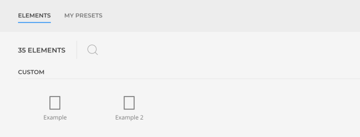
To add custom elements to the page builder, extend the YOOtheme\Builder service by adding new elements. The YOOtheme\Builder::addTypePath method adds multiple elements using a glob pattern. In the following example all elements are located in the elements directory and have their own directory with their element.json configuration file.
use YOOtheme\Builder;
use YOOtheme\Path;

return [

    'extend' => [

        Builder::class => function (Builder $builder) {
            $builder->addTypePath(Path::get('./elements/*/element.json'));
        }

    ]

];

Template Files
All fields added to the customizer are stored under the ~theme namespace and can be accessed in the template files.
echo $config('~theme.option_a');
If the $config variable is not available already, the YOOtheme\Config service can be accessed using the global \YOOtheme\app() function.
namespace YOOtheme;

$config = app(Config::class);

echo $config('~theme.option_a');
Mind that field names have to be unique. Therefore, it's recommended to add a namespace to the field names using the dot notation.
"fields": {
    "my_namespace.option_a": {
        "label": "Option A"
    },
    "my_namespace.option_b": {
        "label": "Option B"
    }
}
Use the YOOtheme\Config::addAlias() method to define an alias and shorten the call to access the field value.
$config->addAlias('~my_namespace', '~theme.my_namespace');

echo $config('~my_namespace.option_a');
echo $config('~my_namespace.option_b');
Add Translations
Add your own language files in order to translate field names or descriptions e.g. for your custom elements.
Register an event handler TranslationListener::initCustomizer to the customizer.init event and add own language files to the translator.
include_once __DIR__ . '/src/TranslationListener.php';

return [

    // Listen to any events triggered by YOOtheme Pro and handle them in your own listener
    'events' => [

        'customizer.init' => [
            TranslationListener::class=> ['initCustomizer', -10],
        ],

    ],

];
Create a new folder languages in the module directory and add a language file for each locale you want to translate, e.g. en_GB.json. Add the language strings you want to translate as key: value to the file. In the TranslationListener add the language file from the languages folder matching the current locale to the Translator.
use YOOtheme\Config;
use YOOtheme\Path;
use YOOtheme\Translator;

class TranslationListener {

    static function initCustomizer(Config $config, Translator $translator) {

        $translator->addResource(Path::get("../languages/{$config('locale.code')}.json"));

    }

}
Add Widget Areas
Custom widget areas, formerly known as sidebar areas, can be added to the theme configuration in the module definition. These areas will be added to the existing ones and automatically registered in WordPress.
<?php

return [

    // Set theme configuration values
    'theme' => [
        'positions' => [
            'my-area' => 'My Area'
        ]
    ]

];