Sections
Sections group content into larger visual blocks and define their appearance. For example, set a background color or image and define the width, padding and text color of the section content.
Hover a section and click the Edit icon right next to the section name to open its settings. Settings are divided into three tabs: Content, Settings and Advanced.
| Tab | Description |
|---|---|
| Content | Contains content fields shown in the layout. |
| Settings | Contains appearance, layout and behavior settings. |
| Advanced | Contains administrative and HTML attribute settings. |
Background
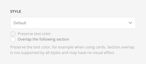
The section background can be set in the Settings tab under Style. Select one of the predefined styles.
| Style | Description |
|---|---|
| Default | The default background, often white or light gray. |
| Muted | The muted background, often slightly darker than the default background. |
| Primary | The primary background, often a vibrant color. |
| Secondary | The secondary background, often black or dark gray. |
Note The colors of these styles are defined by the global theme style selected in the style customizer. They can be modified in the Style → Components → Section panel of YOOtheme Pro.
The Primary or Secondary section styles often have a vibrant or dark color and automatically change the color of their content to light. However, there are cases when this behavior must be prevented, for example, when sections contain cards which have their own background color. Check the Preserve text color option to disable the automatic recoloring by the section. Learn more about how the theme style automatically recolors content in the inverse style documentation.
Some theme styles use slants or textures to create an overlap between two sections. To enable it, check the Overlap the following section option. This even works if the section uses a background image. If instead the following section has the background image, additionally apply the uk-section-overlap-flip class.
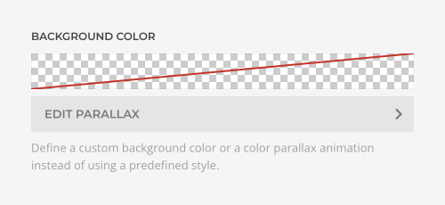
Instead of using a predefined style, define a custom background color or a gradient. Optionally, set a color parallax animation.
Add multiple stops to define start, intermediate and end colors along the animation sequence, set the easing and change the start and end offset for the animation. Learn more about parallax animation in the general elements documentation.
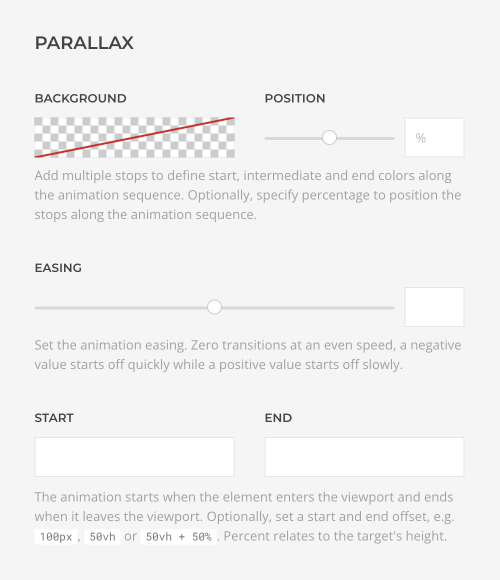
Image and Video
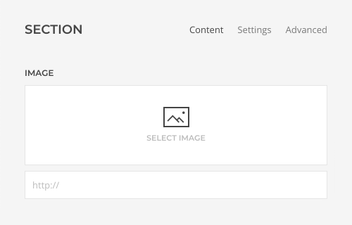
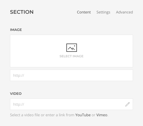
Additionally, a background image or video can be selected in the Content tab.
| Content Field | Description |
|---|---|
| Image | An image field for the section background which opens the media manager. |
| Video | A video field for the section background which opens the media manager. |
Mind that once an image is selected, the video field is hidden. Remove the selected image to show the video field again. The same applies if a video is selected.
Once an image or a video is selected, a button appears to additional settings.
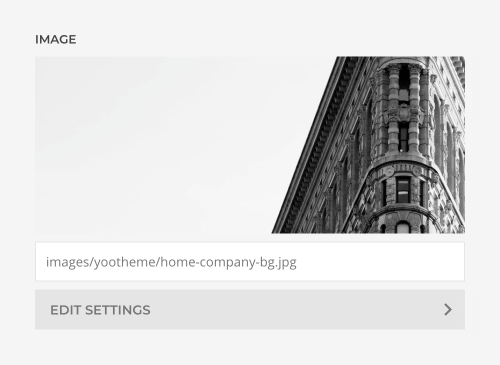
| Option | Description |
|---|---|
| Width and Height | Set the width and height in pixels. Learn more about image dimensions and responsiveness in the files and images documentation. |
| Focal Point | Set a focal point to adjust the image focus when cropping. Learn more in the files and images documentation. |
| Loading | By default, images are loaded lazy. Alternatively, enable eager loading for images which appear in the first viewport. |
| Image Size | Determine whether the image will fit the section dimensions by clipping it or by filling the empty areas with the background color. Alternatively, set the image size to 100% width or height. |
| Image Position | Set the initial background position relative to the section layer. By default, the image is centered. |
| Image Effect | Add a parallax effect or fix the background with regard to the viewport while scrolling. |
| Visibility | Display the image or video only on this device width and larger. This may be necessary if the content becomes illegible on small viewports. |
There are three options on how to recolor the image and video in a different tone.
| Option | Description |
|---|---|
| Background Color | Use the background color in combination with blend modes or a transparent image, or to fill the area if the image doesn't cover the whole section. |
| Blend Mode | Determine how the image or video will blend with the background color. |
| Overlay Color | Set an additional transparent overlay to soften the image or video by setting a color or a gradient. Optionally, animate the color overlay on scrolling using parallax settings. |
Learn more in the color picker documentation.
Text Color
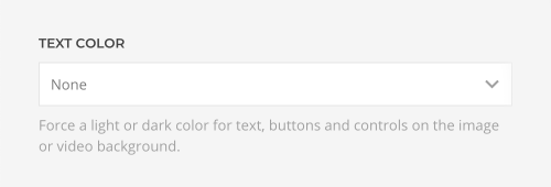
By default, content looks great on any section style. However, using a background image or video may require to change the text color to either Light or Dark.
Width
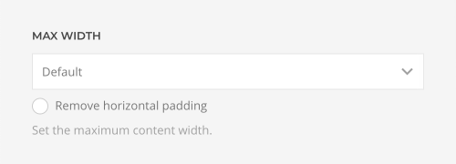
Set the maximum width for the content within the section. Choose between the Default, X-Small, Small, Large and X-Large to set a fixed max width. The Expand option expands the content to the full width of the section keeping a small padding to the left and right while the None option has no padding at all.
The fixed width options keep a small padding to the left and right if the viewport is smaller than the set maximum content width. Check the Remove horizontal padding option to remove the padding on small viewports.
Use the Expand One Side option to expand the width of one side to the left or right while the other side keeps within the constraints of the max width.
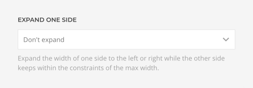
To remove the default padding from the expanding side, open the general settings of the corresponding element and check the Remove left or right padding option.

Height
Set the height for a section to adjust it to the viewport height if its content is smaller than the viewport. This is typically used for hero sections.
| Option | Description |
|---|---|
| None | The height of a section is defined by its content. |
| Pixels | Set a fixed section height in pixels. |
| Viewport | Set a fixed section height in viewport units, and optionally subtract the header height to fill the first visible viewport. |
| Viewport (Subtract Next Section) | Expand the height of a section so the next section also fits the viewport, and optionally subtract the header height to fill the first visible viewport. |
| Expand Page to Viewport | If the height of all sections together is smaller than the viewport, expand one section to fill the viewport. Otherwise, the document background color would be shown below the last section. |
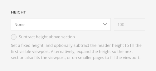
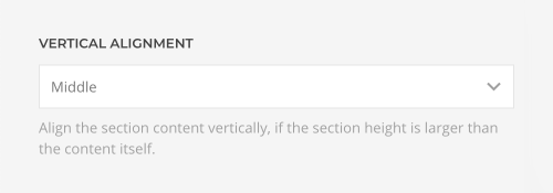
If a fixed section height is set, section content can be aligned vertically using the Vertical Alignment option.
Padding
Set the top and bottom padding of the section. Choose between the Default, X-Small, Small, Large, X-Large and None.
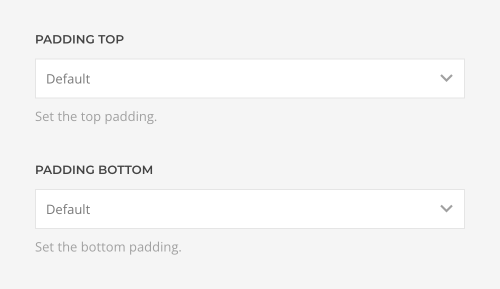
Note If two consecutive sections have the same style, it's recommended to remove either the bottom padding of the first section or the top padding of the second section and control the space with just one padding option. This ensures the same padding across all sections.
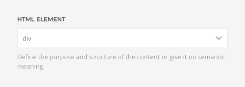
HTML Element
Define the purpose and structure of the content or give it no semantic meaning. This allows you to mark up the content of your website semantically in a way that is meaningful to assistive technologies.
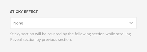
Sticky Effect
Choose a sticky effect for the section. Cover the sticky section by the following section while scrolling or reveal it by previous section.
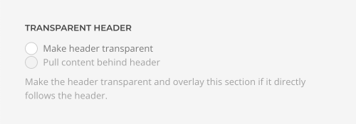
Transparent Header
Make the header transparent and overlay the background of the first section. By default, this option expands the section height to the top while preserving the position and vertical alignment of the content. Check the Pull content behind navbar option to pull the section and its elements behind the header and navbar. For example, if a section has no vertical padding, this can be used to show a full screen image slideshow behind the header and navbar.
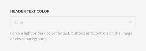
Optionally, force a Light or Dark color for text, buttons and controls on the image or video background. This only applies if the section directly follows the header.
Animation
Apply an animation to all elements inside the section once they enter the viewport.
| Option | Description |
|---|---|
| Fade | The element fades in |
| Scale | The element fades in and scales up or down. |
| Slide Small | The element fades and slides in from the top, bottom, left or right by a small offset. |
| Slide Medium | The element fades and slides in from the top, bottom, left or right by a medium offset. |
| Slide 100% | The element fades and slides in from the top, bottom, left or right by its own height or width as offset. |
Note For the Grid and Gallery elements, the animation is applied to their items and not the element itself.
Check the Delay element animations option to slightly delay the animations, so they don't play all at the same time.
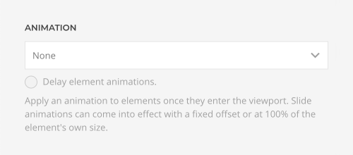
To disable or change the animation for specific elements, use the animation option in the general element setting.

Title
Section titles are a typographic decoration element. They are displayed edgewise on the left or right border of sections. Set the section title in the Content tab. Mind that they do not replace the actual content headings.

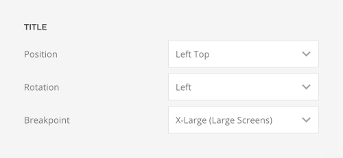
Choose the position, rotation and breakpoint of the section title in the Settings tab.
| Option | Description |
|---|---|
| Position | Define the title position within the section. |
| Rotation | Rotate the title 90 degrees clockwise or counterclockwise. |
| Breakpoint | Display the section title only on this device width and larger. This may be necessary if the title overlays content on small viewports. |
Advanced
The Advanced tab contains administrative and HTML attribute settings for the section.
| Option | Description |
|---|---|
| Name | Define a name to easily identify this section inside the page builder. The name will appear in the builder overview. |
| Status | Disable the section and publish it later. |
| Dynamic Content | Set the fields source for the dynamic content. |
| ID | Define a unique identifier for the section. Use this identifier as a URL fragment in any link to navigate to this section, e.g. #myId. |
| Classes | Define one or more class names for the section. Separate multiple classes with spaces. |
| Attributes | Define one or more attributes for the section. Separate attribute name and value by = character. Use one attribute per line. |
| CSS | Enter your own custom CSS. |
Custom CSS
Apply custom styling to a section in the CSS field. YOOtheme Pro provides the special class selector .el-section to select the section. Custom CSS rules will only apply to this specific section.
Examples
/* Select this section */
.el-section { background: red; }

/* Select all direct child elements of this section */
.el-section > * { background: red; }

/* Select all child elements with the uk-button class of this section */
.el-section .uk-button { background: red; }
