Site & Logo
Choose a logo and customize the overall layout of the site.
The Logo is the brand identity of a website. By default, it is always displayed on the top left of each page. This can be changed by choosing a different header layout.
The following settings can be found in the Layout → Site panel of YOOtheme Pro.
Logo
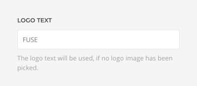
Logo Text
Type in the Logo Text that will be used in case no Logo Image from your media library has been picked.
Logo Image
Upload your logo in the SVG image format for best quality on all screens. SVG logo can be injected into the markup so it adopts the text color automatically. Alternatively, you can use PNG or JPG in a high resolution so that the logo looks sharp on all displays.
Set the width and height of your logo. Learn more how to resize and crop images in the files and images documentation.
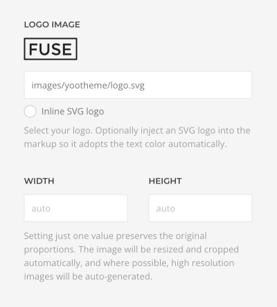
Note Inline SVG option also applies to all following SVG logos.
Inverse Logo
Select an optional Inverse Logo with inversed color, for example white, for better visibility on dark backgrounds. It will be displayed automatically if needed.
Note For example, an inverse logo is used for a transparent header overlaying the first section that has a dark background.
Mobile Logo
Select an optional Mobile Logo for the mobile header. It will replace the default logo on smaller screens. It's recommended to upload a simplified logo that leaves out unnecessary details to fit best on mobile devices. The mobile logo has its own width and height options.
Mobile Inverse Logo
Select an optional Mobile Inverse Logo with inversed color, for example white, for better visibility on dark backgrounds. It will be displayed automatically if needed.
Dialog Logo
Select an optional Dialog Logo. It will be shown in the dialog layouts for both header and mobile header. The dialog logo has its own width and height options.
Layout
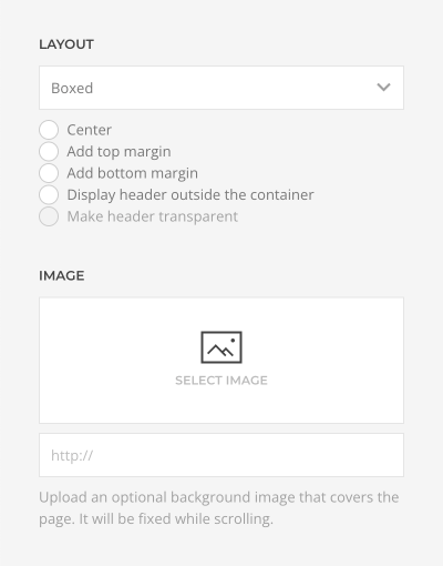
By default, the website expands to the Full Width of the browser window. This includes the background of all sections on your pages. But you can also choose a Boxed Page layout which will wrap all of your page content into a boxed container. By default, the background of the boxed page layout will show a solid color or gradient which depends on your chosen style.
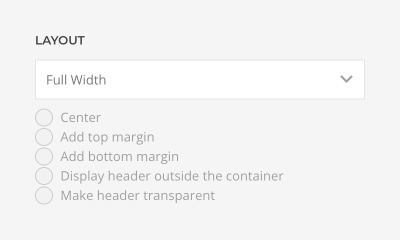
Boxed Page Layout
There are some additional settings for the boxed page layout.
| Option | Description |
|---|---|
| Alignment | Position the page layout in center. |
| Top Margin | Add the top margin to the page layout. |
| Bottom Margin | Add the bottom margin to the page layout. |
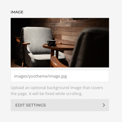
Once an image is selected, a button appears to edit further image settings.
| Option | Description |
|---|---|
| Width and Height | Set the width and height in pixels. Learn more about image dimensions and responsiveness in the files and images documentation. |
| Image Size | Determine whether the image will fit the page dimensions by clipping it or by filling the empty areas with the background color. By default, the image will not be resized. |
| Image Position | Set the initial background position relative to the page layer. By default, the image is centered. |
| Image Effect | Add a parallax effect or fix the background with regard to the viewport while scrolling. |
| Image Visibility | Display the image only on this device width and larger. This is recommended if the image is not visible at all on a smaller viewport, so it's also not being loaded. |
There are three options of how to recolor the image in a different tone.
| Option | Description |
|---|---|
| Background Color | Use the background color in combination with blend modes or a transparent image to fill the area if the image doesn't cover the whole page. |
| Blend Mode | Determine how the image will blend with the background color. |
| Overlay Color | Set an additional transparent overlay to soften the image by setting a color or a gradient. |
Transparent Header
If the header is positioned outside the page, make the header transparent and overlay the page background. Select whether the header and the navbar have Light or Dark text color.
Toolbar
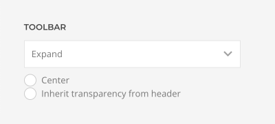
The toolbar is only displayed when the toolbar-left or toolbar-right areas have anything to display on the current page. For example, social icons or the search might be configured to show in the toolbar. By default, the content of the toolbar is constrained to the default container width.
| Option | Description |
|---|---|
| Width | Set a fixed width for the content of the toolbar or expand it to the full width of the window. |
| Center | Center the toolbar so the toolbar-left and toolbar-right areas appear in the middle of the page. |
| Transparency | Allow the toolbar to inherit transparency from the header. |
Note You can publish additional widgets in the toolbar areas.
Breadcrumbs
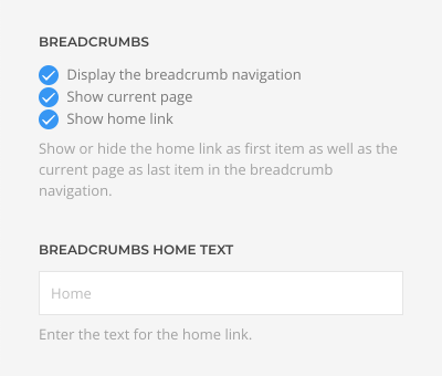
Breadcrumbs are a navigational element for hierarchical page structures. By default, they are hidden. If Display the breadcrumb navigation is enabled, they will show up above the main content of a page, for example when looking at the Blog view.
There are additional options to display breadcrumbs.
| Option | Description |
|---|---|
| Show current page | Show or hide the current page as last item. |
| Show home link | Show or hide the home link as first item. |
| Home Text | Enter the text for the home link. |
This is a shortcut that publishes breadcrumbs on this position. You can also publish a breadcrumbs widget on any available widget area. Hiding the home link and current page may cause the breadcrumbs to collapse if there is no other link to show.
Note This setting won't display the breadcrumbs on pages and templates created with the YOOtheme Pro page builder. Instead, use the breadcrumbs element to publish the breadcrumbs.
Main Section
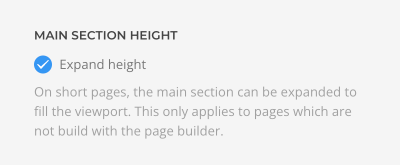
There is an option to expand the height of the main section to fill the viewport on short pages. Mind that the main section is only rendered on pages not using the page builder. Disable this option only if there is a footer section that expands its height instead.
