Widgets
All you need to know about widgets and areas in YOOtheme Pro – from controlling their appearance and style to using the page builder anywhere on your page.
Widgets can be managed in the Widgets panel in YOOtheme Pro. There are several widget areas that can be used to create all kinds of complex layouts.
Widgets
The Widgets panel shows a list of all widget areas and their assigned widgets. A gray dot next to a widget indicates that this widget is published on the page shown in the live preview. Hovering a widget in the sidebar highlights its representation in the live preview with a blue border. An option to only display widgets in the sidebar that are published and visible on the specific page is also available.
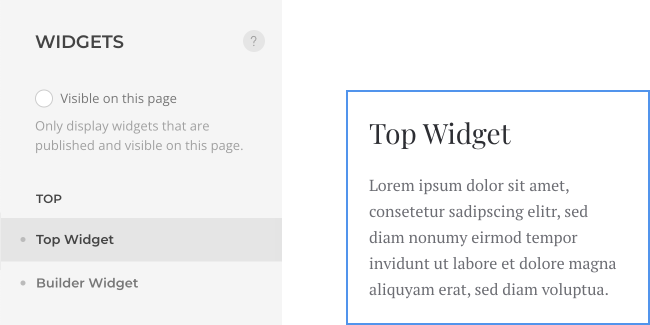
Click a widget to open a panel with further options to control the appearance and style of the widget. To add or edit widgets in WordPress, go to the WordPress administration under Appearance → Widgets.
Add a New Widget
For a more detailed information about widgets, refer to the WordPress documentation.
Widget Areas
YOOtheme Pro comes with the following widget areas where any number of widgets can be published. Areas without widgets or with widgets that have no content output will automatically collapse, and the layout will adapt accordingly.
| Area | Description |
|---|---|
toolbar-lefttoolbar-right |
Publish widgets in the toolbar above the header. Define the layout in the toolbar settings in Layout → Site. |
logonavbarheaderdialog |
Publish widgets in the header. Define the layout in the header settings in Layout → Header. |
logo-mobilenavbar-mobileheader-mobiledialog-mobile |
Publish widgets in the mobile header on small devices. They are mobile equivalents of the header areas. Define the layout in the mobile header settings in Layout → Mobile. |
sidebar |
Publish widgets next to the main system output on pages not built with the YOOtheme Pro page builder. Define the layout in the sidebar settings in Layout → Sidebar. |
topbottom |
Publish widgets above and below the main system output. Define the layout in the top and bottom settings in Layout → Top and in Layout → Bottom. |
builder-1 to builder-6 |
Publish widgets using the Area element in the YOOtheme Pro page builder. They are not rendered anywhere else in the theme. |
Note Use the Builder Widget to create more complex widget layouts in one of abovementioned areas.
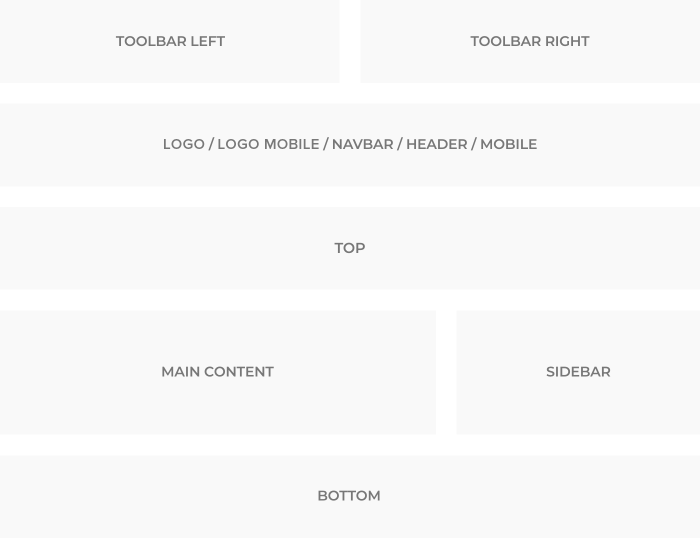
Toolbar
The toolbar-left and toolbar-right areas are perfect for publishing a single line of text, a search or a language switcher above the header. Multiple widgets are displayed next to each other in a row.
Navbar and Header
The navbar, header, navbar-mobile and header-mobile areas are used for publishing different menus, search, social icons or a shopping cart in the header. Multiple widgets are displayed next to each other in a row.
Dialog
The dialog and dialog-mobile areas are used to display menus or widgets in a dropbar, offcanvas sidebar or modal window. The dialog is opened by clicking a toggle icon which automatically appears in the header or mobile header. Multiple widgets will stack above each other.
Logo
The logo and logo-mobile areas are used to display the logos set in the Layout → Site settings. For advanced use cases, for example when displaying different logos on different pages or for different languages, publish widgets in these areas. Multiple widgets are displayed next to each other in a row.
Sidebar
The sidebar area is not rendered on pages built with the YOOtheme Pro page builder, even if a widget is published in the sidebar. This is because the page builder allows building full-width sections where the sidebar needs to be placed within the layout of these sections. This can be done using the Area element in the page builder. Each Area element has its own settings. This allows you to have separate sidebar layouts on different pages. Multiple widgets will stack above each other.
Top and Bottom
Widgets published in the top or bottom area are displayed in a horizontal grid. By default, the widgets fill up the available space evenly. For example, when publishing two widgets, each of them will automatically use 50% of the available space. It's possible to create complex widget layouts. Just set a different width for each widget using the Width option in the widget's settings. The breakpoint from which widgets will stack above each other is set for medium device sizes, like tablets.
Builder 1 to 6
There are six builder-1 to builder-6 areas which are not rendered anywhere else in the theme. They are reserved to be used by the Area element from the page builder.
Widget Settings
Click a widget to see its options. The availability of certain settings depends on the area where the widget is published and its type.
Note Mind that the following settings are ignored if the widget is published using the YOOtheme Pro widget element. This is because these settings are available in the element itself.
Default Options
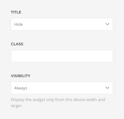
Use these default options to style your widgets published in any area.
| Option | Description |
|---|---|
| Title | Show/Hide the widget title. |
| Class | Set an HTML class for the widget. |
| Visibility | Display the widget only on a specific device width and larger. |
Appearance Options
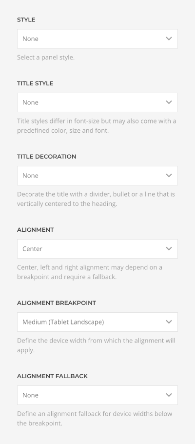
Use these appearance settings to style your widgets published in the sidebar, dialog, dialog-mobile, top and bottom areas.
| Option | Description |
|---|---|
| Style | Define whether the widget looks like a card or whether the style is blank. |
| Title Style | Title styles differ in font-size but may also come with a predefined color, size and font. |
| Title Decoration | Decorate the title with a divider, bullet or a line that is vertically centered to the heading. |
| Alignment | Center, left or right align the text. |
| Alignment Breakpoint | Define the device width starting from which the alignment will apply. |
| Alignment Fallback | Define an alignment fallback for device widths below the breakpoint. |
Grid Options
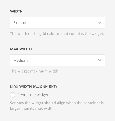
Use these grid settings to style your widgets published in the top and bottom areas.
| Option | Description |
|---|---|
| Width | Set the width of the grid column that contains the widget in percent or choose Expand to fill up the available space evenly. |
| Max Width | Set the widget's maximum width. |
| Max Width Alignment | Define the widget's alignment if the grid column is larger than its max-width. |
List Options
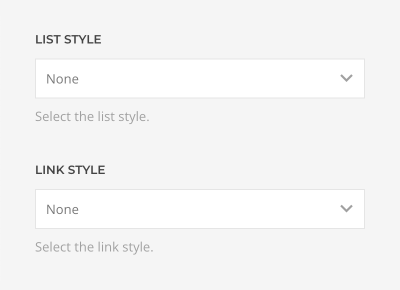
Use these settings to style your list widgets published in sidebar, dialog, dialog-mobile, top or bottom areas.
WordPress offers the following list widgets: Archives, Categories, Pages, Recent Comments, Recent Posts.
| Option | Description |
|---|---|
| List Style | Select whether the list items should be separated with dividers or not. |
| Link Style | Use the default link color or the muted color. |
Menu Options
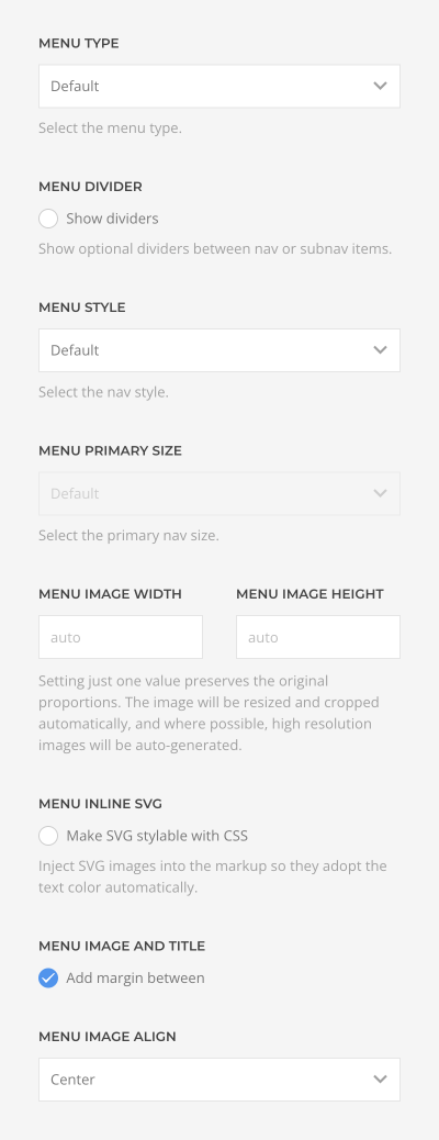
Use these settings to style your menu widgets.
| Option | Description |
|---|---|
| Menu Type | Select whether the menu should be rendered as a horizontal subnav, a vertical nav, or iconnav. The Default type depends on the area where the menu widget is published. |
| Menu Dividers | Show optional dividers between nav or subnav items. |
| Menu Style | Choose between the default, primary and secondary nav style. |
| Menu Primary Size | Select the size for the primary navigation. |
| Menu Image Width and Menu Image Height | Setting just one value preserves the original proportions. The image will be resized and cropped automatically, and where possible, high resolution images will be auto-generated. |
| Menu Inline SVG | Inject SVG images into the page markup so that they can easily be styled with CSS. |
| Menu Image and Title | Add an additional margin between the image and title. |
| Menu Image Align | Align the image to the top or center of the menu item. |
Widget Visibility
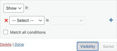
By default, a WordPress widget is visible on all pages. Therefore, we recommend installing Jetpack, an official and free-to-use plugin from WordPress. It adds a Visibility button to the widget settings, which allows you to assign widgets to different pages. The plugin needs to be activated with your wordpress.com account. If you run the demo package locally, you can also activate the Jetpack development mode.
Builder Widget
Use the builder widget to create sophisticated layouts with the YOOtheme Pro page builder anywhere on your page. The builder widget is a regular WordPress widget. It does not have any widget options in the YOOtheme Pro customizer. Instead, clicking the builder widget in the Widgets panel will open the YOOtheme Pro page builder.
Note The layout settings in Layout → Top and Layout → Bottom are ignored by the builder widget that is published in the top or bottom areas because it allows you to create multiple sections which each has its own settings.
Advanced Layouts
The YOOtheme builder widget is especially powerful in combination with the widget and area elements from the YOOtheme Pro element library. Both elements collapse if they have no content output, and the layout adapts accordingly. This gives you a lot of possibilities to create advanced layouts above and below the main content. Read more in the collapsing layouts documentation.