System Elements
Add WordPress functionality to your layouts.
System elements can be found in the element library under System. They add WordPress functionality to your layouts. If a page does not have the functionality, the element has no content output and collapses. Read more in the collapsing layouts documentation.
To learn more about general element settings, see the corresponding documentation.

Breadcrumbs Element
The Breadcrumbs element adds a breadcrumb navigation to a page. Take a look at the breadcrumbs element demo for a detailed showcase.
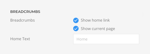
Select whether the Breadcrumbs element starts with the home link and whether the current page is shown at the end. Mind that hiding the home link and current page may cause the Breadcrumbs element to collapse if there is no other link to show. Additionally, enter the text for the home link.
| Option | Description |
|---|---|
| Show Home Link | Show or hide the home link as first item. |
| Show Current Page | Show or hide the current page as last item. |
| Home Text | Enter the text for the home link. |
Comments Element
The Comments element adds the comments functionality to a single post. Make sure to enable the comment option on a post type. Otherwise, the element will collapse. It has a Title and a Link fields. Options for the different content fields are explained in the according Headline and Button element documentation. The Comments element has no element-specific options.
Menu Element
The Menu element allows you to display a navigation anywhere in the page builder layout without having to create a WordPress widget – from sidebar and accordion menus to dropdown menus.
Select an existing menu or render a taxonomy, for example, categories, as menu. A taxonomy menu is rendered just like a regular WordPress menu including the active state.
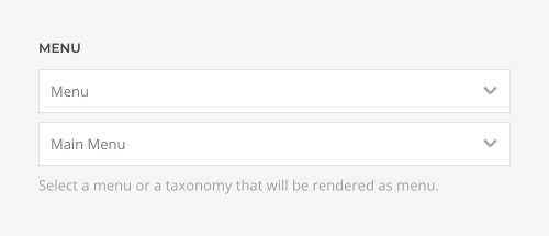
Optionally, pick a base item to always render its submenu items. This is useful to only show specific parts of the menu independent of the page where the Menu element is used.

Set the start and end levels to control which menu levels are shown. For example, create a sidebar menu that only shows Level 2 menu items and deeper. Show submenu items from all items or only the active item. Mind that for dropdown or accordion menus, all submenu items have to be shown.

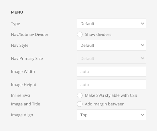
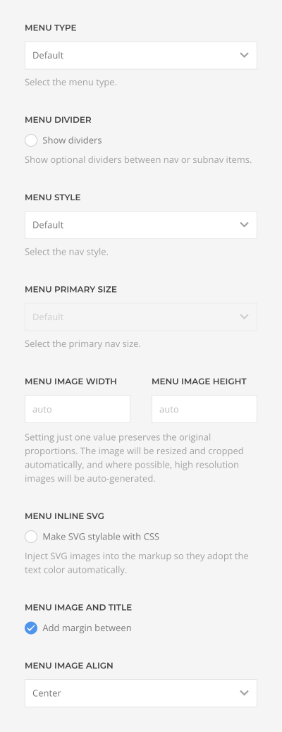
Define the type and style of the menu. Learn more about different menu types in the menus documentation.
| Option | Description |
|---|---|
| Menu Type | Select whether the menu should be rendered as a horizontal subnav, a vertical nav, or iconnav. The Default type depends on the area where the menu is published. |
| Menu Dividers | Show optional dividers between nav or subnav items. |
| Menu Style | Choose between the default, primary and secondary nav style. |
| Menu Primary Size | Select the size for the primary navigation. |
| Menu Image Width and Menu Image Height | Setting just one value preserves the original proportions. The image will be resized and cropped automatically, and where possible, high resolution images will be auto-generated. |
| Menu Inline SVG | Inject SVG images into the page markup so that they can easily be styled with CSS. |
| Menu Image and Title | Add an additional margin between the image and title. |
| Menu Image Align | Align the image to the top or center of the menu item. |
Note Alternatively, menus can also be rendered by loading menu items, categories or tags as dynamic content into the Nav or Subnav elements.
Widget Element
The Widget element allows you to select an existing WordPress widget and render it anywhere in the layout. If the widget has no content output, the element collapses. Mind that since the Widget element has its own settings, the general widget settings are ignored. Take a look at the widget element demo for a detailed showcase.
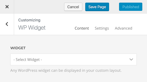
The Widget element has various panel style options. It can look like a boxed card or a blank panel.

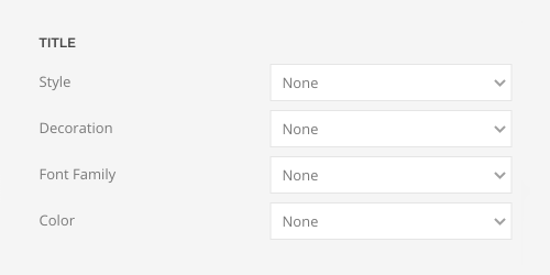
Define the style, decoration, font family and color of the widget title.
| Option | Description |
|---|---|
| Title Style | Define the style of the title. Title styles differ in font-size but may also come with a predefined color, size and font. |
| Title Decoration | Decorate the title with a divider, bullet or a line that is vertically centered to the heading. |
| Title Font Family | Define an alternative font family for the title. |
| Title Color | Select the text color. If the Background option is selected, styles that don’t apply a background image will use the primary color instead. |
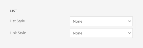
Set the list and link styles for widgets that contain a list.
| Option | Description |
|---|---|
| List Style | Define whether the list items should be separated with dividers. |
| Link Style | Choose between the default link color or a muted color. |
Define the style of the menu widgets.
| Option | Description |
|---|---|
| Menu Type | Select whether the menu should be rendered as a horizontal subnav, a vertical nav, or iconnav. |
| Menu Dividers | Show optional dividers between nav or subnav items. |
| Menu Style | Choose between the default, primary and secondary nav style. |
| Menu Primary Size | Select the size for the primary navigation. |
| Image Width and Height | Setting just one value preserves the original proportions. The image will be resized and cropped automatically, and where possible, high resolution images will be auto-generated. |
| Inline SVG | Inject SVG images into the page markup so that they can easily be styled with CSS. |
| Image and Title | Add an additional margin between the image and title. |
| Image Align | Align the image to the top or center of the menu item. |
Pagination Element
The Pagination element adds a pagination to a single post, archive, post type archive, posts page as well as the search, author and date archives. The number of posts displayed on these pages is defined in the reading settings in WordPress. If all posts are displayed on one page, the Pagination element collapses. Mind that it is not intended to be used with custom sources.
Take a look at the pagination element demo for a detailed showcase.
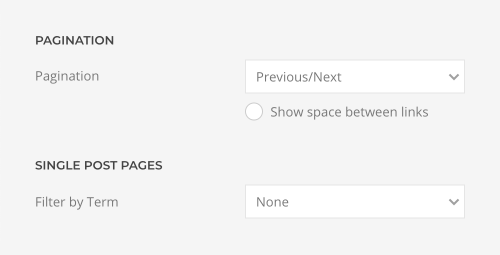
Choose between the previous/next or numeric pagination. The numeric pagination is not available for single posts. Optionally, show space between the previous/next links. Additionally, on single post pages, select a taxonomy to only navigate between posts from the same term.
Area Element
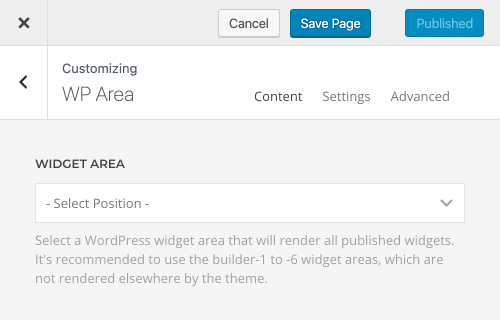
The Area element allows you to select an existing WordPress area and render all its widgets anywhere in the layout. A typical use case is to render the sidebar area in any layout section. There are also six builder-1 to builder-6 areas available for the Area element which are not rendered anywhere else in the theme. The Area element collapses if all its widgets have no content output. The appearance of each widget is defined by the widget settings added by YOOtheme Pro. Take a look at the area element demo for a detailed showcase.
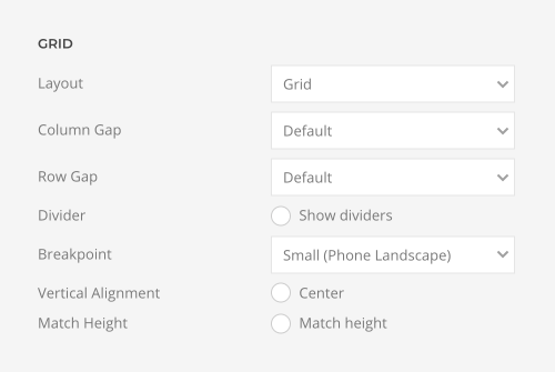
Choose the layout for the widgets, set the column and row gaps and show optional dividers between them.
| Option | Description |
|---|---|
| Layout | Select whether the widgets should be aligned side by side or stacked above each other. |
| Column Gap | Set the size of the gap between the widgets columns. |
| Row Gap | Set the size of the gap between the widget rows. |
| Dividers | Optionally, show a divider between widgets. |
| Breakpoint | Select the breakpoint from which the widgets will stack. |
| Vertical Alignment | vertically align widgets if they have different heights. |
| Match Height | Match content height for all widgets styled as a card. |
Search Element
The Search element displays a search input box. Take a look at the search element demo for a detailed showcase.
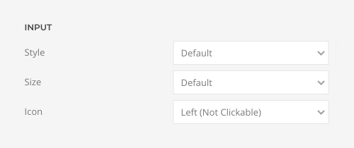
Choose between a default and a large input style for the search. If the default style is selected, choose between a Small, Default and Large size for the input box. Additionally, display a search icon on the left or right. The icon on the right can be clicked to submit the search.
