Page Builder
The YOOtheme Pro page builder allows you to build and design your website visually, without writing a single line of code.
Create layouts with an intuitive drag and drop interface and see its preview in real time. Display content by using a huge collection of elements, from texts and images to slideshows and galleries. You can start from scratch or load one of the prebuilt layouts from the layout library.
The YOOtheme Pro page builder is available for different parts of the website.
| Name | Description |
|---|---|
| Pages and Posts | Create individual page and post layouts in the Pages panel. |
| Templates | Create site-wide template layouts in the Templates panel. |
| Footer | Create a site-wide footer layout in the Layout → Footer panel. |
| Widgets | Create layouts for any widget area in the Widgets panel. |
| Mega Menus | Create layouts for mega menus in the Menus → Menu Item panel. |
Page Builder
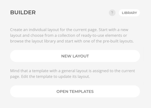
To create a new layout from scratch click the New Layout button and start adding sections and elements to your layout. Alternatively, import an existing layout from the layout library by clicking the Library button.
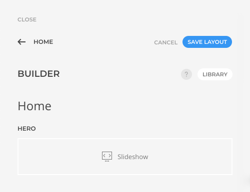
Every time a layout is changed, sticky Save Layout and Cancel buttons appear in the top right corner. Clicking Cancel or leaving the page builder will discard all layout changes since the last saving. Mind that saving the layout of the page will not save the theme settings.
Layout Structure
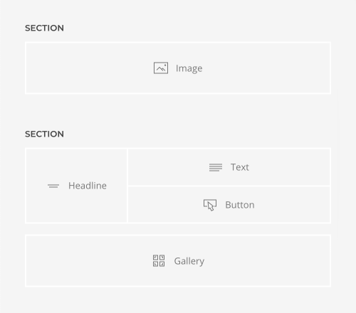
Layouts are organized in three different types of building blocks.
| Name | Description |
|---|---|
| Sections | Sections group content in larger visual blocks. They contain one or multiple rows. |
| Rows and Columns | Rows consist of one or multiple columns which in turn contain elements. |
| Elements | Elements display the actual content. |
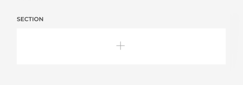
A new layout usually starts with a section which contains a row with an empty column. Click the column to add a new element.
Some layouts only consist of rows and columns. This is because sections always take up the full width of the viewport and cannot be nested into each other. This is the case for mega menu dropdowns, the Sublayout element and the builder widget published in any area except for top and bottom.
Actions
Hover a section, row or element to see the available actions. Here is a quick overview of all actions.
| Icon | Name | Description |
|---|---|---|
| Scroll into view | Scroll an element into view in the live preview. | |
| Edit | Edit a section or row. To edit an element, click on its name. | |
| Copy | Duplicate a section, row or element including all its content. | |
| Delete | Delete a section, row or element including all its content. | |
| Save in library | Save a section layout or an element in the corresponding layout or element libraries. | |
| Add | Add a new section, row or element. |
Section Actions
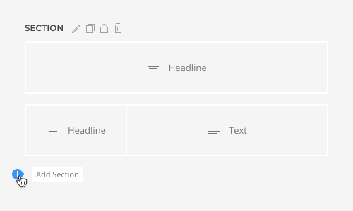
Hover a section, and the actions will appear right next to the section name. To add a new section, click the Add icon in the bottom left corner.
Row Actions
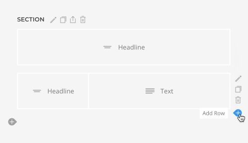
Hover a row, and the actions will appear in the top right corner of the row. To add a new row, click the Add icon in the bottom right corner.
Element Actions
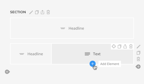
To edit an element, simply click on it. Hover an element, and the actions will appear in the top right corner of the element. To add a new element, click the Add icon at the bottom.
Element Finder
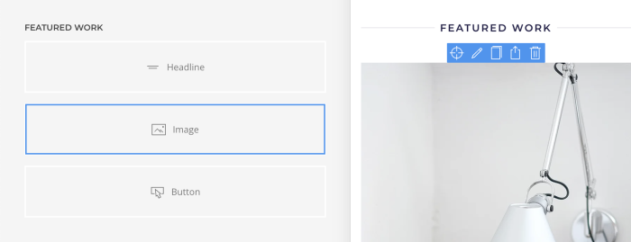
To easily find elements within your website, just hover an element in the sidebar, and all its representations in the live preview will be highlighted with a blue border. If the element is not visible in the viewport, use the scroll into view action icon. Similarly, hovering any content in the live preview will highlight the corresponding element in the sidebar. In addition, all available element actions also appear at the top and bottom of the element in the live preview. This shortcut allows you to quickly scroll into view, edit, copy, save or delete elements, or add a new element.
Ordering
Sections, rows and elements can be ordered with drag and drop.
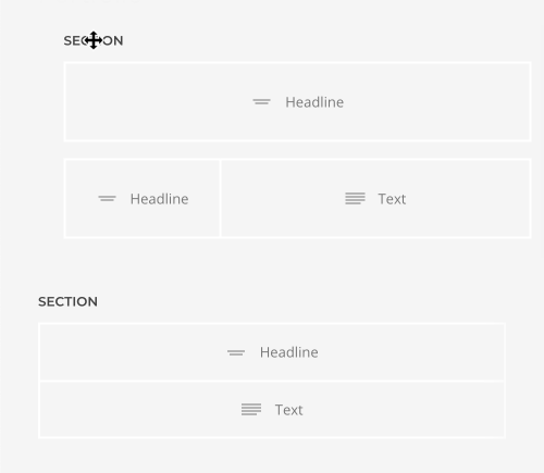
Section Ordering
To change the order of sections, grab the section name.
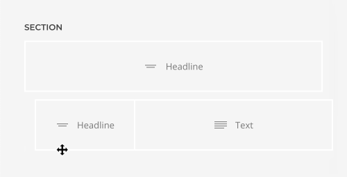
Row Ordering
To change the order of rows, grab the space below the row.
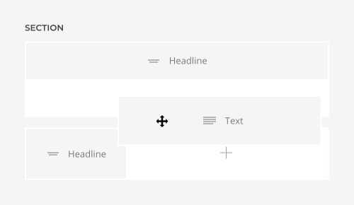
Element Ordering
To change the order of elements, simply grab the element.
Status
Status icons show important information about sections, rows, columns or elements. Here is a list of all status icons.
| Icon | Name | Description |
|---|---|---|
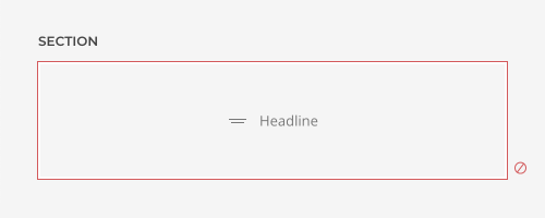
| Disabled | Indicates that the section, row or element is disabled. The Disabled option can be found in the advanced settings. | |
| Dynamic Content | Indicates that the section, row, column or element is loading dynamic content from a single content source, multiple items source, parent source or parent multiple items source. If the icon is red, it indicates that the content source or a mapped field is invalid. If a multiple items source is used, the section, row, column or element which is multiplied is highlighted green. | |
| Position Absolute | Indicates that the element is positioned absolutely and not according to the normal content flow. Therefore, it doesn't expand the height of a column, row or section. The Position option can be found in the general settings of the element with a blue background. | |
| Visibility | Indicates that the element is only shown or hidden on a specific device width and larger. If all elements are hidden, columns, rows and sections will hide accordingly. The Visibility option can be found in the general settings. | |
| HTML Element | Indicates that the section, row, column or element uses a semantic HTML element to define the purpose and structure of its content. | |
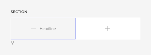
| Position Sticky | Indicates that the column or its elements sticks to the top of the viewport while scrolling down. The Sticky option can be found in the column settings of the column with a blue border. | |
| Contains … | Displays status icons in square brackets from deeper UI panel which have no representation in the page builder overview. This is the case for items of multiple items elements or anything in the Sublayout element. |
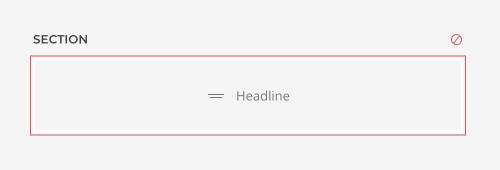
Section Status
The status icons of a section appear on the right of the section name.
Row Status
The status icons of a row appear in the bottom right corner of the row.
Column Status
The status icons of a column appear in the bottom left corner of the column.
Element Status
The status icons of an element appear in the bottom right corner of the element.

Multi-Author Workflow
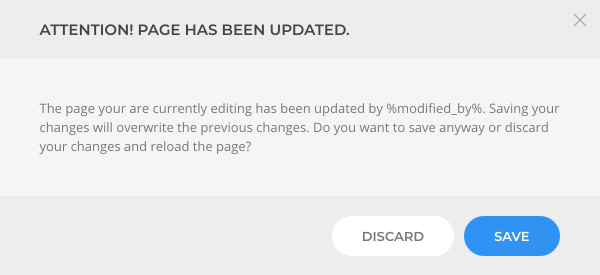
YOOtheme Pro prevents overwriting layouts when multiple authors are working on the same layout simultaneously. If a layout has been updated by a different author, a notification will appear. Either reload and update the page or close it and resume working.

If the page was not reloaded to the newer version, a modal dialog will appear when trying to save the layout. Either save the changes and overwrite the changes of the other author, or discard your changes and reload the page.
